\n
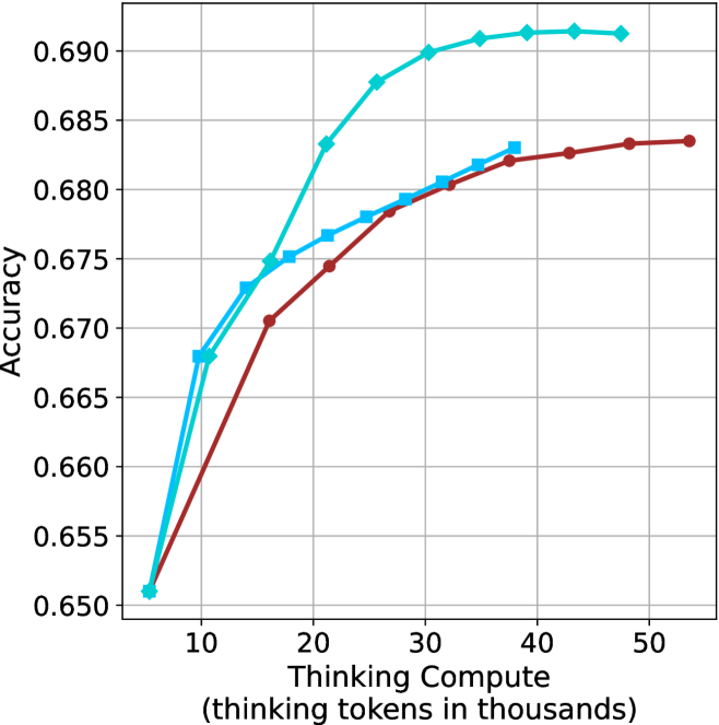
## Line Chart: Accuracy vs. Thinking Compute
### Overview
This image presents a line chart illustrating the relationship between "Accuracy" and "Thinking Compute" (measured in thousands of tokens). Two distinct data series are plotted, showing how accuracy changes with increasing computational effort. The chart appears to be evaluating the performance of two different models or approaches.
### Components/Axes
* **X-axis:** "Thinking Compute (thinking tokens in thousands)". Scale ranges from approximately 0 to 50, with markers at 10, 20, 30, 40, and 50.
* **Y-axis:** "Accuracy". Scale ranges from approximately 0.650 to 0.690, with markers at 0.650, 0.660, 0.670, 0.680, 0.690.
* **Data Series 1:** Represented by a cyan/light blue line.
* **Data Series 2:** Represented by a maroon/dark red line.
* **Gridlines:** A standard Cartesian grid is present, aiding in value estimation.
### Detailed Analysis
**Data Series 1 (Cyan/Light Blue):**
The cyan line exhibits an upward trend, indicating increasing accuracy with increasing "Thinking Compute".
* At 10 (thousands of tokens), Accuracy is approximately 0.671.
* At 20 (thousands of tokens), Accuracy is approximately 0.676.
* At 30 (thousands of tokens), Accuracy is approximately 0.685.
* At 40 (thousands of tokens), Accuracy is approximately 0.689.
* At 50 (thousands of tokens), Accuracy is approximately 0.690.
**Data Series 2 (Maroon/Dark Red):**
The maroon line also shows an upward trend, but it plateaus more quickly than the cyan line.
* At 10 (thousands of tokens), Accuracy is approximately 0.669.
* At 20 (thousands of tokens), Accuracy is approximately 0.675.
* At 30 (thousands of tokens), Accuracy is approximately 0.682.
* At 40 (thousands of tokens), Accuracy is approximately 0.684.
* At 50 (thousands of tokens), Accuracy is approximately 0.684.
### Key Observations
* Both data series demonstrate a positive correlation between "Thinking Compute" and "Accuracy".
* The cyan line consistently shows higher accuracy values than the maroon line across all "Thinking Compute" levels.
* The maroon line's accuracy growth slows down significantly after 30 (thousands of tokens), suggesting diminishing returns.
* The cyan line continues to show improvement, albeit at a decreasing rate, even at 50 (thousands of tokens).
### Interpretation
The chart suggests that increasing the amount of "Thinking Compute" generally improves accuracy. However, the rate of improvement varies between the two data series. The cyan line represents a model or approach that benefits more significantly from increased computation, while the maroon line reaches a point of diminishing returns. This could indicate that the maroon model has reached its performance limit with the given architecture or training data, while the cyan model still has potential for further improvement with more computational resources. The difference in performance between the two lines could be due to differences in model complexity, training methodology, or underlying algorithms. The chart highlights the importance of balancing computational cost with desired accuracy levels. It also suggests that further investment in "Thinking Compute" may be more beneficial for the cyan model than for the maroon model.