\n
## Contour Plot: Dimensionality Reduction of Text Data
### Overview
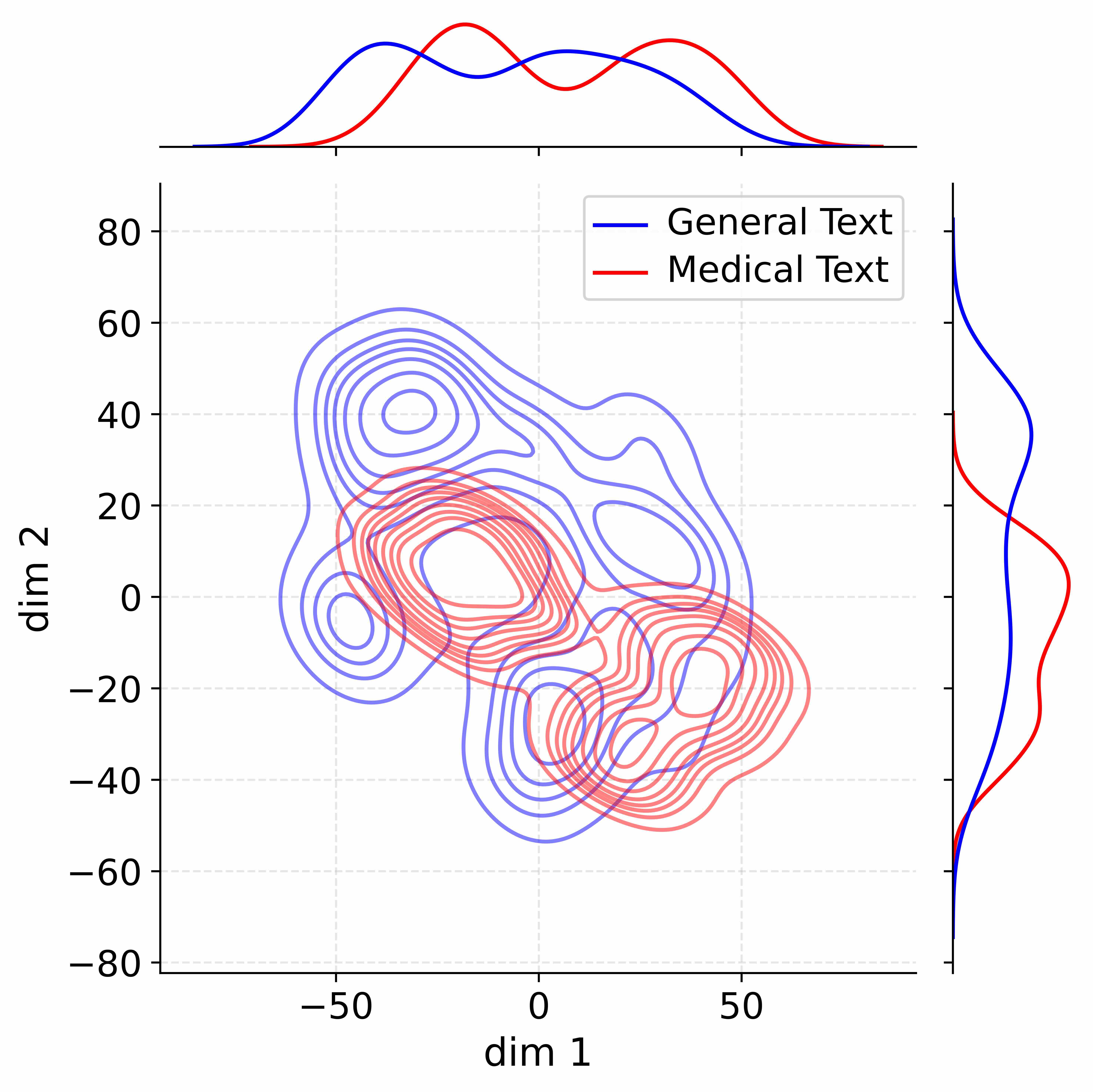
The image presents a contour plot visualizing the distribution of two text categories – "General Text" and "Medical Text" – across two dimensions, labeled "dim 1" and "dim 2". Marginal distributions (density plots) are shown above the contour plot, and a projection of the data along dim 1 is shown on the right. The plot appears to be the result of a dimensionality reduction technique, likely PCA or t-SNE, applied to text data.
### Components/Axes
* **X-axis:** "dim 1" ranging from approximately -60 to 60.
* **Y-axis:** "dim 2" ranging from approximately -80 to 80.
* **Contour Lines:** Represent density levels of the data distribution.
* **Legend (Top-Right):**
* Blue Line: "General Text"
* Red Line: "Medical Text"
* **Density Plots (Top):** Show the marginal distribution of each text type.
* Blue Density Plot: "General Text"
* Red Density Plot: "Medical Text"
* **Projection (Right):** Shows the distribution of each text type along dim 1.
* Blue Line: "General Text"
* Red Line: "Medical Text"
### Detailed Analysis
The contour plot shows a significant overlap between the distributions of "General Text" and "Medical Text". However, there are discernible differences in their concentration.
**Contour Plot Analysis:**
* The "Medical Text" (red contours) appears to be more concentrated in the positive "dim 1" region (approximately 0 to 50) and has a broader distribution along "dim 2".
* The "General Text" (blue contours) is more concentrated in the negative "dim 1" region (approximately -50 to 0) and also exhibits a distribution along "dim 2".
* There is a region of high density overlap around dim1 = 0 and dim2 = 0.
**Density Plot Analysis (Top):**
* The "General Text" density plot (blue) peaks around dim1 = -20, with a relatively narrow distribution.
* The "Medical Text" density plot (red) peaks around dim1 = 20, with a broader distribution.
**Projection Analysis (Right):**
* The "General Text" projection (blue) starts at approximately 0.8 at dim1 = -60, decreases to approximately 0.2 at dim1 = 0, and then increases to approximately 0.6 at dim1 = 60. This indicates a higher concentration of "General Text" at the extremes of dim1.
* The "Medical Text" projection (red) starts at approximately 0.2 at dim1 = -60, increases to a peak of approximately 0.9 at dim1 = 20, and then decreases to approximately 0.3 at dim1 = 60. This indicates a higher concentration of "Medical Text" in the positive dim1 region.
### Key Observations
* The two text categories are not fully separable in this two-dimensional space.
* "Medical Text" tends to have higher values in "dim 1" compared to "General Text".
* The marginal distributions reveal differences in the overall distribution of each text type across "dim 1".
* The projection along dim 1 shows a clear difference in the concentration of each text type.
### Interpretation
This visualization suggests that "dim 1" captures a key differentiating factor between "General Text" and "Medical Text". The fact that the distributions overlap indicates that the two categories share some underlying characteristics, and that the dimensionality reduction process has not perfectly separated them. The density plots and projection further confirm that "Medical Text" is more likely to have higher values in "dim 1".
The choice of dimensionality reduction technique (PCA, t-SNE, etc.) and the features used to represent the text data would influence the specific meaning of "dim 1" and "dim 2". It's likely that "dim 1" represents a combination of features related to medical terminology, specialized vocabulary, or specific writing styles. Further analysis would be needed to determine the exact features contributing to this separation. The overlap suggests that a simple linear classifier might not achieve high accuracy in distinguishing between the two text types, but more complex models could potentially leverage the subtle differences captured in these dimensions.