## Line Graphs: Usage Proportions Over Time
### Overview
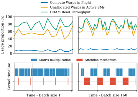
Two line graphs depict dynamic resource usage metrics over time. The left graph shows three metrics (Compute Warps in Flight, Unallocated Warps in Active SMs, DRAM Read Throughput) with usage proportions up to 80%. The right graph extends the y-axis to 100% and includes similar metrics with higher absolute values.
### Components/Axes
- **Left Graph**:
- **Y-axis**: Usage proportion (%) (0–100).
- **X-axis**: Time (unspecified units).
- **Legend**:
- Blue: Compute Warps in Flight.
- Orange: Unallocated Warps in Active SMs.
- Green: DRAM Read Throughput.
- **Right Graph**:
- **Y-axis**: Usage proportion (%) (0–100).
- **X-axis**: Time (unspecified units).
- **Legend**: Same as left graph.
### Detailed Analysis
- **Left Graph Trends**:
- **Compute Warps in Flight (Blue)**: Peaks at ~10%, remains relatively stable.
- **Unallocated Warps (Orange)**: Fluctuates between 40–60%, with a notable dip to ~30% at one point.
- **DRAM Read Throughput (Green)**: Dominates with peaks up to ~90%, averaging ~70–80%.
- **Right Graph Trends**:
- **Compute Warps in Flight (Blue)**: Slightly higher (~15% peak).
- **Unallocated Warps (Orange)**: Ranges 60–80%, with sharper fluctuations.
- **DRAM Read Throughput (Green)**: Similar to left graph (~70–90%).
### Key Observations
1. **DRAM Read Throughput** consistently dominates resource usage in both graphs.
2. **Unallocated Warps** show significant variability, particularly in the right graph.
3. **Compute Warps in Flight** increases modestly in the right graph, suggesting higher demand under certain conditions.
4. The orange line (Unallocated Warps) in the left graph dips below 40% at one point, potentially indicating a transient state.
### Interpretation
- **Resource Allocation**: DRAM Read Throughput is the primary bottleneck, consuming ~70–90% of resources.
- **Compute Efficiency**: Compute Warps in Flight scales with workload (higher in the right graph), but remains a smaller fraction of total usage.
- **Unallocated Warps**: Fluctuations may reflect dynamic resource management or inefficiencies in warp scheduling.
- **Batch Size Impact**: The right graph’s higher Compute Warps and Unallocated Warps values suggest increased computational demand with larger batch sizes (160 vs. 1).
## Bar Charts: Kernel Timeline
### Overview
Two bar charts compare time allocation between matrix multiplication (blue) and attention mechanisms (red) for batch sizes 1 and 160.
### Components/Axes
- **X-axis**: Time (segmented into equal intervals).
- **Y-axis**: Kernel timeline (unspecified units).
- **Legend**:
- Blue: Matrix multiplication.
- Red: Attention mechanism.
### Detailed Analysis
- **Batch Size 1**:
- Matrix multiplication (blue) occupies ~80% of the timeline.
- Attention mechanism (red) uses ~20%, with shorter, sporadic bars.
- **Batch Size 160**:
- Matrix multiplication (blue) remains dominant (~70–80%).
- Attention mechanism (red) increases to ~30–40%, with longer, contiguous bars.
### Key Observations
1. **Attention Mechanism Scaling**: Time allocated to attention mechanisms grows significantly with larger batch sizes.
2. **Matrix Multiplication Dominance**: Remains the primary computational task regardless of batch size.
### Interpretation
- **Batch Size Trade-offs**: Larger batches increase attention mechanism overhead, potentially impacting parallelism.
- **Hardware Utilization**: Matrix multiplication’s consistent dominance suggests it is the core computational kernel, while attention mechanisms introduce variable overhead.
## Final Notes
- **Language**: All text is in English.
- **Data Gaps**: Exact time units and batch size definitions are unspecified.
- **Anomalies**: The left graph’s Unallocated Warps dip below 40% may indicate a transient state or measurement artifact.