## Line Plots: Comparison of Theory vs. Simulations for Learning Metrics
### Overview
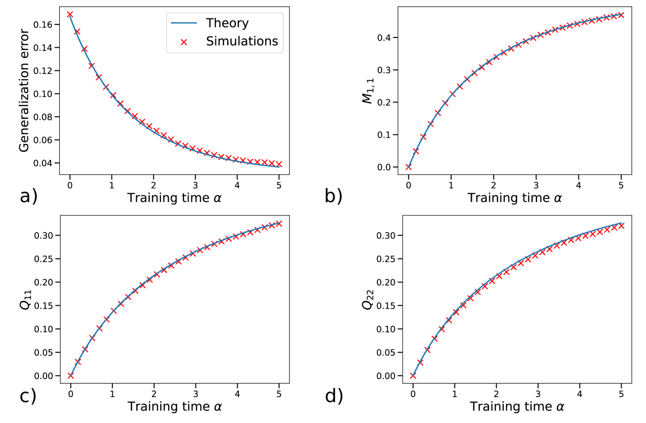
The image displays a 2x2 grid of four line plots, labeled a), b), c), and d). Each plot compares a theoretical prediction (solid blue line) against simulation results (red 'x' markers) for a different metric as a function of "Training time α". The plots demonstrate a very close agreement between theory and simulation across all four metrics. A single legend, located in the top-left corner of subplot a), defines the two data series.
### Components/Axes
* **Common X-Axis (All Plots):** Label: "Training time α". Scale: Linear, ranging from 0 to 5 with major tick marks at integer intervals (0, 1, 2, 3, 4, 5).
* **Legend:** Positioned in the top-left corner of subplot a). Contains two entries:
* A solid blue line labeled "Theory".
* A red 'x' marker labeled "Simulations".
* **Subplot a) - Top Left:**
* **Y-Axis Label:** "Generalization error".
* **Y-Axis Scale:** Linear, ranging from approximately 0.04 to 0.17.
* **Subplot b) - Top Right:**
* **Y-Axis Label:** "M₁,₁" (M with subscript 1,1).
* **Y-Axis Scale:** Linear, ranging from 0.0 to approximately 0.45.
* **Subplot c) - Bottom Left:**
* **Y-Axis Label:** "Q₁₁" (Q with subscript 11).
* **Y-Axis Scale:** Linear, ranging from 0.00 to approximately 0.33.
* **Subplot d) - Bottom Right:**
* **Y-Axis Label:** "Q₂₂" (Q with subscript 22).
* **Y-Axis Scale:** Linear, ranging from 0.00 to approximately 0.33.
### Detailed Analysis
**Trend Verification & Data Points (Approximate):**
* **Subplot a) Generalization Error:**
* **Trend:** The line slopes downward, showing a decreasing, convex curve. The rate of decrease slows as α increases.
* **Data Points (α, Value):**
* α=0: ~0.165
* α=1: ~0.105
* α=2: ~0.070
* α=3: ~0.050
* α=4: ~0.042
* α=5: ~0.038
* **Subplot b) M₁,₁:**
* **Trend:** The line slopes upward, showing an increasing, concave curve. The rate of increase slows as α increases.
* **Data Points (α, Value):**
* α=0: 0.00
* α=1: ~0.20
* α=2: ~0.32
* α=3: ~0.38
* α=4: ~0.42
* α=5: ~0.44
* **Subplot c) Q₁₁:**
* **Trend:** The line slopes upward, showing an increasing, concave curve. The rate of increase slows as α increases.
* **Data Points (α, Value):**
* α=0: 0.00
* α=1: ~0.12
* α=2: ~0.21
* α=3: ~0.26
* α=4: ~0.30
* α=5: ~0.32
* **Subplot d) Q₂₂:**
* **Trend:** The line slopes upward, showing an increasing, concave curve. The rate of increase slows as α increases. The curve and final value are very similar to Q₁₁.
* **Data Points (α, Value):**
* α=0: 0.00
* α=1: ~0.13
* α=2: ~0.22
* α=3: ~0.27
* α=4: ~0.30
* α=5: ~0.32
**Component Isolation & Cross-Reference:**
* In all four subplots, the red 'x' markers (Simulations) lie directly on or extremely close to the solid blue line (Theory), confirming excellent agreement.
* The legend in subplot a) applies to all four panels, as the same marker and line styles are used throughout.
### Key Observations
1. **Strong Theory-Simulation Agreement:** The most prominent feature is the near-perfect overlap between the theoretical curves and the simulation data points across all metrics and all values of α.
2. **Consistent Functional Forms:** Three of the four metrics (M₁,₁, Q₁₁, Q₂₂) show a similar increasing, saturating trend. Generalization error shows the inverse—a decreasing, saturating trend.
3. **Asymptotic Behavior:** All metrics appear to approach an asymptotic limit as training time α increases beyond 4 or 5.
4. **Similarity of Q₁₁ and Q₂₂:** The plots for Q₁₁ and Q₂₂ are nearly identical in shape and magnitude, suggesting these two quantities evolve similarly during training.
### Interpretation
This figure validates a theoretical model for the dynamics of a learning system. The "Training time α" likely represents a normalized measure of training duration or sample size.
* **What the data suggests:** The theory accurately predicts how key system parameters (M₁,₁, Q₁₁, Q₂₂) evolve and how the generalization error decreases during the learning process. The close match implies the theoretical assumptions and derivations are sound for the simulated scenario.
* **Relationship between elements:** The decreasing generalization error (plot a) is causally linked to the increasing values of the internal parameters M and Q (plots b-d). As the system's internal state (represented by M and Q) evolves away from its initial condition (zero), its ability to generalize to new data improves (error drops).
* **Notable patterns:** The saturating trends indicate a learning process that experiences diminishing returns; initial training yields rapid improvement, but gains slow as the system approaches a stable, trained state. The near-identity of Q₁₁ and Q₂₂ might indicate symmetry in the system's structure or that these parameters represent similar properties (e.g., variances of different but equivalent components).
* **Underlying context:** This type of analysis is common in statistical mechanics of learning, mean-field theory of neural networks, or the study of online learning algorithms, where theoretical curves are derived from analytical models and tested against numerical simulations of the learning dynamics. The variables M and Q are typical notations for order parameters in such theories.