## Chart Type: Line Graphs Comparing Learned and True Functions
### Overview
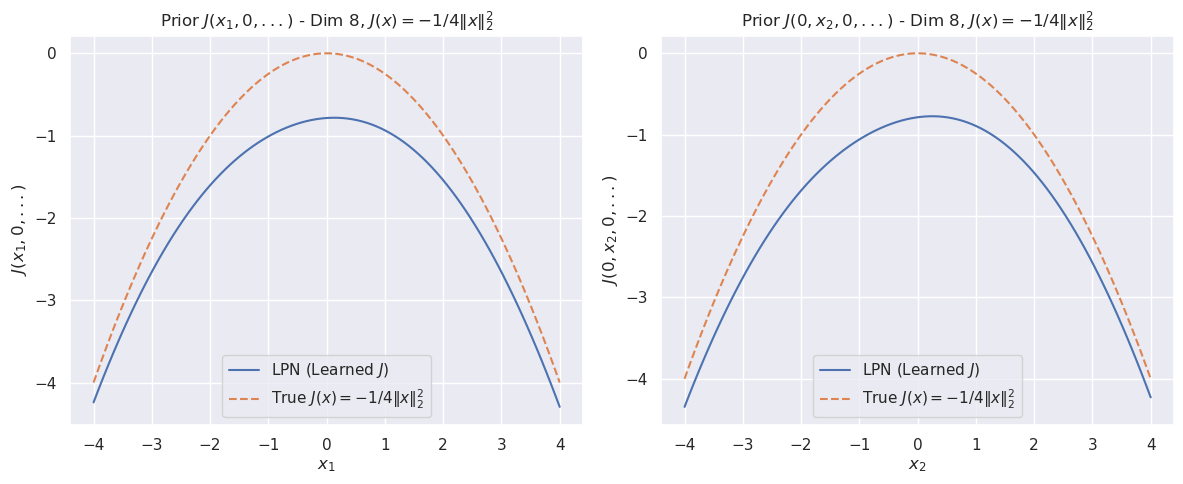
The image contains two line graphs displayed side-by-side. Both graphs compare a learned function (LPN) with a true function, where the true function is defined as J(x) = -1/4||x||². The left graph shows the prior with x1 as the variable, while the other variables are set to 0. The right graph shows the prior with x2 as the variable, while the other variables are set to 0. Both graphs have the same x and y axis scales.
### Components/Axes
**Left Graph:**
* **Title:** Prior J(x1, 0, ...) - Dim 8, J(x) = -1/4||x||²
* **X-axis:** x1, with ticks at -4, -3, -2, -1, 0, 1, 2, 3, 4
* **Y-axis:** J(x1, 0, ...), with ticks at 0, -1, -2, -3, -4
* **Legend (bottom-left):**
* Blue solid line: LPN (Learned J)
* Brown dashed line: True J(x) = -1/4||x||²
**Right Graph:**
* **Title:** Prior J(0, x2, 0, ...) - Dim 8, J(x) = -1/4||x||²
* **X-axis:** x2, with ticks at -4, -3, -2, -1, 0, 1, 2, 3, 4
* **Y-axis:** J(0, x2, 0, ...), with ticks at 0, -1, -2, -3, -4
* **Legend (bottom-right):**
* Blue solid line: LPN (Learned J)
* Brown dashed line: True J(x) = -1/4||x||²
### Detailed Analysis
**Left Graph (x1):**
* **LPN (Learned J) - Blue solid line:** The line forms a concave-down curve. It starts at approximately -4.2 at x1 = -4, rises to a peak of approximately -0.7 at x1 = 0, and then decreases back down to approximately -4.2 at x1 = 4.
* **True J(x) = -1/4||x||² - Brown dashed line:** The line forms a concave-down curve. It starts at approximately -4 at x1 = -4, rises to a peak of 0 at x1 = 0, and then decreases back down to approximately -4 at x1 = 4.
**Right Graph (x2):**
* **LPN (Learned J) - Blue solid line:** The line forms a concave-down curve. It starts at approximately -4.2 at x2 = -4, rises to a peak of approximately -0.7 at x2 = 0, and then decreases back down to approximately -4.2 at x2 = 4.
* **True J(x) = -1/4||x||² - Brown dashed line:** The line forms a concave-down curve. It starts at approximately -4 at x2 = -4, rises to a peak of 0 at x2 = 0, and then decreases back down to approximately -4 at x2 = 4.
### Key Observations
* Both graphs show similar trends.
* The "True J(x)" curve is consistently higher than the "LPN (Learned J)" curve.
* The peak of the "True J(x)" curve is at 0, while the peak of the "LPN (Learned J)" curve is around -0.7.
* The LPN curve is a smoothed version of the True J(x) curve.
### Interpretation
The graphs illustrate how a learned function (LPN) approximates a true function. The LPN curve, representing the learned function, is a smoothed and slightly lower version of the true function. This suggests that the learning process captures the general trend of the true function but doesn't perfectly replicate it, resulting in a slight underestimation of the function's values, especially at the peak. The similarity between the two graphs indicates that the function's behavior is consistent whether x1 or x2 is varied while the other variables are held at 0. The difference between the learned and true functions could be due to limitations in the learning algorithm, the amount of training data, or the complexity of the function being learned.