## [Chart Type]: Dual-Panel Line Plot Comparison
### Overview
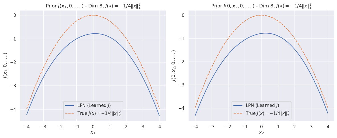
The image displays two side-by-side line plots comparing a "Learned" function (LPN) against a "True" mathematical function. Both plots visualize a 1-dimensional slice of an 8-dimensional function, where all other dimensions are held at zero. The left panel varies the first dimension (`x₁`), and the right panel varies the second dimension (`x₂`). The overall purpose is to demonstrate how well a learned model (LPN) approximates a known target function.
### Components/Axes
**Titles:**
* **Left Plot:** `Prior J(x₁, 0, ...) - Dim 8, J(x) = -1/4||x||₂²`
* **Right Plot:** `Prior J(0, x₂, 0, ...) - Dim 8, J(x) = -1/4||x||₂²`
**Axes:**
* **X-Axis (Left Plot):** Labeled `x₁`. Scale ranges from -4 to 4, with major ticks at -4, -3, -2, -1, 0, 1, 2, 3, 4.
* **X-Axis (Right Plot):** Labeled `x₂`. Scale ranges from -4 to 4, with major ticks at -4, -3, -2, -1, 0, 1, 2, 3, 4.
* **Y-Axis (Both Plots):** Labeled `J(x₁, 0, ...)` (left) and `J(0, x₂, 0, ...)` (right). Scale ranges from -4 to 0, with major ticks at -4, -3, -2, -1, 0.
**Legend (Present in both plots, located in the bottom-left corner):**
* **Solid Blue Line:** `LPN (Learned J)`
* **Dashed Orange Line:** `True J(x) = -1/4||x||₂²`
### Detailed Analysis
**Left Plot (Varying `x₁`):**
* **True Function (Dashed Orange):** This is a perfect downward-opening parabola. Its vertex (maximum value) is at `(x₁=0, J=0)`. At the extremes (`x₁ = ±4`), the value is `J = -1/4 * (4²) = -4`. The curve is perfectly symmetric around `x₁=0`.
* **Learned Function (Solid Blue):** This curve is also a downward-opening parabola, symmetric around `x₁=0`. Its vertex is at approximately `(x₁=0, J ≈ -0.8)`. At the extremes (`x₁ = ±4`), the value is approximately `J ≈ -4.3`. The learned curve is consistently below the true curve across the entire domain.
**Right Plot (Varying `x₂`):**
* **True Function (Dashed Orange):** Identical in shape and values to the left plot's true function. Vertex at `(x₂=0, J=0)`, value at `x₂ = ±4` is `J = -4`.
* **Learned Function (Solid Blue):** Visually identical to the learned function in the left plot. Vertex at approximately `(x₂=0, J ≈ -0.8)`, value at `x₂ = ±4` is approximately `J ≈ -4.3`. It is also consistently below the true curve.
**Trend Verification:**
* **Both True Curves:** Slope downward symmetrically from a peak at the center (x=0). The slope becomes steeper as the absolute value of x increases.
* **Both Learned Curves:** Follow the same symmetric, downward-sloping trend as the true curves but are vertically offset downward. The gap between the learned and true curves appears to widen slightly as |x| increases.
### Key Observations
1. **Consistent Underestimation:** The learned function (LPN) systematically underestimates the true function `J(x)` across all tested values of `x₁` and `x₂`.
2. **Shape Preservation:** The LPN successfully learns the correct parabolic shape and symmetry of the target function.
3. **Constant Offset:** The vertical offset between the two curves is not constant. The difference at the peak (`x=0`) is approximately `0.8`, while the difference at the edges (`x=±4`) is approximately `0.3`. This suggests the error is not a simple additive constant.
4. **Identical Behavior Across Dimensions:** The model's performance is identical when varying the first or second dimension, indicating consistent behavior in these two dimensions of the 8-dimensional space.
### Interpretation
This visualization is a diagnostic tool for evaluating a machine learning model (LPN) tasked with learning a prior distribution or objective function `J(x)`.
* **What the data suggests:** The LPN has successfully captured the fundamental *structure* of the target function—its quadratic nature and symmetry. However, it has failed to learn the correct *scale* or *magnitude*, resulting in a consistent under-prediction. The error is not uniform; the model is more accurate near the center of the distribution (`x≈0`) and less accurate in the tails (`|x| large`).
* **How elements relate:** The side-by-side comparison across two different input dimensions (`x₁` and `x₂`) serves to validate that the learned behavior is not an artifact of a single dimension. The identical plots suggest the model's approximation error is consistent across these dimensions.
* **Notable anomalies:** The primary anomaly is the systematic negative bias. In a perfect approximation, the blue and orange lines would overlap. The fact that the learned curve is always below the true curve indicates a potential issue in the model's training objective, capacity, or the scaling of the output. The widening gap at the extremes could be particularly problematic if accurate predictions in the tails of the distribution are important for the downstream task.