\n
## Line Chart: Accuracy vs. Ratio for Different Data Distributions
### Overview
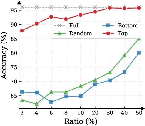
This image presents a line chart illustrating the relationship between 'Ratio (%)' and 'Accuracy (%)' for four different data distributions: 'Full', 'Random', 'Bottom', and 'Top'. The chart aims to compare the performance (accuracy) of a model or system as the ratio of a certain data characteristic changes.
### Components/Axes
* **X-axis:** 'Ratio (%)' - Ranges from 2% to 50%, with markers at 2, 4, 6, 8, 10, 20, 30, 40, and 50.
* **Y-axis:** 'Accuracy (%)' - Ranges from approximately 60% to 96%, with markers at 60, 65, 70, 75, 80, 85, 90, 95.
* **Legend:** Located in the top-right corner, identifying the four data series:
* 'Full' - Represented by a grey dashed line with 'x' markers.
* 'Random' - Represented by a green solid line with triangle markers.
* 'Bottom' - Represented by a blue solid line with square markers.
* 'Top' - Represented by a red solid line with circle markers.
### Detailed Analysis
Here's a breakdown of each data series, noting trends and approximate values:
* **Full (Grey, 'x' markers):** The line is relatively flat, hovering around 95% accuracy across all ratios.
* Ratio 2%: Accuracy ≈ 95.5%
* Ratio 4%: Accuracy ≈ 95.5%
* Ratio 6%: Accuracy ≈ 95%
* Ratio 8%: Accuracy ≈ 95%
* Ratio 10%: Accuracy ≈ 95%
* Ratio 20%: Accuracy ≈ 95.5%
* Ratio 30%: Accuracy ≈ 95.5%
* Ratio 40%: Accuracy ≈ 95.5%
* Ratio 50%: Accuracy ≈ 95.5%
* **Random (Green, triangle markers):** The line shows an increasing trend, starting low and rising significantly towards the higher ratios.
* Ratio 2%: Accuracy ≈ 62%
* Ratio 4%: Accuracy ≈ 58%
* Ratio 6%: Accuracy ≈ 63%
* Ratio 8%: Accuracy ≈ 65%
* Ratio 10%: Accuracy ≈ 67%
* Ratio 20%: Accuracy ≈ 70%
* Ratio 30%: Accuracy ≈ 72%
* Ratio 40%: Accuracy ≈ 80%
* Ratio 50%: Accuracy ≈ 85%
* **Bottom (Blue, square markers):** The line exhibits a generally increasing trend, but with more fluctuations than the 'Top' line.
* Ratio 2%: Accuracy ≈ 66%
* Ratio 4%: Accuracy ≈ 65%
* Ratio 6%: Accuracy ≈ 62%
* Ratio 8%: Accuracy ≈ 63%
* Ratio 10%: Accuracy ≈ 65%
* Ratio 20%: Accuracy ≈ 69%
* Ratio 30%: Accuracy ≈ 71%
* Ratio 40%: Accuracy ≈ 74%
* Ratio 50%: Accuracy ≈ 80%
* **Top (Red, circle markers):** The line shows a strong increasing trend initially, then plateaus at a high accuracy level.
* Ratio 2%: Accuracy ≈ 88%
* Ratio 4%: Accuracy ≈ 90%
* Ratio 6%: Accuracy ≈ 92%
* Ratio 8%: Accuracy ≈ 92%
* Ratio 10%: Accuracy ≈ 93%
* Ratio 20%: Accuracy ≈ 94%
* Ratio 30%: Accuracy ≈ 95%
* Ratio 40%: Accuracy ≈ 95%
* Ratio 50%: Accuracy ≈ 95%
### Key Observations
* The 'Full' distribution consistently achieves the highest accuracy, remaining stable across all ratios.
* The 'Top' distribution shows the fastest initial increase in accuracy with increasing ratio, quickly reaching a plateau.
* The 'Random' distribution starts with the lowest accuracy but demonstrates the most significant improvement as the ratio increases.
* The 'Bottom' distribution shows a moderate increase in accuracy, but remains lower than 'Top' and 'Full' across all ratios.
### Interpretation
The data suggests that the distribution of the data significantly impacts the accuracy of the system being evaluated. A 'Full' distribution, presumably representing a balanced dataset, yields the best and most consistent performance. Focusing on the 'Top' portion of the data provides a quick initial boost in accuracy, but gains diminish as the ratio increases. The 'Random' distribution indicates that the system benefits from a more representative sample, as accuracy improves with a higher ratio. The 'Bottom' distribution consistently underperforms, suggesting that this portion of the data is less informative or more challenging for the system.
The plateau observed in the 'Full' and 'Top' distributions suggests a point of diminishing returns – increasing the ratio beyond a certain point does not lead to further significant improvements in accuracy. The steep climb of the 'Random' distribution highlights the importance of data representation for effective model training or system performance. The differences between the lines suggest that the system is sensitive to the characteristics of the data it is processing.