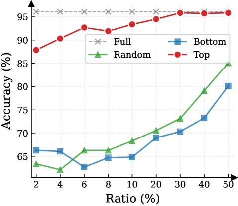
## Line Chart: Accuracy vs. Ratio (%)
### Overview
The chart displays four data series representing accuracy percentages across varying ratios (2% to 50%). The y-axis shows accuracy (%), and the x-axis shows ratio (%). Four lines are plotted: "Full" (gray dashed), "Bottom" (blue squares), "Random" (green triangles), and "Top" (red circles). The legend is positioned in the upper-right corner.
### Components/Axes
- **X-axis (Ratio %)**: Labeled "Ratio (%)" with ticks at 2, 4, 6, 8, 10, 20, 30, 40, 50.
- **Y-axis (Accuracy %)**: Labeled "Accuracy (%)" with ticks at 60, 65, 70, 75, 80, 85, 90, 95.
- **Legend**: Located in the upper-right corner, with four entries:
- **Full**: Gray dashed line with "X" markers.
- **Bottom**: Blue squares.
- **Random**: Green triangles.
- **Top**: Red circles.
### Detailed Analysis
1. **Full (Gray Dashed Line)**:
- Maintains a flat trend at ~95% accuracy across all ratios.
- No significant variation observed.
2. **Top (Red Circles)**:
- Starts at ~88% accuracy at 2% ratio.
- Increases to ~92% by 10% ratio.
- Plateaus near 95% after 20% ratio.
3. **Random (Green Triangles)**:
- Begins at ~63% accuracy at 2% ratio.
- Dips slightly to ~62% at 4% ratio.
- Steadily rises to ~85% at 50% ratio.
4. **Bottom (Blue Squares)**:
- Starts at ~66% accuracy at 2% ratio.
- Drops to ~63% at 4% ratio.
- Gradually increases to ~80% at 50% ratio.
### Key Observations
- **Highest Accuracy**: "Full" and "Top" lines dominate, with "Full" being the most consistent.
- **Significant Growth**: "Random" and "Bottom" lines show gradual improvement as ratio increases, with "Random" surpassing "Bottom" after ~20% ratio.
- **Diminishing Returns**: "Top" line plateaus near 95% after 20% ratio, suggesting limited gains beyond this point.
- **Initial Dip**: Both "Random" and "Bottom" lines experience minor accuracy drops between 2% and 4% ratios.
### Interpretation
The data suggests that higher ratios generally correlate with improved accuracy, particularly for "Top" and "Random" series. The "Full" line likely represents a theoretical maximum or baseline accuracy. The "Top" line’s plateau indicates diminishing returns after 20% ratio, while the "Random" line’s steady rise implies that variability in data may enhance performance as more data is included. The "Bottom" line’s slower improvement could reflect a model or approach less sensitive to increased data volume. The initial dip in "Random" and "Bottom" lines at 4% ratio warrants further investigation into potential data quality or sampling issues at lower ratios.