\n
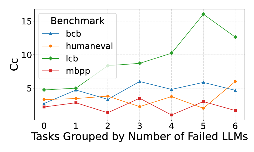
## Line Chart: CC vs. Tasks Grouped by Failed LLMs
### Overview
This line chart displays the relationship between the number of tasks grouped by the number of failed Large Language Models (LLMs) on the x-axis and the CC (likely a correlation coefficient or similar metric) on the y-axis. Four different benchmarks are represented by distinct colored lines. The chart shows how the CC value changes as the number of failed LLMs increases for each benchmark.
### Components/Axes
* **X-axis Title:** "Tasks Grouped by Number of Failed LLMs"
* Scale: 0 to 6, with markers at each integer value.
* **Y-axis Title:** "CC"
* Scale: 0 to 16, with markers at 0, 5, 10, and 15.
* **Legend Title:** "Benchmark"
* **Line Labels & Colors:**
* `bcb` - Blue
* `humaneval` - Orange
* `lcb` - Green
* `mbpp` - Red
* **Gridlines:** Present, providing a visual aid for reading values.
### Detailed Analysis
The chart displays four lines, each representing a benchmark.
* **bcb (Blue Line):** The line starts at approximately 2 at x=0, rises to a peak of approximately 5 at x=3, then declines to approximately 4.8 at x=6. The trend is initially upward, then downward.
* (0, 2)
* (1, 2.5)
* (2, 3)
* (3, 5)
* (4, 4.8)
* (5, 4.5)
* (6, 4.8)
* **humaneval (Orange Line):** The line begins at approximately 2.2 at x=0, fluctuates around 3-4 until x=4, then rises to approximately 5.5 at x=6. The trend is relatively flat initially, then upward.
* (0, 2.2)
* (1, 2.8)
* (2, 3.2)
* (3, 3.5)
* (4, 3.8)
* (5, 4.8)
* (6, 5.5)
* **lcb (Green Line):** This line shows the most dramatic increase. It starts at approximately 2.5 at x=0 and rises steadily to a peak of approximately 15.5 at x=5, then declines to approximately 12.5 at x=6. The trend is strongly upward, then slightly downward.
* (0, 2.5)
* (1, 4.5)
* (2, 6.5)
* (3, 8.5)
* (4, 10.5)
* (5, 15.5)
* (6, 12.5)
* **mbpp (Red Line):** The line starts at approximately 1.8 at x=0, decreases to approximately 1.5 at x=1, then rises to approximately 2.5 at x=3, and declines to approximately 1.8 at x=6. The trend is initially downward, then upward, then downward.
* (0, 1.8)
* (1, 1.5)
* (2, 2)
* (3, 2.5)
* (4, 2.2)
* (5, 2)
* (6, 1.8)
### Key Observations
* The `lcb` benchmark exhibits the highest CC values and the most significant increase with the number of failed LLMs.
* The `mbpp` benchmark consistently has the lowest CC values.
* The `bcb` and `humaneval` benchmarks show moderate CC values with less pronounced trends.
* The `lcb` benchmark shows a clear positive correlation between the number of failed LLMs and the CC value, up to x=5, after which it slightly decreases.
### Interpretation
The chart suggests that as the number of tasks grouped by failed LLMs increases, the correlation (CC) between the tasks and the benchmarks varies significantly depending on the benchmark used. The `lcb` benchmark appears to be particularly sensitive to the number of failed LLMs, showing a strong positive correlation. This could indicate that `lcb` is a good measure of task difficulty or complexity, as tasks that are difficult for LLMs to solve may also be more correlated with each other.
The lower CC values for `mbpp` suggest that this benchmark may be less sensitive to the number of failed LLMs, or that the tasks within `mbpp` are more diverse and less correlated. The fluctuating trends for `bcb` and `humaneval` indicate a more complex relationship between the number of failed LLMs and the correlation within these benchmarks.
The slight decrease in CC for `lcb` at x=6 could indicate a saturation point, where adding more tasks grouped by failed LLMs does not further increase the correlation. It's also possible that this decrease is due to noise or outliers in the data. Further investigation would be needed to determine the underlying cause.