## Horizontal Bar Chart: Single Data Point Visualization
### Overview
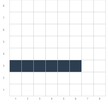
The image displays a simple, grid-based horizontal bar chart with a single dark blue bar. The chart is presented on a white background with light gray grid lines. There are no chart titles, axis labels, or legends present. The only textual information consists of numerical markers on the X and Y axes.
### Components/Axes
* **Chart Type:** Horizontal Bar Chart.
* **Grid:** A square grid with major grid lines forming cells.
* **X-Axis (Horizontal):**
* **Label:** None present.
* **Scale:** Linear, numbered from 1 to 8.
* **Markers:** The numbers 1, 2, 3, 4, 5, 6, 7, 8 are positioned below the axis line, centered under their respective grid lines.
* **Y-Axis (Vertical):**
* **Label:** None present.
* **Scale:** Linear, numbered from 1 to 8.
* **Markers:** The numbers 1, 2, 3, 4, 5, 6, 7, 8 are positioned to the left of the axis line, centered beside their respective grid lines.
* **Data Series:** A single horizontal bar.
* **Color:** Dark blue (approximate hex: #2C3E50).
* **Position:** Vertically centered on the grid line corresponding to Y=3.
* **Start Point:** Aligned with the grid line for X=1.
* **End Point:** Extends to a position between the grid lines for X=6 and X=7. Visually, it ends approximately 60% of the way from X=6 to X=7, suggesting a value of **~6.6**.
### Detailed Analysis
* **Data Point:** The chart contains one data point represented by the length of the bar.
* **Value Extraction:** The bar originates at X=1 and terminates at an approximate X-value of 6.6. Therefore, the **length or value represented is approximately 5.6 units** (6.6 - 1.0).
* **Spatial Grounding:** The bar is located in the lower half of the chart, spanning horizontally across the central columns. Its vertical position is fixed at Y=3.
* **Trend Verification:** As there is only one data series, no comparative trends (e.g., increasing, decreasing) can be observed. The visual "trend" is a static, horizontal line.
### Key Observations
1. **Minimalist Design:** The chart is extremely sparse, containing only the essential grid, axis numbers, and a single data bar. It lacks all descriptive metadata (title, axis labels, legend).
2. **Single Data Focus:** The visualization is designed to draw attention to one specific value or measurement.
3. **Precision Ambiguity:** The exact endpoint of the bar is not aligned with a grid line, requiring visual estimation. The value is approximate (~6.6).
4. **Language:** The only language present is numerical (Arabic numerals 1-8).
### Interpretation
This image functions as a bare-bones data visualization, likely a component of a larger dashboard, a placeholder, or a simplified example. Its primary purpose is to communicate a single quantitative value (approximately 5.6 units, or an endpoint value of ~6.6) through the length of a bar against a scaled axis.
The absence of context is the most significant feature. Without axis titles (e.g., "Time (seconds)", "Revenue ($M)") or a chart title, the data is abstract. The value itself is meaningless without knowing what is being measured. The choice of a horizontal bar chart is appropriate for comparing a single value against a scale, but the lack of labels prevents any real-world interpretation.
**Peircean Investigative Reading:** The chart is an *icon* in the Peircean sense—it resembles the concept of a measured quantity via its length. It is also an *index* as it points to a specific value on the X-scale. However, it fails as a *symbol* because it lacks the conventional labels (language) needed to assign specific meaning to the represented quantity. The viewer can deduce *that* a value is being shown and *what* its approximate magnitude is, but not *what* it represents. The chart's existence implies an intent to communicate data, but its incompleteness renders the communication only partially successful.