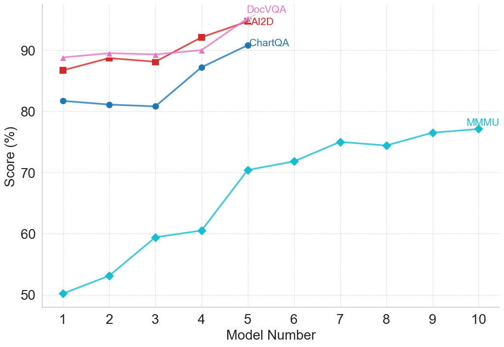
## Line Chart: Model Performance Comparison
### Overview
This line chart compares the performance scores of four different models (DocVQA, AI2D, ChartQA, and MMU) across ten model numbers. The performance is measured as a score in percentage.
### Components/Axes
* **X-axis:** "Model Number" ranging from 1 to 10.
* **Y-axis:** "Score (%)" ranging from 50 to 95.
* **Data Series:**
* DocVQA (Pink Line)
* AI2D (Red Line)
* ChartQA (Dark Blue Line)
* MMU (Teal Line)
* **Legend:** Located in the top-right corner, labeling each line with the corresponding model name and color.
### Detailed Analysis
Let's analyze each data series individually:
* **DocVQA (Pink Line):** Starts at approximately 88% (Model 1), remains relatively stable around 92-94% from Model 2 to Model 5, then decreases slightly to around 91% at Model 10.
* **AI2D (Red Line):** Begins at approximately 86% (Model 1), increases to a peak of around 93% at Model 4, then declines to approximately 91% at Model 10.
* **ChartQA (Dark Blue Line):** Starts at approximately 81% (Model 1), increases steadily to around 89% at Model 4, continues to rise to approximately 93% at Model 5, and remains relatively stable around 92-93% from Model 6 to Model 10.
* **MMU (Teal Line):** Starts at approximately 50% (Model 1), increases rapidly to around 60% at Model 3, continues to climb to approximately 72% at Model 5, then plateaus around 74-76% from Model 6 to Model 10.
Here's a more detailed breakdown of the data points:
| Model Number | DocVQA (%) | AI2D (%) | ChartQA (%) | MMU (%) |
|--------------|------------|----------|-------------|---------|
| 1 | 88 | 86 | 81 | 50 |
| 2 | 92 | 90 | 84 | 54 |
| 3 | 92 | 91 | 87 | 60 |
| 4 | 94 | 93 | 89 | 68 |
| 5 | 93 | 92 | 93 | 72 |
| 6 | 93 | 92 | 92 | 74 |
| 7 | 93 | 91 | 92 | 75 |
| 8 | 92 | 91 | 92 | 75 |
| 9 | 91 | 91 | 92 | 75 |
| 10 | 91 | 91 | 93 | 76 |
### Key Observations
* ChartQA consistently achieves the highest scores, particularly from Model 5 onwards.
* DocVQA and AI2D exhibit similar performance, with slight fluctuations.
* MMU demonstrates the most significant improvement over the model numbers, but starts with the lowest score and remains considerably lower than the other models.
* The performance of DocVQA, AI2D, and ChartQA appears to plateau after Model 5.
### Interpretation
The data suggests that ChartQA is the most effective model for the task being evaluated, consistently outperforming the other models. DocVQA and AI2D offer comparable performance, while MMU shows substantial improvement but still lags behind. The plateauing of DocVQA, AI2D, and ChartQA after Model 5 could indicate a point of diminishing returns, where further model improvements yield minimal gains in performance. The large initial gap between MMU and the other models, coupled with its consistent improvement, suggests that MMU may benefit from further development and optimization. The chart demonstrates a clear hierarchy of model performance, with ChartQA leading the way, followed by DocVQA and AI2D, and finally MMU. This information could be used to guide future research and development efforts, focusing on improving the performance of MMU and exploring strategies to overcome the plateau observed in the other models.