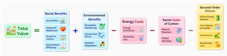
## Flowchart: Total Value Calculation
### Overview
The diagram illustrates a causal chain of factors contributing to "Total Value," balancing social and environmental benefits against energy and carbon-related costs, culminating in long-term second-order effects. It uses color-coded boxes with icons to represent components and directional arrows to show relationships.
### Components/Axes
1. **Input**: "Total Value" (green box with house/landscape icon)
2. **Positive Contributors**:
- **Social Benefits** (blue box):
- Accessibility (wheelchair icon)
- Improved Healthcare (heart icon)
- Access to Justice (scales icon)
- Government Efficiency (house icon)
- **Environmental Benefits** (blue box):
- Ecosystem Monitoring (globe icon)
- Conservation Efforts (whale icon)
- Assisted Adaptation (sunflower icon)
3. **Negative Contributors**:
- **Energy Costs** (pink box):
- Energy Grid Strain (power plant icon)
- Electricity Use (lightbulb icon)
- **Social Costs of Carbon** (pink box):
- Natural Disasters (tornado icon)
- Global Warming (thermometer/globe icon)
4. **Output**: **Second-Order Effects** (yellow box):
- Future Energy Demand (battery icon)
- Toxic Wastes & Landfills (factory icon)
- Desertification (cactus icon)
- Biodiversity Loss (fox icon)
### Flow Structure
- **Addition**: Social Benefits + Environmental Benefits → Total Value
- **Subtraction**: Total Value - Energy Costs - Social Costs of Carbon → Second-Order Effects
### Key Observations
- **Color Coding**: Blue (benefits), Pink (costs), Yellow (long-term consequences)
- **Iconography**: Each sub-component uses a distinct icon for visual clarity
- **Directionality**: Arrows show a linear progression from inputs to final outcomes
- **Balance**: Equal emphasis on social/environmental benefits vs. energy/carbon costs
### Interpretation
The diagram frames sustainability as a trade-off between immediate human/environmental gains and long-term systemic costs. It suggests that while social programs and environmental conservation directly enhance "Total Value," their implementation incurs energy infrastructure strain and carbon-related societal harms. These costs manifest as future challenges (e.g., energy demand, ecological degradation), implying that current "value" calculations may underestimate long-term liabilities. The use of opposing colors (blue/pink) visually reinforces the tension between short-term gains and long-term costs, while the yellow output box highlights irreversible consequences requiring proactive mitigation.