# Technical Document: Anomaly Detection Analysis
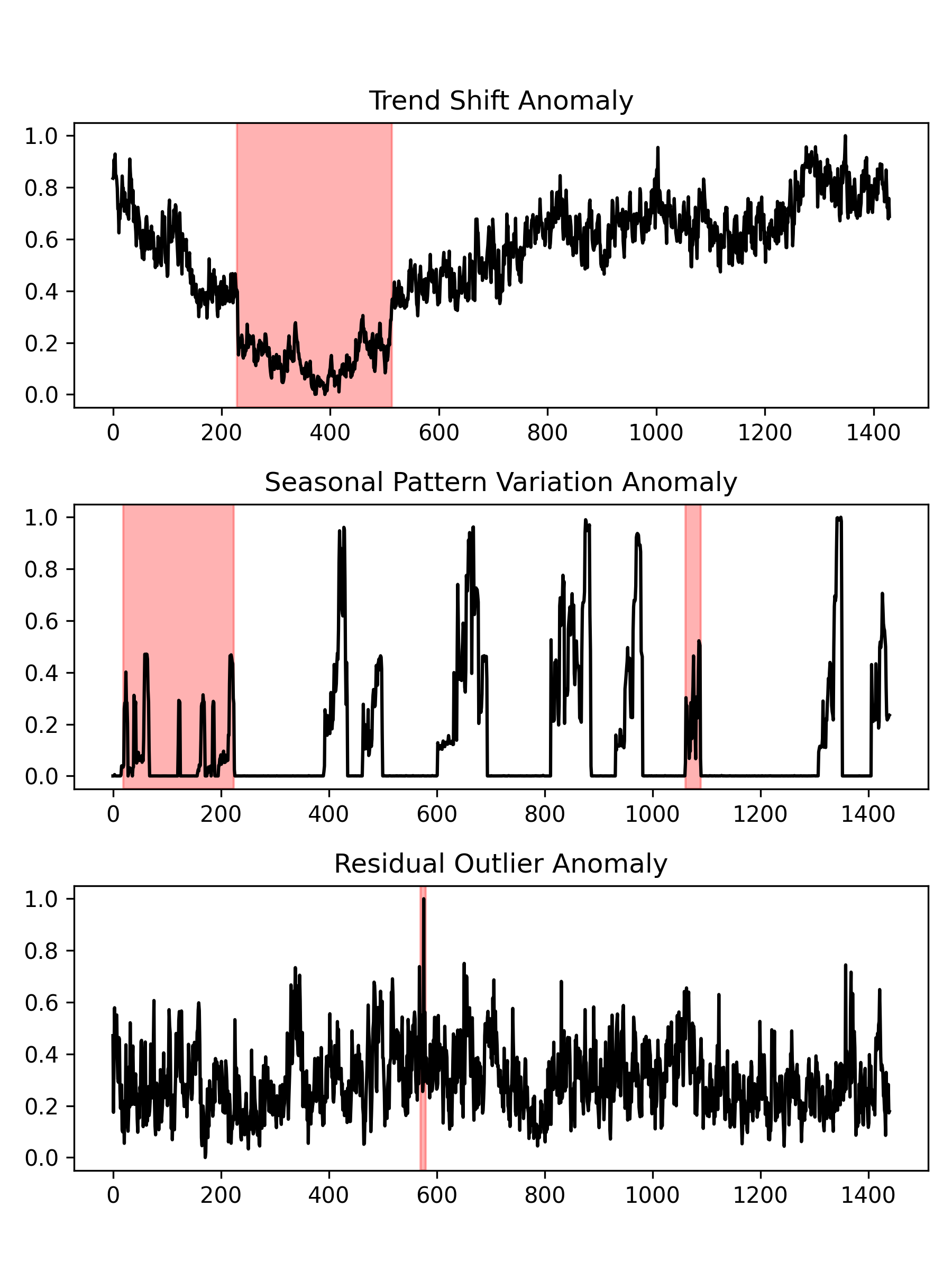
## Graph 1: Trend Shift Anomaly
- **Title**: Trend Shift Anomaly
- **X-Axis**: Time (Sample Points) [0, 200, 400, 600, 800, 1000, 1200, 1400]
- **Y-Axis**: Value [0.0, 0.2, 0.4, 0.6, 0.8, 1.0]
- **Key Observations**:
- Data exhibits a gradual decline followed by a sharp drop.
- **Anomaly Region**: Red-shaded area between **200–500** sample points.
- Post-anomaly, values stabilize with minor fluctuations.
## Graph 2: Seasonal Pattern Variation Anomaly
- **Title**: Seasonal Pattern Variation Anomaly
- **X-Axis**: Time (Sample Points) [0, 200, 400, 600, 800, 1000, 1200, 1400]
- **Y-Axis**: Value [0.0, 0.2, 0.4, 0.6, 0.8, 1.0]
- **Key Observations**:
- High-frequency oscillations with periodic spikes.
- **Anomaly Regions**:
1. Red-shaded area between **0–200** sample points (initial deviation).
2. Red-shaded area between **1000–1200** sample points (late-cycle deviation).
## Graph 3: Residual Outlier Anomaly
- **Title**: Residual Outlier Anomaly
- **X-Axis**: Time (Sample Points) [0, 200, 400, 600, 800, 1000, 1200, 1400]
- **Y-Axis**: Value [0.0, 0.2, 0.4, 0.6, 0.8, 1.0]
- **Key Observations**:
- Consistent noise with sporadic outliers.
- **Anomaly Region**: Red-shaded vertical line at **500–600** sample points (isolated spike).
### Cross-Graph Analysis
- All graphs share identical axes (Time vs. Value) but represent distinct anomaly types.
- Red shading consistently marks anomalous regions across all visualizations.
- No legends or additional categorical labels are present in the image.