\n
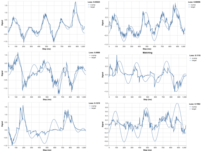
## Chart: Signal vs. Step with Loss Metrics
### Overview
The image presents a 2x3 grid of line charts, each depicting a "Signal" plotted against "Step (ms)". Each chart also displays two lines representing "e-prop" and "target", along with a "Loss" value in the top-right corner. The charts appear to be comparing a predicted signal ("e-prop") to a desired signal ("target") over time steps, and the loss value indicates the discrepancy between the two. The charts are arranged in a grid format, with each chart representing a different experiment or condition.
### Components/Axes
* **X-axis:** "Step (ms)", ranging from 0 to 1000.
* **Y-axis:** "Signal", ranging from approximately -1.0 to 1.5.
* **Lines:**
* "e-prop" (solid blue line) - Represents the estimated or predicted signal.
* "target" (dashed black line) - Represents the desired or actual signal.
* **Legend:** Located in the top-left corner of each chart, identifying the lines.
* **Loss Value:** Displayed in the top-right corner of each chart, a numerical value representing the error between "e-prop" and "target".
* **Grid:** Each chart has a light gray grid for easier readability.
### Detailed Analysis or Content Details
Here's a breakdown of each chart, including approximate data points and trends:
**Chart 1 (Top-Left):**
* Loss: 0.03623
* "e-prop" starts around 0.1 at Step 0, rises to a peak of approximately 1.3 at Step 600, and then declines to around 0.2 at Step 1000. The line is quite noisy.
* "target" starts around 0.1 at Step 0, rises to a peak of approximately 1.4 at Step 500, and then declines to around 0.0 at Step 1000. The line is smoother than "e-prop".
**Chart 2 (Top-Right):**
* Loss: 0.0096
* "e-prop" starts around 0.2 at Step 0, oscillates between approximately -0.5 and 0.5, with a peak around 0.8 at Step 900, and ends around 0.3 at Step 1000.
* "target" starts around 0.1 at Step 0, oscillates between approximately -0.5 and 0.5, with a peak around 0.9 at Step 900, and ends around 0.2 at Step 1000.
**Chart 3 (Middle-Left):**
* Loss: 0.0988
* "e-prop" starts around 0.2 at Step 0, rises to a peak of approximately 0.8 at Step 300, then dips to around -0.6 at Step 600, and ends around 0.1 at Step 1000.
* "target" starts around 0.1 at Step 0, rises to a peak of approximately 0.9 at Step 300, then dips to around -0.7 at Step 600, and ends around 0.0 at Step 1000.
**Chart 4 (Middle-Right):**
* Loss: 0.1118
* "e-prop" starts around 0.0 at Step 0, rises to a peak of approximately 0.6 at Step 300, then dips to around -0.4 at Step 600, and ends around 0.1 at Step 1000.
* "target" starts around 0.0 at Step 0, rises to a peak of approximately 0.7 at Step 300, then dips to around -0.5 at Step 600, and ends around 0.0 at Step 1000.
**Chart 5 (Bottom-Left):**
* Loss: 0.1219
* "e-prop" starts around 0.1 at Step 0, rises to a peak of approximately 1.4 at Step 400, then dips to around -0.8 at Step 700, and ends around 0.2 at Step 1000.
* "target" starts around 0.1 at Step 0, rises to a peak of approximately 1.5 at Step 400, then dips to around -0.9 at Step 700, and ends around 0.1 at Step 1000.
**Chart 6 (Bottom-Right):**
* Loss: 0.1592
* "e-prop" starts around 0.1 at Step 0, oscillates between approximately -0.6 and 0.4, with a peak around 0.5 at Step 500, and ends around 0.0 at Step 1000.
* "target" starts around 0.1 at Step 0, oscillates between approximately -0.8 and 0.5, with a peak around 0.6 at Step 500, and ends around 0.0 at Step 1000.
### Key Observations
* The "Loss" values vary significantly across the charts, ranging from 0.0096 to 0.1592.
* Charts with lower loss values (e.g., Chart 2) show a closer alignment between the "e-prop" and "target" lines.
* The "e-prop" lines generally exhibit more noise and fluctuations compared to the "target" lines.
* The shapes of the "e-prop" and "target" curves are generally similar, but there are phase shifts and amplitude differences.
### Interpretation
The charts demonstrate the performance of a prediction model ("e-prop") against a known target signal. The loss value quantifies the error between the prediction and the target. Lower loss values indicate better performance. The variations in loss across the charts suggest that the model's performance is sensitive to the specific conditions or data used in each experiment. The noise in the "e-prop" lines could be due to factors such as data uncertainty, model complexity, or limitations in the prediction algorithm. The charts suggest that while the model can generally capture the overall trend of the target signal, it struggles to accurately predict the fine-grained details and timing. The differences in the shapes of the curves (phase shifts, amplitude differences) indicate systematic errors in the prediction. Further analysis would be needed to identify the root causes of these errors and improve the model's performance. The charts are likely part of a larger experiment aimed at optimizing the prediction model or understanding the underlying signal generation process.