## Line Chart: Test Accuracy on MATH with Scaled Inference Compute
### Overview
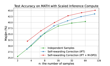
The image is a line chart titled "Test Accuracy on MATH with Scaled Inference Compute." It plots the performance of three different methods for solving MATH problems as a function of the number of samples used for inference. The chart demonstrates that increasing the number of samples (`n`) improves accuracy for all methods, with one method consistently outperforming the others.
### Components/Axes
* **Chart Title:** "Test Accuracy on MATH with Scaled Inference Compute" (centered at the top).
* **Y-Axis:**
* **Label:** "Maj@n (%)" (vertical text on the left). This likely stands for "Majority Vote at n samples" accuracy percentage.
* **Scale:** Linear scale from 25.0 to 45.0, with major tick marks every 2.5 units (25.0, 27.5, 30.0, 32.5, 35.0, 37.5, 40.0, 42.5, 45.0).
* **X-Axis:**
* **Label:** "n: the number of samples" (centered at the bottom).
* **Scale:** Logarithmic (base-2) scale with discrete points at n = 2, 4, 8, 16, 32, 64, 128.
* **Legend:** Located in the bottom-right quadrant of the chart area. It contains three entries, each with a colored line and marker symbol:
1. **Green line with circle markers:** "Independent Samples"
2. **Blue line with circle markers:** "Self-rewarding Correction (IFT)"
3. **Red line with circle markers:** "Self-rewarding Correction (IFT + M-DPO)"
* **Grid:** A light gray grid is present, aligning with the major ticks on both axes.
### Detailed Analysis
The chart displays three data series, each showing an upward trend that flattens as `n` increases (diminishing returns). The values below are approximate, read from the chart's grid.
**1. Independent Samples (Green Line)**
* **Trend:** Starts lowest, increases steadily, and shows the most pronounced flattening at higher `n`.
* **Data Points (Approximate):**
* n=2: ~25.5%
* n=4: ~30.0%
* n=8: ~34.5%
* n=16: ~38.0%
* n=32: ~39.5%
* n=64: ~40.5%
* n=128: ~41.0%
**2. Self-rewarding Correction (IFT) (Blue Line)**
* **Trend:** Starts higher than the green line, maintains a consistent lead over it, and follows a similar growth curve.
* **Data Points (Approximate):**
* n=2: ~27.5%
* n=4: ~31.0%
* n=8: ~35.5%
* n=16: ~39.0%
* n=32: ~41.0%
* n=64: ~42.5%
* n=128: ~43.5%
**3. Self-rewarding Correction (IFT + M-DPO) (Red Line)**
* **Trend:** Starts the highest and maintains the largest lead throughout. Its growth is steep initially and remains strong even at higher `n`.
* **Data Points (Approximate):**
* n=2: ~32.0%
* n=4: ~35.0%
* n=8: ~37.5%
* n=16: ~40.0%
* n=32: ~42.5%
* n=64: ~44.0%
* n=128: ~45.0%
### Key Observations
1. **Performance Hierarchy:** There is a clear and consistent performance hierarchy across all sample sizes: `IFT + M-DPO` > `IFT` > `Independent Samples`.
2. **Sample Efficiency:** The `IFT + M-DPO` method is the most sample-efficient. For example, it achieves ~40% accuracy at n=16, a level the `Independent Samples` method only approaches at n=64.
3. **Diminishing Returns:** All curves show diminishing returns. The gain from doubling `n` decreases as `n` becomes larger. This flattening is most severe for the `Independent Samples` method.
4. **Convergence Gap:** The performance gap between the methods appears relatively stable or slightly widening on the linear percentage scale as `n` increases, suggesting the advanced methods maintain their advantage.
### Interpretation
This chart provides strong evidence for the effectiveness of the "Self-rewarding Correction" technique, particularly when combined with "M-DPO" (likely a form of Direct Preference Optimization), for improving the reasoning capabilities of a model on the MATH benchmark.
* **What the data suggests:** The results demonstrate that simply generating more independent samples (`Independent Samples`) improves accuracy, but applying a correction mechanism (`IFT`) yields better results for the same computational budget (same `n`). Adding an additional optimization step (`M-DPO`) provides a further significant boost.
* **How elements relate:** The x-axis represents a computational budget (more samples = more cost/time). The y-axis represents performance. The chart shows that for any given budget, the advanced methods deliver higher performance. Conversely, to achieve a target accuracy, the advanced methods require a smaller budget.
* **Notable implications:** The steep initial rise of the red curve is particularly important. It indicates that the `IFT + M-DPO` method is exceptionally effective at low sample counts, which is crucial for practical applications where inference cost is a major constraint. The consistent ordering of the lines validates the incremental value of each component (`IFT` and `M-DPO`) in the proposed method. The chart argues that investing in better sample *quality* (through correction and preference optimization) is more effective than merely increasing sample *quantity* with a base model.