\n
## Heatmap: Context Length vs. 64
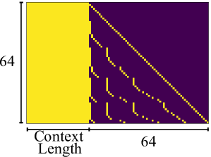
### Overview
The image presents a heatmap visualizing a relationship between "Context Length" on the x-axis and a value represented on the y-axis, ranging from approximately 0 to 64. The heatmap is colored with a gradient from yellow to purple, with yellow indicating higher values and purple indicating lower values. The heatmap is divided into two distinct regions: a solid yellow block on the left and a patterned region on the right.
### Components/Axes
* **X-axis:** Labeled "Context Length". The scale ranges from approximately 0 to 64.
* **Y-axis:** An unlabeled vertical axis, with a scale ranging from approximately 0 to 64.
* **Color Scale:** Yellow represents higher values, transitioning to purple for lower values.
* **Regions:** A solid yellow block on the left side and a patterned region with diagonal lines on the right side.
### Detailed Analysis
The left side of the heatmap, representing lower "Context Length" values, is entirely yellow, indicating consistently high values (approximately 64) across the entire y-axis range. The right side of the heatmap displays a series of diagonal, dashed yellow lines against a purple background. These lines represent decreasing values as "Context Length" increases.
* **Line 1 (Topmost):** Starts at approximately (Context Length = 0, Y = 64) and slopes downward, reaching approximately (Context Length = 64, Y = 0).
* **Line 2:** Starts at approximately (Context Length = 0, Y = 56) and slopes downward, reaching approximately (Context Length = 64, Y = 8).
* **Line 3:** Starts at approximately (Context Length = 0, Y = 48) and slopes downward, reaching approximately (Context Length = 64, Y = 16).
* **Line 4:** Starts at approximately (Context Length = 0, Y = 40) and slopes downward, reaching approximately (Context Length = 64, Y = 24).
* **Line 5:** Starts at approximately (Context Length = 0, Y = 32) and slopes downward, reaching approximately (Context Length = 64, Y = 32).
* **Line 6:** Starts at approximately (Context Length = 0, Y = 24) and slopes downward, reaching approximately (Context Length = 64, Y = 40).
* **Line 7:** Starts at approximately (Context Length = 0, Y = 16) and slopes downward, reaching approximately (Context Length = 64, Y = 48).
* **Line 8:** Starts at approximately (Context Length = 0, Y = 8) and slopes downward, reaching approximately (Context Length = 64, Y = 56).
* **Line 9 (Bottommost):** Starts at approximately (Context Length = 0, Y = 0) and slopes downward, reaching approximately (Context Length = 64, Y = 64).
The lines are spaced approximately 8 units apart on the Y-axis. The lines are dashed, with segments of approximately 4 units in length, alternating with gaps of approximately 4 units.
### Key Observations
The heatmap demonstrates a clear transition in value based on "Context Length". For low "Context Length" values, the value is consistently high. As "Context Length" increases, the value decreases linearly, as indicated by the diagonal lines. The spacing between the lines suggests a consistent decrement in the initial value for each line.
### Interpretation
This heatmap likely represents the performance or relevance of a model or system as a function of "Context Length". The high yellow values at low "Context Length" suggest strong performance or high relevance when limited context is available. The decreasing values as "Context Length" increases indicate that performance or relevance degrades with increasing context. This could be due to several factors, such as the model being overwhelmed by too much information, or the context becoming noisy or irrelevant. The linear decrease suggests a predictable relationship between context length and performance. The dashed lines might represent discrete steps or intervals in the context length or performance metric. This visualization could be used to determine an optimal "Context Length" for maximizing performance or relevance.