## Chart Type: Decision Boundary Plots
### Overview
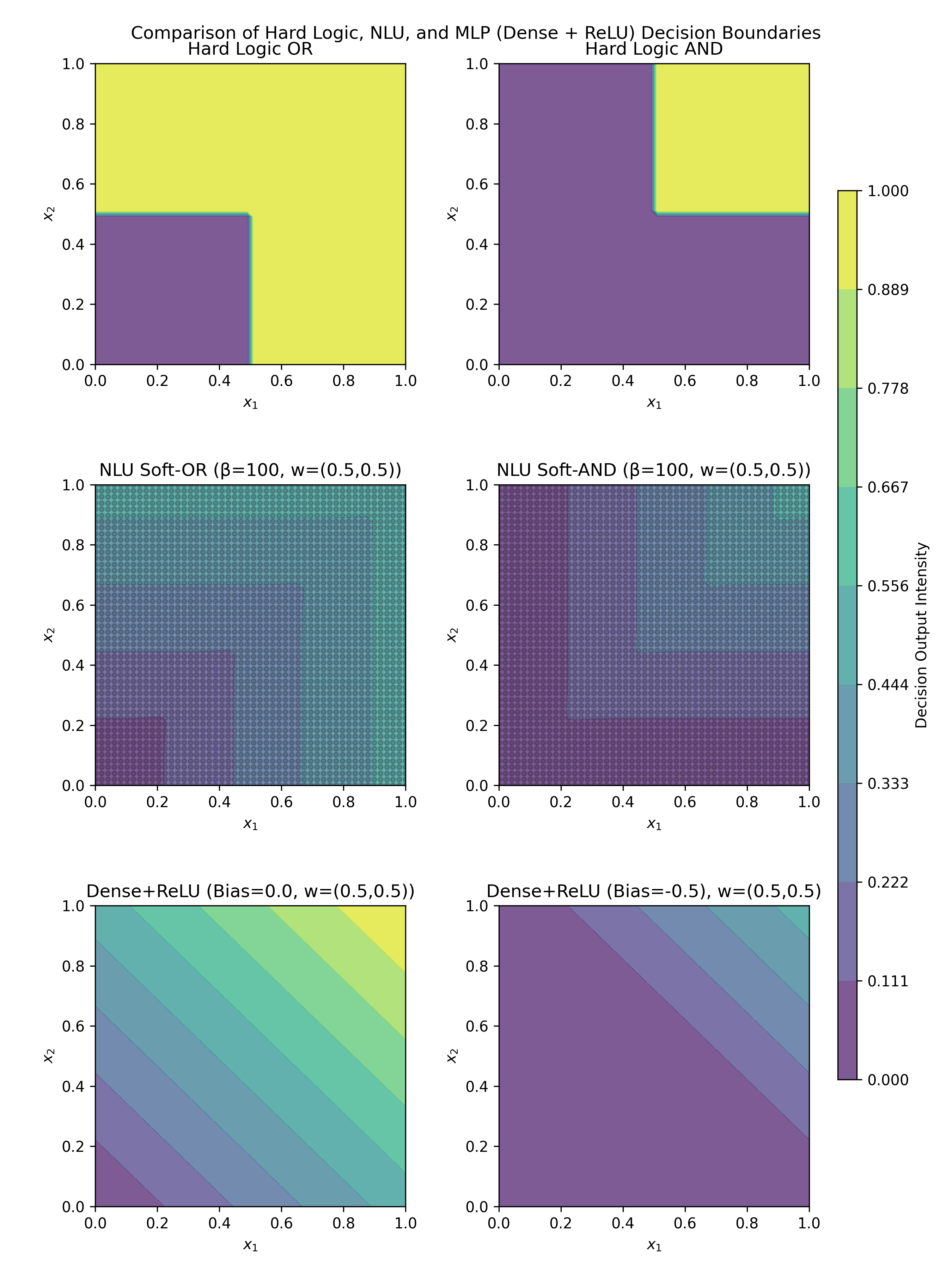
The image presents a comparison of decision boundaries generated by different logic and neural network models. It includes plots for Hard Logic (OR and AND), NLU Soft Logic (OR and AND), and Dense+ReLU networks with different bias values. The plots visualize the decision output intensity as a function of two input variables, x1 and x2, ranging from 0 to 1. A colorbar on the right indicates the decision output intensity, ranging from 0.000 to 1.000.
### Components/Axes
* **Title:** Comparison of Hard Logic, NLU, and MLP (Dense + ReLU) Decision Boundaries
* **X-axis:** x1, ranging from 0.0 to 1.0
* **Y-axis:** x2, ranging from 0.0 to 1.0
* **Colorbar:** Decision Output Intensity, ranging from 0.000 to 1.000, with markers at 0.000, 0.111, 0.222, 0.333, 0.444, 0.556, 0.667, 0.778, 0.889, and 1.000.
* **Plots (from top-left to bottom-right):**
1. Hard Logic OR
2. Hard Logic AND
3. NLU Soft-OR (β=100, w=(0.5,0.5))
4. NLU Soft-AND (β=100, w=(0.5,0.5))
5. Dense+ReLU (Bias=0.0, w=(0.5,0.5))
6. Dense+ReLU (Bias=-0.5, w=(0.5,0.5))
### Detailed Analysis
**1. Hard Logic OR (Top-Left)**
* The region where either x1 or x2 is greater than approximately 0.5 is colored yellow (intensity ~1.000).
* The region where both x1 and x2 are less than approximately 0.5 is colored purple (intensity ~0.000).
**2. Hard Logic AND (Top-Right)**
* The region where both x1 and x2 are greater than approximately 0.5 is colored yellow (intensity ~1.000).
* The region where either x1 or x2 is less than approximately 0.5 is colored purple (intensity ~0.000).
**3. NLU Soft-OR (β=100, w=(0.5,0.5)) (Middle-Left)**
* The plot shows a gradient of colors, with the highest intensity (yellow, ~1.000) in the top-right corner and the lowest intensity (purple, ~0.000) in the bottom-left corner.
* The decision boundary is smoother compared to the Hard Logic OR.
**4. NLU Soft-AND (β=100, w=(0.5,0.5)) (Middle-Right)**
* The plot shows a gradient of colors, with the highest intensity (yellow, ~1.000) in the top-right corner and the lowest intensity (purple, ~0.000) in the bottom-left corner.
* The decision boundary is smoother compared to the Hard Logic AND.
**5. Dense+ReLU (Bias=0.0, w=(0.5,0.5)) (Bottom-Left)**
* The plot shows a linear gradient of colors from bottom-left (purple, ~0.000) to top-right (yellow, ~1.000).
* The decision boundary is a straight line.
**6. Dense+ReLU (Bias=-0.5, w=(0.5,0.5)) (Bottom-Right)**
* The plot shows a region of low intensity (purple, ~0.000) in the bottom-left corner and a gradient towards higher intensity (yellow, ~1.000) in the top-right corner.
* The decision boundary is a straight line, but shifted compared to the previous plot.
### Key Observations
* Hard Logic plots have sharp, distinct decision boundaries.
* NLU Soft Logic plots have smoother decision boundaries due to the "soft" nature of the logic.
* Dense+ReLU plots show linear decision boundaries, with the bias affecting the position of the boundary.
* The colorbar provides a consistent scale for comparing the decision output intensity across all plots.
### Interpretation
The image demonstrates how different logic and neural network models create decision boundaries for binary classification problems. The Hard Logic models represent traditional boolean logic, while the NLU Soft Logic models introduce a degree of fuzziness. The Dense+ReLU networks, with their linear decision boundaries, show how neural networks can approximate logical functions. The bias parameter in the Dense+ReLU networks shifts the decision boundary, affecting the classification outcome. The plots highlight the trade-offs between the sharpness of decision boundaries and the smoothness of the decision function. The NLU Soft-OR and Soft-AND plots show a more gradual transition between the two classes, which can be useful in situations where the input data is noisy or uncertain. The Dense+ReLU plots show that a simple neural network can learn a linear decision boundary, but may not be able to perfectly replicate the behavior of Hard Logic or NLU Soft Logic.