## Line Chart: Probability Distribution vs. q
### Overview
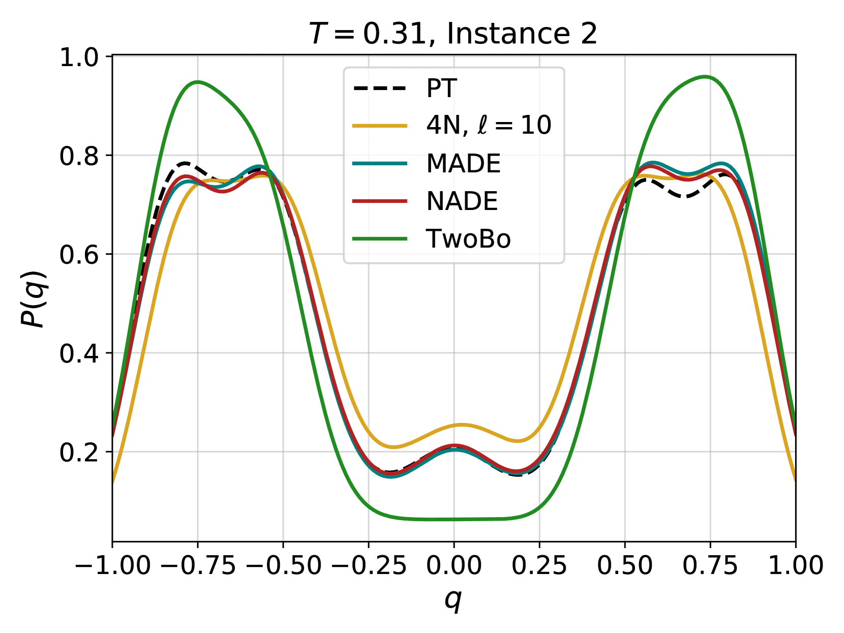
The image is a line chart displaying the probability distribution P(q) as a function of q for different models: PT, 4N (with l=10), MADE, NADE, and TwoBo. The chart is for a specific instance (Instance 2) at a temperature T=0.31. The x-axis represents 'q', ranging from -1.00 to 1.00, and the y-axis represents P(q), ranging from 0 to 1.0.
### Components/Axes
* **Title:** T = 0.31, Instance 2
* **X-axis:**
* Label: q
* Scale: -1.00, -0.75, -0.50, -0.25, 0.00, 0.25, 0.50, 0.75, 1.00
* **Y-axis:**
* Label: P(q)
* Scale: 0.2, 0.4, 0.6, 0.8, 1.0
* **Legend:** Located in the top-right area of the chart.
* PT (Black, dashed line)
* 4N, l = 10 (Gold line)
* MADE (Teal line)
* NADE (Red line)
* TwoBo (Green line)
### Detailed Analysis
* **PT (Black, dashed line):** Starts at approximately 0.25 at q=-1.00, increases to approximately 0.75 at q=-0.75, decreases to approximately 0.15 at q=0.00, then increases again to approximately 0.75 at q=0.75, and ends at approximately 0.25 at q=1.00.
* **4N, l = 10 (Gold line):** Starts at approximately 0.15 at q=-1.00, increases to approximately 0.75 at q=-0.75, decreases to approximately 0.20 at q=0.00, then increases again to approximately 0.75 at q=0.75, and ends at approximately 0.15 at q=1.00.
* **MADE (Teal line):** Starts at approximately 0.25 at q=-1.00, increases to approximately 0.75 at q=-0.75, decreases to approximately 0.15 at q=0.00, then increases again to approximately 0.75 at q=0.75, and ends at approximately 0.25 at q=1.00.
* **NADE (Red line):** Starts at approximately 0.25 at q=-1.00, increases to approximately 0.75 at q=-0.75, decreases to approximately 0.20 at q=0.00, then increases again to approximately 0.75 at q=0.75, and ends at approximately 0.25 at q=1.00.
* **TwoBo (Green line):** Starts at approximately 0.30 at q=-1.00, increases to approximately 0.95 at q=-0.75, decreases to approximately 0.05 at q=0.00, then increases again to approximately 0.95 at q=0.75, and ends at approximately 0.30 at q=1.00.
### Key Observations
* All models exhibit a similar U-shaped distribution, with peaks around q = -0.75 and q = 0.75, and a minimum around q = 0.00.
* The TwoBo model has the most pronounced peaks and the lowest minimum value.
* The PT, MADE, and NADE models are very similar to each other.
* The 4N model is similar to the other models, but has a slightly higher minimum value.
### Interpretation
The chart compares the probability distributions of different models (PT, 4N, MADE, NADE, and TwoBo) for a given instance and temperature. The U-shaped distribution suggests that the system is more likely to be in states corresponding to q values around -0.75 and 0.75, and less likely to be in a state corresponding to q = 0. The differences in the peak heights and minimum values between the models indicate variations in their ability to capture the underlying physics of the system. The TwoBo model appears to have the most pronounced preference for the states around q = -0.75 and q = 0.75, while the other models show a less extreme preference. The similarity between PT, MADE, and NADE suggests that these models may be capturing similar aspects of the system's behavior.