TECHNICAL ASSET FINGERPRINT
8236e0316b60f25266095ab7
Click to view fullscreen
Press ESC or click to close
FOUND IN PAPERS
EXPERT: healer-alpha-free VERSION 1
RUNTIME: free/openrouter/healer-alpha
INTEL_VERIFIED
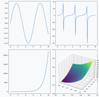
## Mathematical Function Plots: A Four-Panel Visualization
### Overview
The image is a composite of four distinct mathematical function plots arranged in a 2x2 grid. Each panel displays a different type of function or data visualization without any accompanying titles, axis labels, legends, or explanatory text. The plots are purely graphical representations of numerical data against coordinate axes.
### Components/Axes
The image is segmented into four quadrants:
1. **Top-Left Panel:** A 2D line plot.
2. **Top-Right Panel:** A 2D line plot.
3. **Bottom-Left Panel:** A 2D line plot.
4. **Bottom-Right Panel:** A 3D surface plot.
**Common Features Across 2D Plots (Top-Left, Top-Right, Bottom-Left):**
* **X-Axis:** Each has a horizontal axis with numerical tick markers. The visible range is from 0 to 10, with major ticks at 0, 2, 4, 6, 8, and 10.
* **Y-Axis:** Each has a vertical axis with numerical tick markers. The scale and range differ for each plot.
* **Grid:** Faint grid lines are visible, aligning with the major tick marks.
* **Line Color:** All data series are plotted in a solid, medium-blue line.
**Bottom-Right Panel (3D Surface Plot):**
* **Axes:** Three axes are present (X, Y, Z).
* **X and Y Axes:** Both range from 0.0 to 1.0, with ticks at 0.0, 0.2, 0.4, 0.6, 0.8, and 1.0.
* **Z-Axis:** Vertical axis with ticks from 0.0 to 1.0, with increments of 0.2.
* **Surface:** A colored surface is plotted within this 3D space. The color gradient (from dark purple/blue to yellow) corresponds to the Z-axis value, acting as an implicit legend for height.
### Detailed Analysis
**1. Top-Left Panel: Sinusoidal Wave**
* **Trend:** The line follows a smooth, periodic, wave-like pattern.
* **Y-Axis Range:** Approximately -1.00 to 1.00. Ticks are at -1.00, -0.75, -0.50, -0.25, 0.00, 0.25, 0.50, 0.75, 1.00.
* **Key Data Points (Approximate):**
* Starts near (0, 0).
* First peak at approximately (1.5, 1.0).
* Crosses zero going downward at approximately (3.1, 0).
* Trough at approximately (4.7, -1.0).
* Crosses zero going upward at approximately (6.3, 0).
* Second peak at approximately (7.9, 1.0).
* Ends near (10, 0).
* **Interpretation:** This is a classic sine or cosine wave with an amplitude of 1 and a period of approximately 6.3 units (2π).
**2. Top-Right Panel: Periodic Sharp Peaks**
* **Trend:** The line is mostly flat near zero but features three sharp, narrow, positive-going peaks followed by immediate negative-going spikes.
* **Y-Axis Range:** Approximately -40 to 20. Ticks are at -40, -30, -20, -10, 0, 10, 20.
* **Key Data Points (Approximate):**
* **Peak 1:** Sharp rise to ~18 at x ≈ 1.5, immediate drop to ~-38 at x ≈ 1.6.
* **Peak 2:** Sharp rise to ~18 at x ≈ 4.7, immediate drop to ~-38 at x ≈ 4.8.
* **Peak 3:** Sharp rise to ~18 at x ≈ 7.9, immediate drop to ~-38 at x ≈ 8.0.
* Between peaks, the line hovers near y=0.
* **Interpretation:** This plot resembles the derivative of a function with sharp corners or the output of a system with impulse responses. The pattern is periodic with a period of ~3.2 units.
**3. Bottom-Left Panel: Exponential Growth**
* **Trend:** The line shows slow, near-zero growth for low x-values, followed by a rapid, accelerating increase.
* **Y-Axis Range:** 0 to over 20000. Ticks are at 0, 5000, 10000, 15000, 20000.
* **Key Data Points (Approximate):**
* For x from 0 to ~6, y remains very close to 0.
* At x=8, y is approximately 1000.
* At x=9, y is approximately 5000.
* At x=10, y is approximately 22000.
* **Interpretation:** This is characteristic of exponential or high-order polynomial growth (e.g., y = e^x or y = x^n for large n). The function's value explodes after x=8.
**4. Bottom-Right Panel: 3D Surface Plot**
* **Trend:** The surface forms a smooth, curved "valley" or "saddle" shape.
* **Spatial Grounding:** The lowest point (dark purple) is near the corner where X≈0 and Y≈0. The surface rises as X and Y increase, reaching its highest points (yellow) along the edges where X=1 or Y=1.
* **Key Features:**
* The surface is symmetric along the line X=Y.
* The gradient from purple (low Z) to yellow (high Z) visually encodes the Z-value, which ranges from 0.0 to 1.0.
* The shape suggests a function like Z = X * Y or a similar product/interaction term between the two input variables.
### Key Observations
1. **Absence of Metadata:** The most significant observation is the complete lack of textual labels. No chart titles, axis titles (e.g., "Time (s)", "Voltage (V)"), legends, or data source information are present. This makes definitive interpretation impossible.
2. **Visual Contrast:** The plots showcase fundamentally different mathematical behaviors: periodic oscillation (top-left), impulsive/spiky behavior (top-right), explosive growth (bottom-left), and a smooth 3D manifold (bottom-right).
3. **Consistent Styling:** The 2D plots share an identical visual style (blue line, gray grid), suggesting they may be generated from the same software or for the same technical report.
4. **Color as Data in 3D:** The 3D plot uses color effectively as a fourth dimension to represent the Z-axis value, compensating for the lack of a separate legend.
### Interpretation
This image appears to be a technical figure, likely from a scientific paper, engineering report, or mathematical textbook, intended to visually compare the behavior of four different functions or systems. The choice to omit labels suggests it was meant to be accompanied by a detailed caption or referenced in surrounding text that defines the variables and units.
* **What the data suggests:** The collection demonstrates a taxonomy of function types: bounded periodic, discontinuous/impulsive, unbounded growth, and multivariate interaction.
* **Relationships:** The panels are related only by their presentation format. They do not depict a single system but rather a portfolio of mathematical archetypes. The top-right plot could be the derivative of a function related to the top-left, but without labels, this is speculative.
* **Anomalies:** The primary anomaly is the lack of context. For a technical document, this renders the figure only partially informative, serving as a visual reference for someone already familiar with the underlying subject matter. The extreme difference in Y-axis scales between the top-left (range of 2) and bottom-left (range of >20000) is a critical detail that would be lost without careful inspection of the axis ticks.
DECODING INTELLIGENCE...