## Heatmap
### Overview
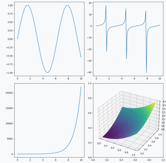
The image displays a heatmap with a 3D surface plot. The heatmap represents a matrix of values, where each cell corresponds to a pair of coordinates (x, y). The color intensity of each cell indicates the magnitude of the value at that point.
### Components/Axes
- **X-axis**: Represents the horizontal coordinate (x).
- **Y-axis**: Represents the vertical coordinate (y).
- **Color bar**: Indicates the magnitude of the values, with darker colors representing higher values and lighter colors representing lower values.
### Detailed Analysis or ### Content Details
The heatmap shows a clear trend of increasing values from the bottom-left to the top-right of the matrix. The color intensity varies from dark blue to light purple, suggesting a gradient of values. The 3D surface plot provides a three-dimensional perspective of the data, with the surface appearing to rise from the bottom-left to the top-right.
### Key Observations
- The heatmap and 3D surface plot are closely related, with the heatmap providing a two-dimensional representation of the data and the 3D surface plot offering a three-dimensional perspective.
- The color intensity of the cells in the heatmap correlates with the height of the surface plot, indicating that the values are higher in the 3D space.
- There are no visible outliers or anomalies in the data, as the color intensity varies smoothly across the matrix.
### Interpretation
The heatmap and 3D surface plot together provide a comprehensive view of the data. The heatmap allows for a quick visual assessment of the overall trend and distribution of the values, while the 3D surface plot offers a more detailed understanding of the spatial relationships between the values. The color intensity in the heatmap suggests that the values are higher in the 3D space, indicating a possible correlation between the x and y coordinates and the values. The smooth variation in color intensity suggests that the data is well-behaved and does not contain any significant outliers or anomalies.