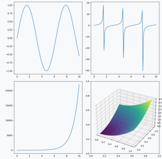
## Multi-Subplot Visualization: Mathematical and Data Trends
### Overview
The image contains four distinct subplots arranged in a 2x2 grid, each representing different mathematical or data trends. The visualizations include oscillatory behavior, spike patterns, logarithmic growth, and a 3D surface plot. All subplots use a consistent color scheme (blue for lines, gradient for 3D surface) and share axis labels ("x-axis", "y-axis") with minor variations.
---
### Components/Axes
1. **Top-Left Plot (Sine Wave)**
- **X-axis**: Labeled "x-axis", range 0–10, linear scale.
- **Y-axis**: Labeled "y-axis", range -1.0 to 1.0, linear scale.
- **Legend**: "Sine Wave" (blue line), positioned in the top-right corner of the subplot.
- **Grid**: Light gray grid lines.
2. **Top-Right Plot (Spike Patterns)**
- **X-axis**: Labeled "x-axis", range 0–10, linear scale.
- **Y-axis**: Labeled "y-axis", range -30 to 30, linear scale.
- **Legend**: Three categories ("Spike 1", "Spike 2", "Spike 3") with distinct blue line styles, positioned in the top-right corner.
- **Grid**: Light gray grid lines.
3. **Bottom-Left Plot (Logarithmic Growth)**
- **X-axis**: Labeled "x-axis", range 0–10, linear scale.
- **Y-axis**: Labeled "y-axis", range 0 to 20,000, logarithmic scale.
- **Legend**: "Logarithmic Growth" (blue line), positioned in the top-right corner.
- **Grid**: Light gray grid lines.
4. **Bottom-Right Plot (3D Surface Plot)**
- **X-axis**: Labeled "x", range 0–1, linear scale.
- **Y-axis**: Labeled "y", range 0–1, linear scale.
- **Z-axis**: Labeled "z", range 0–1, linear scale.
- **Color Gradient**: Purple (low values) to yellow (high values), no explicit legend.
- **Grid**: 3D grid lines with axis ticks.
---
### Detailed Analysis
#### Top-Left Plot (Sine Wave)
- **Trend**: Oscillatory pattern with three peaks and two troughs.
- **Key Data Points**:
- Peaks at approximately (x=1, y=1.0), (x=5, y=1.0), (x=9, y=1.0).
- Troughs at approximately (x=3, y=-1.0), (x=7, y=-1.0).
- Final point at (x=10, y=-0.5).
#### Top-Right Plot (Spike Patterns)
- **Trend**: Three sharp vertical spikes at x=2, 4, and 6.
- **Key Data Points**:
- **Spike 1**: Rises to y=30 at x=2, drops to y=-30 at x=3.
- **Spike 2**: Rises to y=30 at x=4, drops to y=-30 at x=5.
- **Spike 3**: Rises to y=30 at x=6, drops to y=-30 at x=7.
- Baseline at y=0 between spikes.
#### Bottom-Left Plot (Logarithmic Growth)
- **Trend**: Exponential growth starting near x=5.
- **Key Data Points**:
- y ≈ 100 at x=5.
- y ≈ 10,000 at x=9.
- y ≈ 20,000 at x=10.
#### Bottom-Right Plot (3D Surface Plot)
- **Trend**: Saddle-shaped surface with:
- High values (yellow) at edges (x=0, y=0; x=1, y=1).
- Low values (purple) at the center (x=0.5, y=0.5).
- Gradual transition from purple to yellow across the surface.
---
### Key Observations
1. **Periodicity**: The sine wave exhibits regular oscillations with a period of ~4 units.
2. **Discontinuities**: The spike plot shows abrupt transitions between positive and negative extremes.
3. **Asymmetry**: The logarithmic growth curve accelerates rapidly after x=5, suggesting a threshold effect.
4. **Multivariate Interaction**: The 3D surface plot reveals a non-linear relationship between x, y, and z, with opposing curvatures.
---
### Interpretation
- **Sine Wave**: Represents a periodic phenomenon (e.g., signal processing, harmonic motion).
- **Spike Patterns**: Likely model sudden events (e.g., sensor anomalies, financial market crashes).
- **Logarithmic Growth**: Indicates exponential scaling, common in population growth or viral spread.
- **3D Surface Plot**: Suggests a complex system with competing forces (e.g., economic models, fluid dynamics).
The visualizations collectively demonstrate diverse mathematical behaviors, from deterministic periodicity to chaotic spikes and nonlinear growth. The 3D plot’s saddle shape implies a system with both stabilizing and destabilizing components.