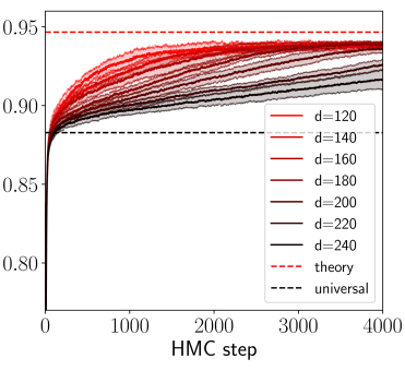
## Line Chart: Convergence of HMC Sampling Across Dimensions
### Overview
The image is a line chart displaying the performance or convergence metric of a Hamiltonian Monte Carlo (HMC) sampling process over a number of steps. It compares multiple runs across different problem dimensions (`d`), showing how the metric evolves and approaches theoretical and universal limits.
### Components/Axes
* **X-Axis:** Labeled **"HMC step"**. It is a linear scale ranging from **0 to 4000**, with major tick marks at 0, 1000, 2000, 3000, and 4000.
* **Y-Axis:** Has numerical markers but no explicit title. The scale is linear, ranging from **0.80 to 0.95**, with major tick marks at 0.80, 0.85, 0.90, and 0.95.
* **Legend:** Positioned in the **center-right** of the chart area. It contains:
* Seven solid lines representing different dimensions (`d`), with a color gradient from red to black:
* `d=120` (bright red)
* `d=140` (red)
* `d=160` (dark red)
* `d=180` (brownish-red)
* `d=200` (dark brown)
* `d=220` (very dark brown/black)
* `d=240` (black)
* Two dashed reference lines:
* `theory` (red dashed line)
* `universal` (black dashed line)
### Detailed Analysis
* **Data Series Trends:** All seven solid lines follow a similar pattern: a very steep, near-vertical increase from step 0 to approximately step 100-200, followed by a gradual, concave-down increase that plateaus as steps increase.
* **Dimension (`d`) Effect:** There is a clear inverse relationship between dimension `d` and the final plateau value. Lines for lower `d` (e.g., `d=120`, red) plateau at higher y-values, while lines for higher `d` (e.g., `d=240`, black) plateau at lower y-values.
* **Reference Lines:**
* The **`theory`** red dashed line is a horizontal line at **y ≈ 0.95**. The curves for the lowest dimensions (`d=120`, `d=140`) approach this line very closely by step 4000.
* The **`universal`** black dashed line is a horizontal line at **y ≈ 0.88**. All curves surpass this line early in the process (before step 500).
* **Approximate Final Values (at HMC step 4000):**
* `d=120`: ~0.945
* `d=140`: ~0.940
* `d=160`: ~0.935
* `d=180`: ~0.930
* `d=200`: ~0.925
* `d=220`: ~0.920
* `d=240`: ~0.915
### Key Observations
1. **Convergence Behavior:** All processes show rapid initial improvement followed by diminishing returns, characteristic of many optimization or sampling algorithms.
2. **Dimensional Scaling:** Performance, as measured by the y-axis metric, degrades systematically as the problem dimension `d` increases. The gap between the `d=120` and `d=240` curves is significant (~0.03 units).
3. **Theoretical Bound:** The `theory` line appears to represent an asymptotic upper bound that lower-dimensional problems can nearly achieve within 4000 steps.
4. **Universal Baseline:** The `universal` line acts as a lower performance threshold that all tested dimensions exceed very quickly.
### Interpretation
This chart likely illustrates the **"curse of dimensionality"** in the context of HMC sampling. The y-axis probably represents a measure of sampling efficiency, such as the effective sample size, acceptance rate, or a convergence diagnostic like the Gelman-Rubin statistic.
The data suggests that for this specific model or target distribution:
* HMC is highly effective in lower dimensions (`d=120-160`), achieving performance near the theoretical optimum.
* As dimensionality increases, the sampler's ability to explore the space efficiently diminishes, resulting in a lower final performance metric. This is a common challenge in Bayesian computation, where higher-dimensional spaces are harder to traverse.
* The existence of a `universal` bound suggests there may be a fundamental limit to performance that applies regardless of dimension, which the algorithm surpasses but cannot exceed by a large margin in high dimensions.
The chart provides a clear visual argument for the importance of dimensionality reduction techniques or more advanced sampling methods when dealing with high-dimensional (`d > 200`) problems using HMC.