## Pie Chart: Relevance Distribution
### Overview
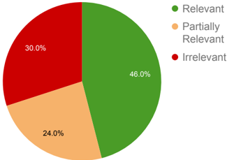
This image is a pie chart illustrating the distribution of relevance across three categories: Relevant, Partially Relevant, and Irrelevant. The chart visually represents the proportion of each category as a slice of a whole pie.
### Components/Axes
* **Legend**: Located in the top-right portion of the image.
* Green circle: "Relevant"
* Orange circle: "Partially Relevant"
* Red circle: "Irrelevant"
### Content Details
The pie chart is divided into three slices, each representing a category from the legend and displaying its corresponding percentage:
* **Relevant**: Represented by a large green slice, occupying **46.0%** of the pie. This slice is positioned in the top-right quadrant.
* **Partially Relevant**: Represented by a medium-sized orange slice, occupying **24.0%** of the pie. This slice is positioned in the bottom-left quadrant.
* **Irrelevant**: Represented by a red slice, occupying **30.0%** of the pie. This slice is positioned in the top-left quadrant.
### Key Observations
* The "Relevant" category constitutes the largest portion of the distribution, accounting for nearly half of the total.
* The "Irrelevant" category is the second-largest segment, followed by "Partially Relevant".
* The sum of the percentages is 46.0% + 24.0% + 30.0% = 100.0%.
### Interpretation
This pie chart demonstrates a clear distribution of relevance, with a significant majority of items or data points being categorized as "Relevant". The "Irrelevant" category is also substantial, indicating that a considerable portion is not pertinent. The "Partially Relevant" category represents a smaller, but still notable, segment. This data could be used to assess the effectiveness of a search, the quality of content, or the outcome of a classification task, suggesting that while a good portion is relevant, there is also room for improvement in reducing irrelevant results and potentially optimizing the partially relevant ones.