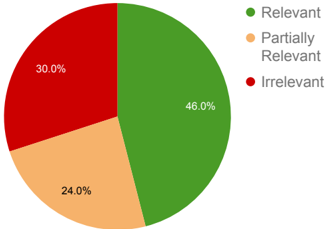
## Pie Chart: Relevance Distribution
### Overview
The image displays a pie chart illustrating the proportional distribution of three categories of relevance. The chart is composed of three colored segments, each labeled with a percentage, and is accompanied by a legend on the right side that maps colors to category names.
### Components/Axes
* **Chart Type:** Pie Chart.
* **Legend:** Positioned to the right of the pie chart. It contains three entries:
* A green circle labeled **"Relevant"**.
* An orange circle labeled **"Partially Relevant"**.
* A red circle labeled **"Irrelevant"**.
* **Data Labels:** Each segment of the pie chart has a percentage value printed directly on or adjacent to it.
* **Language:** All text in the image is in English.
### Detailed Analysis
The pie chart is divided into three segments with the following exact values and corresponding categories (verified by color match with the legend):
1. **Green Segment (Relevant):** This is the largest segment, occupying the right side of the pie. It is labeled **46.0%**.
2. **Red Segment (Irrelevant):** This is the second-largest segment, located in the upper-left quadrant of the pie. It is labeled **30.0%**.
3. **Orange Segment (Partially Relevant):** This is the smallest segment, situated in the lower-left quadrant of the pie. It is labeled **24.0%**.
**Trend Verification:** The visual trend shows a clear hierarchy: the "Relevant" category is the dominant classification, followed by "Irrelevant," with "Partially Relevant" being the least common. The segments are distinct and non-overlapping.
### Key Observations
* The three categories sum to exactly 100.0% (46.0% + 30.0% + 24.0% = 100.0%), indicating a complete partitioning of the dataset.
* The "Relevant" category, while the largest single segment, represents less than half of the total (46.0%).
* The combined proportion of items that are not fully relevant ("Partially Relevant" + "Irrelevant") constitutes a majority at 54.0%.
### Interpretation
This chart presents a quantitative assessment of relevance for a given set of items (e.g., documents, search results, data points, survey responses). The data suggests that while the largest single group is fully relevant, the majority of items (54%) fall short of full relevance. This could indicate a problem with source quality, selection criteria, or the matching process being evaluated. The significant "Irrelevant" portion (30%) is particularly notable, as it represents nearly one-third of the total, which may point to substantial noise or inefficiency in the system under analysis. The chart effectively communicates that achieving a high rate of fully relevant items is a challenge in this context.