## Pie Chart: Data Relevance
### Overview
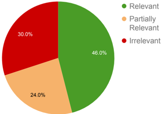
The pie chart displays the percentage of data that is considered relevant, partially relevant, or irrelevant. The chart is divided into three segments, each representing a different category of relevance.
### Components/Axes
- **Legend**: The legend is located at the top right of the chart and provides a color-coded key for the three categories of relevance.
- **Axes**: There are no axes visible in the chart, as it is a pie chart and does not require axis labels.
### Detailed Analysis or ### Content Details
- **Relevant**: 46.0% of the data is considered relevant.
- **Partially Relevant**: 24.0% of the data is considered partially relevant.
- **Irrelevant**: 30.0% of the data is considered irrelevant.
### Key Observations
The chart shows that the majority of the data (46%) is considered relevant, followed by partially relevant data (24%), and the least amount of data (30%) is considered irrelevant. This suggests that the majority of the data is relevant to the context being analyzed.
### Interpretation
The data suggests that the majority of the data is relevant to the context being analyzed. This could indicate that the data is useful for making informed decisions or that the context being analyzed is important. The partially relevant data could indicate that the data is useful in certain situations, but not in others. The irrelevant data could indicate that the data is not useful for the context being analyzed or that the context being analyzed is not important.