# Technical Data Extraction: Action Frequency and Failure Analysis
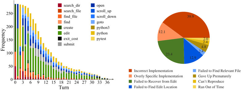
This document provides a comprehensive extraction of the data contained in the provided image, which consists of two primary components: a stacked bar chart showing action frequency over time and a pie chart detailing failure modes.
---
## 1. Component Isolation: Stacked Bar Chart (Left)
### Metadata and Axes
* **Type:** Stacked Bar Chart.
* **Y-Axis Label:** Frequency (Scale: 0 to 250+).
* **X-Axis Label:** Turn (Scale: 0 to 39, marked in increments of 3).
* **Legend Location:** Top center, between the two charts.
### Legend Categories (Actions)
The legend identifies 14 distinct actions categorized by color groups:
* **Search/File Operations (Reds/Oranges):** `search_dir` (Dark Red), `search_file` (Rust), `find_file` (Orange), `find` (Peach).
* **Editing/System (Greens/Grays):** `create` (Dark Green), `edit` (Light Green), `exit_cost` (Black), `submit` (Gray).
* **Navigation (Blues):** `open` (Dark Blue), `scroll_up` (Medium Blue), `scroll_down` (Bright Blue), `goto` (Light Blue).
* **Execution (Yellows):** `python3` (Olive/Gold), `python` (Yellow), `pytest` (Light Yellow).
### Trend Analysis
* **Overall Trend:** The total frequency of actions per turn follows a sharp downward decay curve. It starts at its peak (approx. 280 actions) at Turn 0 and tapers off to near zero by Turn 39.
* **Early Phase (Turns 0-6):** Dominated by search and navigation actions (`search_dir`, `find_file`, `open`). There is a significant spike in `edit` (green) and `python3/pytest` (yellow) actions starting around Turn 3.
* **Middle Phase (Turns 9-21):** The proportion of `edit` (green) and `submit` (gray) actions remains relatively high compared to the shrinking total volume.
* **Late Phase (Turns 24-39):** Action volume is very low. The remaining actions are primarily `edit`, `submit`, and occasional `python` executions.
---
## 2. Component Isolation: Failure Mode Pie Chart (Right)
### Metadata
* **Type:** Pie Chart.
* **Data Labels:** Numerical percentages are printed directly on the slices.
* **Legend Location:** Bottom right, below the pie chart.
### Data Table: Failure Modes
The following table reconstructs the data presented in the pie chart, cross-referencing the legend colors with the percentage values.
| Color | Failure Category | Percentage (%) |
| :--- | :--- | :--- |
| Rust | Incorrect Implementation | 39.9 |
| Peach | Overly Specific Implementation | 12.1 |
| Dark Green | Failed to Recover from Edit | 23.4 |
| Dark Blue | Failed to Find Edit Location | 12.9 |
| Light Blue | Failed to Find Relevant File | 2.4 |
| Olive/Gold | Gave Up Prematurely | 4.8 |
| Yellow | Can't Reproduce | 2.4 |
| Light Yellow | Ran Out of Time | 2.0 |
**Total Calculated:** 100.0%
---
## 3. Synthesis and Observations
* **Primary Failure Driver:** "Incorrect Implementation" is the single largest cause of failure at 39.9%.
* **Process Correlation:** The stacked bar chart shows a high frequency of `edit` and `python/pytest` actions throughout the middle turns. The pie chart reveals that a combined 63.3% of failures (Incorrect Implementation + Failed to Recover from Edit) occur during or after the editing phase.
* **Navigation Efficiency:** While navigation actions (`open`, `scroll`, `find`) dominate the early turns, "Failed to Find Relevant File" and "Failed to Find Edit Location" account for a combined 15.3% of total failures, suggesting that the initial search phase is successful in the majority of cases.
* **Temporal Constraint:** "Ran Out of Time" is the least frequent failure mode (2.0%), suggesting that the decay in the bar chart is due to task completion or other failure types rather than reaching a hard time limit.