## Stacked Bar Chart and Pie Chart: User Actions and Failure Reasons
### Overview
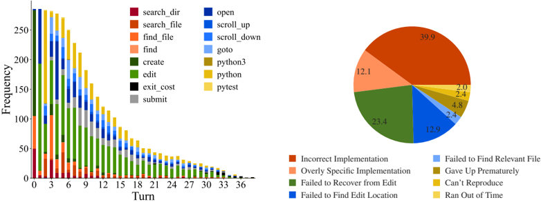
The image contains two visualizations: a **stacked bar chart** on the left and a **pie chart** on the right. The bar chart tracks the frequency of user actions across 37 turns (0–36), while the pie chart categorizes failure reasons. Both use a shared color-coded legend for actions and failure types.
---
### Components/Axes
#### Stacked Bar Chart (Left)
- **X-axis (Turn)**: Discrete values from 0 to 36, representing sequential steps or iterations.
- **Y-axis (Frequency)**: Continuous scale from 0 to 250, indicating the count of actions per turn.
- **Legend**: 15 action categories with distinct colors:
- `search_dir` (purple), `search_file` (orange), `find_file` (light orange), `find` (pink), `create` (dark green), `edit` (light green), `exit_cost` (black), `submit` (gray), `open` (dark blue), `scroll_up` (light blue), `scroll_down` (cyan), `goto` (yellow), `python3` (olive), `python` (gold), `pytest` (light yellow).
#### Pie Chart (Right)
- **Segments**: Six failure categories with percentages:
- `Incorrect Implementation` (39.9%), `Overly Specific Implementation` (12.1%), `Failed to Recover from Edit` (23.4%), `Failed to Find Edit Location` (12.9%), `Gave Up Prematurely` (4.8%), `Can't Reproduce` (2.4%), `Ran Out of Time` (2.0%).
- **Colors**: Matches legend entries (e.g., dark green for `Failed to Recover from Edit`, light blue for `Failed to Find Edit Location`).
---
### Detailed Analysis
#### Stacked Bar Chart
- **Trends**:
- All action frequencies **decline monotonically** as turn numbers increase. Early turns (0–6) show high activity, while later turns (24–36) have minimal engagement.
- Dominant actions in early turns: `search_dir`, `search_file`, and `find_file` (purple, orange, light orange).
- Later turns show increased use of `edit` (light green) and `submit` (gray), suggesting iterative refinement.
- `python3` (olive) and `python` (gold) appear sporadically, peaking around turns 12–18.
#### Pie Chart
- **Distribution**:
- `Incorrect Implementation` dominates (39.9%), indicating flawed execution despite correct actions.
- `Failed to Recover from Edit` (23.4%) and `Failed to Find Edit Location` (12.9%) suggest challenges in debugging or navigation.
- Smaller segments: `Overly Specific Implementation` (12.1%) and `Gave Up Prematurely` (4.8%) reflect design or persistence issues.
---
### Key Observations
1. **Action Decline**: User engagement drops sharply after turn 12, with most actions becoming negligible by turn 36.
2. **Failure Correlation**: The pie chart’s largest failure category (`Incorrect Implementation`) aligns with the bar chart’s frequent `edit` actions, implying repeated corrections.
3. **Color Consistency**: All legend colors match their respective data points in both charts (e.g., dark green for `edit` in bars and `Failed to Recover from Edit` in the pie).
---
### Interpretation
- **User Behavior**: The bar chart reveals a pattern of initial exploration (`search_dir`, `search_file`) followed by iterative editing and submission. The decline suggests task complexity or user fatigue.
- **Failure Insights**: The pie chart highlights implementation errors as the primary bottleneck, outweighing technical issues like file navigation or time constraints. This implies a need for better error handling or user guidance.
- **Anomalies**: The sporadic use of `python3`/`python` and `pytest` (light yellow) in later turns may indicate specialized debugging or testing phases.
The data collectively suggests that while users engage in systematic actions early on, execution errors and implementation flaws are the main barriers to success. The decline in activity over time could reflect abandonment due to unresolved issues or task abandonment.