## Scatter Plot: Energy vs. Log Probability and Lag vs. Autocorrelation Function
### Overview
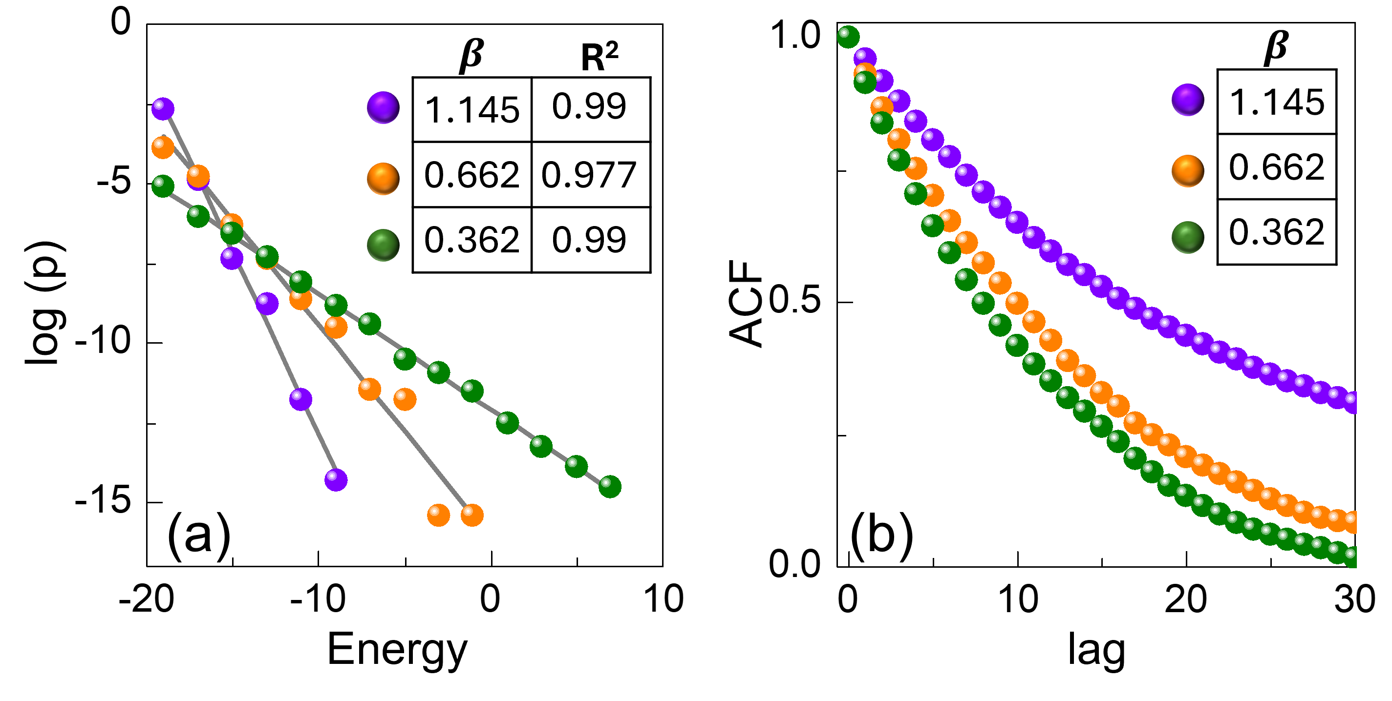
The image presents two scatter plots side-by-side. Plot (a) shows the relationship between Energy and the logarithm of probability (log(p)), while plot (b) illustrates the relationship between lag and the Autocorrelation Function (ACF). Both plots display three data series, each corresponding to a different value of β (1.145, 0.662, and 0.362). The plots include legends indicating the β values and their corresponding R-squared values for plot (a).
### Components/Axes
**Plot (a): Energy vs. log(p)**
* **X-axis:** Energy, ranging from approximately -20 to 10. Axis markers are present at -20, -10, 0, and 10.
* **Y-axis:** log(p), ranging from approximately -15 to 0. Axis markers are present at -15, -10, -5, and 0.
* **Data Series:**
* **Purple:** β = 1.145, R² = 0.99
* **Orange:** β = 0.662, R² = 0.977
* **Green:** β = 0.362, R² = 0.99
* **Legend:** Located in the top-right corner of plot (a). It displays the β values and their corresponding R² values in a table format.
* **Plot Label:** (a) is located in the bottom-left corner of the plot.
**Plot (b): Lag vs. ACF**
* **X-axis:** lag, ranging from 0 to 30. Axis markers are present at 0, 10, 20, and 30.
* **Y-axis:** ACF, ranging from 0.0 to 1.0. Axis markers are present at 0.0, 0.5, and 1.0.
* **Data Series:**
* **Purple:** β = 1.145
* **Orange:** β = 0.662
* **Green:** β = 0.362
* **Legend:** Located in the top-right corner of plot (b). It displays the β values.
* **Plot Label:** (b) is located in the bottom-left corner of the plot.
### Detailed Analysis
**Plot (a): Energy vs. log(p)**
* **Purple (β = 1.145, R² = 0.99):** The data points are approximately: (-18, -3), (-13, -7), (-8, -10), (-3, -14). The line slopes downward.
* **Orange (β = 0.662, R² = 0.977):** The data points are approximately: (-18, -4), (-13, -6), (-3, -11), (2, -16). The line slopes downward.
* **Green (β = 0.362, R² = 0.99):** The data points are approximately: (-18, -5), (-13, -7), (-3, -11), (7, -14). The line slopes downward.
**Plot (b): Lag vs. ACF**
* **Purple (β = 1.145):** The data points are approximately: (0, 1), (5, 0.9), (10, 0.7), (15, 0.5), (20, 0.4), (25, 0.3), (30, 0.25). The line slopes downward.
* **Orange (β = 0.662):** The data points are approximately: (0, 1), (5, 0.75), (10, 0.5), (15, 0.3), (20, 0.15), (25, 0.05), (30, 0.01). The line slopes downward.
* **Green (β = 0.362):** The data points are approximately: (0, 1), (5, 0.7), (10, 0.4), (15, 0.2), (20, 0.08), (25, 0.02), (30, 0.001). The line slopes downward.
### Key Observations
* In plot (a), as Energy increases, log(p) decreases for all values of β.
* In plot (b), as lag increases, ACF decreases for all values of β.
* The R-squared values for plot (a) are all very high (close to 1), indicating a strong correlation between Energy and log(p).
* The rate of decrease in ACF with increasing lag varies depending on the value of β. Higher β values result in a slower decrease in ACF.
### Interpretation
The plots suggest that there is a strong negative correlation between energy and the log of probability, as indicated by the high R-squared values. The autocorrelation function decreases with increasing lag, which is expected. The different β values influence the rate at which the autocorrelation decays. A higher β value corresponds to a slower decay of the autocorrelation function, suggesting a longer memory or persistence in the system being modeled. The data suggests that the system with β = 1.145 retains its autocorrelation for a longer duration compared to systems with lower β values.