\n
## Scatter Plots: Energy vs. Log(p) and ACF vs. Lag
### Overview
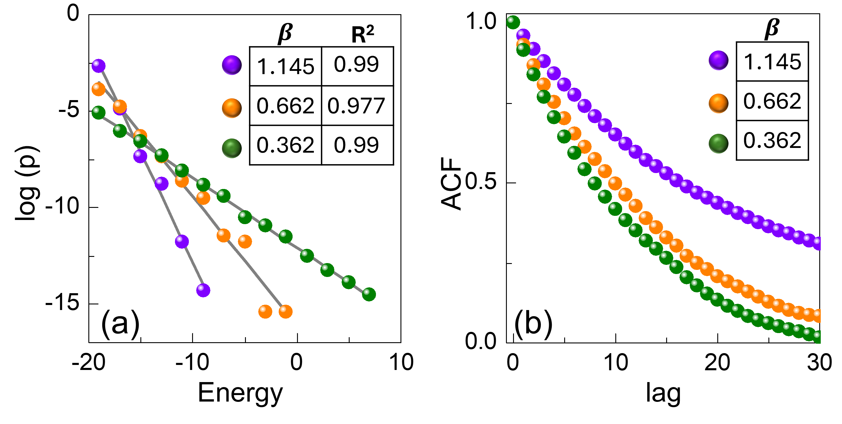
The image presents two scatter plots, labeled (a) and (b). Plot (a) shows the relationship between Energy and log(p), while plot (b) depicts the Autocorrelation Function (ACF) against Lag. Each plot contains three data series, distinguished by color and represented with associated β and R² values in a legend.
### Components/Axes
**Plot (a): Energy vs. Log(p)**
* **X-axis:** Energy, ranging from approximately -20 to 10.
* **Y-axis:** log(p), ranging from approximately -15 to 0.
* **Data Series 1:** Purple, β = 1.145, R² = 0.99
* **Data Series 2:** Orange, β = 0.662, R² = 0.977
* **Data Series 3:** Green, β = 0.362, R² = 0.99
**Plot (b): ACF vs. Lag**
* **X-axis:** Lag, ranging from approximately 0 to 30.
* **Y-axis:** ACF, ranging from approximately 0.0 to 1.0.
* **Data Series 1:** Purple, β = 1.145
* **Data Series 2:** Orange, β = 0.662
* **Data Series 3:** Green, β = 0.362
Both plots share a common legend positioned in the top-right corner.
### Detailed Analysis or Content Details
**Plot (a): Energy vs. Log(p)**
* **Purple Data Series:** The data points exhibit a strong downward trend. Starting at approximately log(p) = -1.0 when Energy = -20, the series decreases to approximately log(p) = -14.5 when Energy = 10. The points are tightly clustered around a decreasing line.
* **Orange Data Series:** This series also shows a downward trend, but less pronounced than the purple series. Starting at approximately log(p) = -3.5 when Energy = -20, it decreases to approximately log(p) = -13.5 when Energy = 10. The points are more scattered than the purple series.
* **Green Data Series:** This series exhibits a similar downward trend to the orange series, but with a shallower slope. Starting at approximately log(p) = -2.5 when Energy = -20, it decreases to approximately log(p) = -14.0 when Energy = 10. The points are relatively well-aligned.
**Plot (b): ACF vs. Lag**
* **Purple Data Series:** The ACF starts at approximately 1.0 at Lag = 0 and decays rapidly to approximately 0.2 at Lag = 30. The decay is relatively slow initially, then accelerates.
* **Orange Data Series:** The ACF starts at approximately 1.0 at Lag = 0 and decays to approximately 0.1 at Lag = 30. The decay is faster than the purple series.
* **Green Data Series:** The ACF starts at approximately 1.0 at Lag = 0 and decays to approximately 0.05 at Lag = 30. This series exhibits the fastest decay among the three.
### Key Observations
* In both plots, the purple data series consistently exhibits the strongest trend (steepest slope in (a) and fastest decay in (b)).
* The R² values in plot (a) indicate a strong linear relationship between Energy and log(p) for all three series, with the purple series having the highest R² value (0.99).
* The β values are different for each series, indicating different rates of change.
* The ACF values in plot (b) all start at 1.0, as expected for autocorrelation at lag 0.
### Interpretation
The plots likely represent the analysis of a time series or a similar sequential dataset. Plot (a) suggests a power-law relationship between Energy and probability (represented by log(p)), where higher energy levels correspond to lower probabilities. The different β values indicate that the rate of this decrease varies depending on the specific series. The high R² values suggest that this relationship is well-modeled by a linear function in log-log space.
Plot (b) shows the autocorrelation function, which measures the correlation between the series and its lagged values. The rapid decay of the ACF indicates that the series is not strongly autocorrelated, meaning that values at different time points are largely independent. The different decay rates for the three series suggest that they have different levels of temporal dependence. The purple series, with the slowest decay, exhibits the strongest autocorrelation.
The combination of these two plots provides insights into the statistical properties of the underlying data. The power-law relationship in plot (a) suggests a scale-free behavior, while the ACF in plot (b) reveals the temporal structure of the data. The differences between the three series suggest that they may represent different aspects of the same phenomenon or different phenomena altogether.