\n
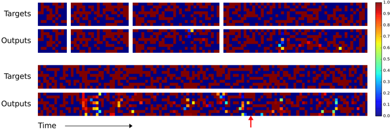
## Heatmap: Targets vs. Outputs over Time
### Overview
The image presents a series of heatmaps visualizing the relationship between "Targets" and "Outputs" over "Time". There are two sets of four heatmaps, arranged in two rows. The top row shows a series of snapshots, while the bottom row appears to show a longer-term view or a different representation of the same data. The heatmaps use a color gradient to represent values ranging from 0.0 to 1.0. A red arrow points to a specific region in the bottom row's last heatmap.
### Components/Axes
* **Labels:** "Targets" (appears twice), "Outputs" (appears twice), "Time" (indicated by an arrow).
* **Color Scale:** A vertical color bar on the right side of the image represents the value range, with:
* 0.0: Dark Blue
* 0.2: Cyan
* 0.4: Light Green
* 0.6: Yellow
* 0.8: Orange
* 1.0: Red
* **Heatmap Arrangement:** Two rows of four heatmaps each. Each heatmap appears to be a 2D grid of cells, with color representing the value at each grid point.
* **Time Axis:** The horizontal axis is labeled "Time" and indicated by an arrow pointing to the right. The heatmaps are arranged sequentially, suggesting a progression in time from left to right.
### Detailed Analysis or Content Details
**Top Row (Snapshots):**
* **Heatmap 1 (Targets):** Predominantly dark blue and red, with scattered yellow and orange. No clear pattern. Approximate values range from 0.0 to 1.0.
* **Heatmap 2 (Targets):** Similar to Heatmap 1, with a mix of dark blue, red, yellow, and orange. No clear pattern. Approximate values range from 0.0 to 1.0.
* **Heatmap 3 (Targets):** Predominantly dark blue and red, with scattered yellow and orange. No clear pattern. Approximate values range from 0.0 to 1.0.
* **Heatmap 4 (Targets):** Predominantly dark blue and red, with scattered yellow and orange. No clear pattern. Approximate values range from 0.0 to 1.0.
* **Heatmap 1 (Outputs):** Predominantly dark blue and red, with scattered yellow and orange. No clear pattern. Approximate values range from 0.0 to 1.0.
* **Heatmap 2 (Outputs):** Predominantly dark blue and red, with scattered yellow and orange. No clear pattern. Approximate values range from 0.0 to 1.0.
* **Heatmap 3 (Outputs):** Predominantly dark blue and red, with a small cluster of cyan and green in the center. Approximate values range from 0.0 to 0.7.
* **Heatmap 4 (Outputs):** A more pronounced cluster of cyan and green in the center, with some yellow and orange. Approximate values range from 0.0 to 0.9.
**Bottom Row (Longer View/Different Representation):**
* **Heatmap 1 (Targets):** Predominantly dark blue and red, with scattered yellow and orange. No clear pattern. Approximate values range from 0.0 to 1.0.
* **Heatmap 2 (Targets):** Predominantly dark blue and red, with scattered yellow and orange. No clear pattern. Approximate values range from 0.0 to 1.0.
* **Heatmap 3 (Targets):** Predominantly dark blue and red, with scattered yellow and orange. No clear pattern. Approximate values range from 0.0 to 1.0.
* **Heatmap 4 (Targets):** Predominantly dark blue and red, with scattered yellow and orange. No clear pattern. Approximate values range from 0.0 to 1.0.
* **Heatmap 1 (Outputs):** A vertical streak of cyan and green on the left side, transitioning to dark blue and red. Approximate values range from 0.0 to 0.8.
* **Heatmap 2 (Outputs):** Similar to Heatmap 1, with a vertical streak of cyan and green on the left side, transitioning to dark blue and red. Approximate values range from 0.0 to 0.8.
* **Heatmap 3 (Outputs):** Similar to Heatmap 1 and 2, with a vertical streak of cyan and green on the left side, transitioning to dark blue and red. Approximate values range from 0.0 to 0.8.
* **Heatmap 4 (Outputs):** Multiple clusters of cyan and green, with some yellow and orange. The red arrow points to a cluster of cyan and green in the center. Approximate values range from 0.0 to 0.9.
### Key Observations
* The "Targets" heatmaps consistently show a random distribution of colors, suggesting no strong correlation or pattern within the target data itself.
* The "Outputs" heatmaps, particularly in the bottom row, show a more dynamic pattern with clusters of cyan and green appearing and shifting over time.
* The bottom row "Outputs" heatmaps exhibit a streak of cyan/green on the left, which may indicate an initial activation or response.
* The red arrow highlights a specific region of interest in the last "Outputs" heatmap, suggesting a significant event or pattern.
* The top row "Outputs" heatmaps show less pronounced patterns compared to the bottom row.
### Interpretation
The image likely represents the output of a machine learning model or a dynamic system where "Targets" represent desired states and "Outputs" represent the actual results. The heatmaps visualize the similarity or correlation between these two over time.
The consistent randomness in the "Targets" suggests that the desired states are either inherently unpredictable or are not directly influencing the system's behavior. The evolving patterns in the "Outputs" indicate that the system is responding to some input or undergoing internal changes.
The streak of cyan/green in the bottom row "Outputs" could represent an initial response or activation phase. The clusters highlighted by the red arrow suggest that the system is converging towards a specific state or achieving a desired outcome at certain points in time.
The difference between the top and bottom row "Outputs" could indicate different levels of granularity or different time scales. The top row might represent snapshots, while the bottom row represents a more continuous view of the system's evolution.
The data suggests a system that is not always perfectly aligned with its targets, but is capable of adapting and generating outputs that sometimes approach the desired states. Further analysis would be needed to understand the underlying mechanisms driving these patterns and the significance of the highlighted region.