## Spatiotemporal Heatmap Comparison: Targets vs. Outputs
### Overview
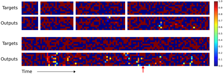
The image displays a series of comparative heatmaps, likely visualizing the performance of a predictive model or simulation against ground truth data over time. It is divided into two main sections, each comparing "Targets" (ground truth) with "Outputs" (model predictions). The visualization uses a color scale to represent numerical values, with time progressing from left to right.
### Components/Axes
* **Labels (Left Side):** The text "Targets" and "Outputs" appears twice, labeling two distinct comparison sets.
* **Top Set:** "Targets" (top row), "Outputs" (bottom row). Each row contains four discrete, square heatmap panels.
* **Bottom Set:** "Targets" (top row), "Outputs" (bottom row). Each row is a single, continuous horizontal heatmap strip.
* **Time Axis (Bottom):** A horizontal arrow labeled "Time" points to the right, indicating the temporal direction for the continuous strips in the bottom set.
* **Color Bar (Right Side):** A vertical legend mapping colors to numerical values.
* **Scale:** Linear, ranging from 0.0 (bottom) to 1.0 (top).
* **Color Gradient:** Deep blue (0.0) → Cyan (~0.3-0.4) → Yellow (~0.6-0.7) → Deep red (1.0).
* **Tick Marks:** Labeled at 0.0, 0.1, 0.2, 0.3, 0.4, 0.5, 0.6, 0.7, 0.8, 0.9, 1.0.
### Detailed Analysis
**Top Set (Discrete Panels):**
* **Targets Row:** Four square panels show a consistent, stable pattern of interlocking blue (low value) and red (high value) regions. The pattern appears similar across all four panels, suggesting a static or slowly changing target state.
* **Outputs Row:** The first two panels closely match their corresponding "Targets" panels. The third panel shows a small, distinct yellow/cyan spot (value ~0.5-0.7) in the upper-middle area, deviating from the target pattern. The fourth panel shows two such deviation spots: one yellow/cyan spot in the lower-middle and another in the lower-right area.
**Bottom Set (Continuous Strips):**
* **Targets Strip:** A long, continuous horizontal band displaying a stable, repeating pattern of blue and red regions, similar to the discrete panels above. No significant visual anomalies are present.
* **Outputs Strip:** This strip shows significant and increasing deviation from the "Targets" strip above it.
* **Left Section (~0-30% of length):** Mostly matches the target pattern, with a few isolated cyan/yellow pixels.
* **Middle Section (~30-70%):** Deviations become more frequent and pronounced. Multiple clusters of yellow and cyan pixels appear, indicating localized areas where the output value is significantly different from the target (mid-range values instead of near 0 or 1).
* **Right Section (~70-100%):** Deviations are most intense here. There are larger, more frequent clusters of yellow and cyan. A prominent red arrow (added annotation) points upward to a specific cluster of bright yellow/cyan pixels near the bottom edge in this section, highlighting a major point of interest or error.
### Key Observations
1. **Increasing Error Over Time:** In the continuous "Outputs" strip, the frequency and visual prominence of deviation spots (yellow/cyan) increase from left to right, correlating with the "Time" axis. This suggests model performance degrades or errors accumulate as the sequence progresses.
2. **Spatial Localization of Errors:** Errors are not uniform; they appear as localized "hotspots" or clusters within the output field, rather than a global shift in values.
3. **Nature of Deviations:** The target patterns are largely binary (blue/red, ~0.0/1.0). The deviations in the outputs often manifest as mid-range values (cyan/yellow, ~0.3-0.7), indicating the model is producing uncertain or intermediate predictions where sharp transitions are expected.
4. **Annotated Anomaly:** The red arrow explicitly draws attention to a specific error cluster in the late stage of the sequence, marking it as a critical failure case or event of interest.
### Interpretation
This visualization is a diagnostic tool for evaluating a spatiotemporal model (e.g., for physics simulation, video prediction, or cellular automata). The "Targets" represent the true, desired state of a system over time. The "Outputs" are the model's predictions.
The data suggests the model learns the general pattern well initially (left side of continuous strip, first two discrete panels) but struggles with **temporal stability** and **precision**. The increasing errors imply a problem with error propagation or a failure to capture long-term dependencies. The localized nature of the errors indicates the model may fail at specific spatial features or boundaries within the data. The mid-range value deviations are particularly telling, showing the model is not confident and is "smoothing" or "blurring" what should be sharp, binary distinctions.
The red arrow likely points to a **catastrophic failure mode** or a **phase transition point** in the system that the model fails to predict accurately. Overall, the image demonstrates a model that has learned short-range correlations but lacks robustness for long-horizon prediction, with errors manifesting as spatially localized, temporally increasing regions of uncertain (mid-range) values.