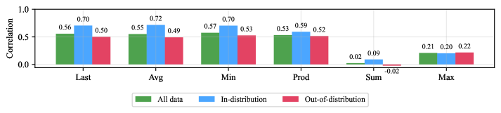
## Bar Chart: Correlation Metrics Across Data Types
### Overview
The chart compares correlation values across six metrics (Last, Avg, Min, Prod, Sum, Max) for three data types: All data (green), In-distribution (blue), and Out-of-distribution (red). The y-axis represents correlation strength (0.0–1.0), with values labeled on top of each bar.
### Components/Axes
- **X-axis (Metrics)**: Last, Avg, Min, Prod, Sum, Max
- **Y-axis (Correlation)**: 0.0 to 1.0 in increments of 0.1
- **Legend**:
- Green = All data
- Blue = In-distribution
- Red = Out-of-distribution
- **Bar Structure**: Each metric has three grouped bars (green, blue, red) aligned vertically.
### Detailed Analysis
1. **Last**:
- All data: 0.56
- In-distribution: 0.70
- Out-of-distribution: 0.50
2. **Avg**:
- All data: 0.55
- In-distribution: 0.72
- Out-of-distribution: 0.49
3. **Min**:
- All data: 0.57
- In-distribution: 0.70
- Out-of-distribution: 0.53
4. **Prod**:
- All data: 0.53
- In-distribution: 0.59
- Out-of-distribution: 0.52
5. **Sum**:
- All data: 0.02
- In-distribution: 0.09
- Out-of-distribution: -0.02
6. **Max**:
- All data: 0.21
- In-distribution: 0.20
- Out-of-distribution: 0.22
### Key Observations
- **In-distribution data** consistently shows the highest correlation across all metrics except "Max," where it is slightly lower than All data.
- **Out-of-distribution data** exhibits the weakest correlations, with a notable negative value (-0.02) in the "Sum" metric.
- **All data** performs intermediately, often closer to Out-of-distribution than In-distribution.
- The "Sum" metric is an outlier, with all data types showing near-zero or negative correlations.
### Interpretation
The data suggests that **In-distribution samples** maintain stronger relationships with the target variable compared to All data and Out-of-distribution samples. The negative correlation in "Sum" for Out-of-distribution data implies an inverse relationship, potentially indicating data quality issues or domain shifts. The "Max" metric’s low correlations across all types may reflect diminishing returns or saturation effects at extreme values. This pattern highlights the importance of domain alignment in predictive modeling, as Out-of-distribution data degrades performance significantly.