## Line Chart: MER Average vs. N for Different Methods
### Overview
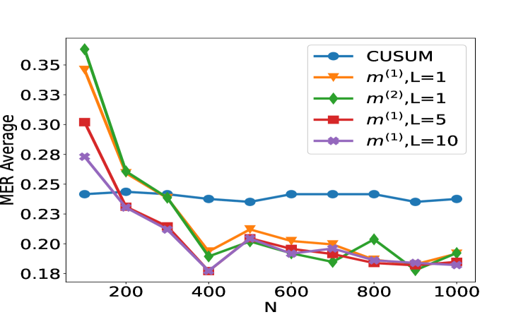
This image presents a line chart comparing the Mean Error Rate (MER) Average for several methods as a function of 'N', likely representing sample size or number of observations. The methods being compared are CUSUM, m<sup>(1)</sup> with L=1, m<sup>(2)</sup> with L=1, m<sup>(1)</sup> with L=5, and m<sup>(1)</sup> with L=10.
### Components/Axes
* **X-axis:** Labeled "N", ranging from approximately 0 to 1000, with markers at 200, 400, 600, 800, and 1000.
* **Y-axis:** Labeled "MER Average", ranging from approximately 0.18 to 0.36, with markers at 0.18, 0.20, 0.22, 0.24, 0.26, 0.28, 0.30, 0.32, 0.34, and 0.36.
* **Legend:** Located in the top-right corner of the chart. It identifies each line with its corresponding method:
* Blue circle: CUSUM
* Orange triangle: m<sup>(1)</sup>, L=1
* Green diamond: m<sup>(2)</sup>, L=1
* Red triangle: m<sup>(1)</sup>, L=5
* Purple cross: m<sup>(1)</sup>, L=10
### Detailed Analysis
* **CUSUM (Blue Line):** The line starts at approximately 0.25 at N=0, fluctuates between approximately 0.23 and 0.25, and ends at approximately 0.24 at N=1000. It shows a relatively stable performance across the range of N.
* **m<sup>(1)</sup>, L=1 (Orange Line):** This line begins at approximately 0.32 at N=0, decreases sharply to approximately 0.22 at N=200, continues to decrease to approximately 0.19 at N=400, and then plateaus around 0.18-0.20 for the remainder of the range, ending at approximately 0.19 at N=1000.
* **m<sup>(2)</sup>, L=1 (Green Line):** This line starts at approximately 0.36 at N=0, decreases rapidly to approximately 0.22 at N=200, continues to decrease to approximately 0.18 at N=400, and then remains relatively stable between approximately 0.18 and 0.19, ending at approximately 0.18 at N=1000.
* **m<sup>(1)</sup>, L=5 (Red Line):** This line begins at approximately 0.30 at N=0, decreases to approximately 0.21 at N=200, continues to decrease to approximately 0.18 at N=400, and then fluctuates between approximately 0.18 and 0.20, ending at approximately 0.18 at N=1000.
* **m<sup>(1)</sup>, L=10 (Purple Line):** This line starts at approximately 0.27 at N=0, decreases to approximately 0.20 at N=200, continues to decrease to approximately 0.18 at N=400, and then remains relatively stable between approximately 0.17 and 0.19, ending at approximately 0.18 at N=1000.
### Key Observations
* All methods show a decreasing MER Average as N increases, indicating improved performance with larger sample sizes.
* m<sup>(2)</sup>, L=1 and m<sup>(1)</sup>, L=1 initially have the highest MER Average, but they also show the most significant decrease in MER Average as N increases.
* CUSUM exhibits the most stable performance, with the smallest fluctuations in MER Average.
* The methods m<sup>(1)</sup>, L=5 and m<sup>(1)</sup>, L=10 converge to similar MER Average values as N increases.
### Interpretation
The chart demonstrates the performance of different methods for detecting changes or anomalies, as measured by the Mean Error Rate. The 'N' parameter likely represents the number of data points used in the analysis. The results suggest that increasing the sample size (N) generally improves the accuracy of all methods.
The initial higher error rates for m<sup>(2)</sup>, L=1 and m<sup>(1)</sup>, L=1 could indicate that these methods require a larger sample size to achieve optimal performance. The stability of the CUSUM method suggests it is less sensitive to sample size variations, making it a robust choice when sample sizes are limited.
The convergence of m<sup>(1)</sup>, L=5 and m<sup>(1)</sup>, L=10 suggests that the value of 'L' (likely a smoothing parameter or window size) has a diminishing effect on performance beyond a certain point. The choice of method and parameter settings should be based on the specific application and the trade-off between initial performance and sensitivity to sample size.