## Line Chart: MER Average vs. N for Different Methods
### Overview
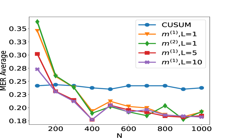
The image is a line chart comparing the performance of five different statistical methods or algorithms. The performance metric is "MER Average" plotted against a variable "N". The chart shows how the average MER (likely Mean Error Rate or a similar metric) changes as N increases for each method.
### Components/Axes
* **Chart Type:** Multi-line chart with markers.
* **X-Axis:**
* **Label:** `N`
* **Scale:** Linear, ranging from approximately 100 to 1000.
* **Major Ticks:** 200, 400, 600, 800, 1000.
* **Y-Axis:**
* **Label:** `MER Average`
* **Scale:** Linear, ranging from approximately 0.18 to 0.35.
* **Major Ticks:** 0.18, 0.20, 0.23, 0.25, 0.28, 0.30, 0.33, 0.35.
* **Legend:** Located in the top-right quadrant of the chart area. It contains five entries, each associating a color and marker shape with a method name.
1. **Blue line with circle markers:** `CUSUM`
2. **Orange line with downward-pointing triangle markers:** `m^(1),L=1`
3. **Green line with diamond markers:** `m^(2),L=1`
4. **Red line with square markers:** `m^(1),L=5`
5. **Purple line with pentagon (or star-like) markers:** `m^(1),L=10`
### Detailed Analysis
The chart plots five data series. Below is an analysis of each, including approximate data points extracted by visual inspection. Values are approximate due to the resolution of the image.
**1. CUSUM (Blue, Circle Markers)**
* **Trend:** Nearly flat, showing very stable performance across all values of N.
* **Data Points (Approximate):**
* N=100: ~0.24
* N=200: ~0.24
* N=300: ~0.24
* N=400: ~0.24
* N=500: ~0.24
* N=600: ~0.24
* N=700: ~0.24
* N=800: ~0.24
* N=900: ~0.24
* N=1000: ~0.24
**2. m^(1),L=1 (Orange, Downward Triangle Markers)**
* **Trend:** Starts very high, drops sharply until N=400, then fluctuates with a slight downward trend.
* **Data Points (Approximate):**
* N=100: ~0.35
* N=200: ~0.27
* N=300: ~0.24
* N=400: ~0.20
* N=500: ~0.21
* N=600: ~0.20
* N=700: ~0.20
* N=800: ~0.19
* N=900: ~0.19
* N=1000: ~0.19
**3. m^(2),L=1 (Green, Diamond Markers)**
* **Trend:** Starts the highest, drops very sharply until N=400, then fluctuates with a slight downward trend, often crossing the orange line.
* **Data Points (Approximate):**
* N=100: ~0.36
* N=200: ~0.27
* N=300: ~0.24
* N=400: ~0.19
* N=500: ~0.21
* N=600: ~0.20
* N=700: ~0.19
* N=800: ~0.21
* N=900: ~0.18
* N=1000: ~0.20
**4. m^(1),L=5 (Red, Square Markers)**
* **Trend:** Starts moderately high, drops steadily until N=400, then continues a slow, steady decline.
* **Data Points (Approximate):**
* N=100: ~0.30
* N=200: ~0.24
* N=300: ~0.22
* N=400: ~0.19
* N=500: ~0.20
* N=600: ~0.19
* N=700: ~0.19
* N=800: ~0.19
* N=900: ~0.19
* N=1000: ~0.19
**5. m^(1),L=10 (Purple, Pentagon Markers)**
* **Trend:** Starts the lowest among the non-CUSUM methods, drops to the lowest point on the chart at N=400, then rises slightly and stabilizes.
* **Data Points (Approximate):**
* N=100: ~0.28
* N=200: ~0.24
* N=300: ~0.22
* N=400: ~0.18
* N=500: ~0.20
* N=600: ~0.19
* N=700: ~0.19
* N=800: ~0.19
* N=900: ~0.19
* N=1000: ~0.19
### Key Observations
1. **Performance Hierarchy at Low N:** At N=100, there is a clear hierarchy. `m^(2),L=1` performs worst (highest MER), followed by `m^(1),L=1`, `m^(1),L=5`, `m^(1),L=10`, with `CUSUM` performing best (lowest MER).
2. **Convergence:** All methods except `CUSUM` show a significant improvement (decrease in MER) as N increases from 100 to 400. After N=400, their performance differences become much smaller.
3. **CUSUM Stability:** The `CUSUM` method is remarkably stable, showing almost no sensitivity to the value of N within the tested range.
4. **Optimal Point:** The lowest MER value on the chart (~0.18) is achieved by `m^(1),L=10` at N=400.
5. **Parameter L Impact:** For the `m^(1)` family, increasing the parameter L from 1 to 5 to 10 generally leads to better (lower) MER, especially at lower N values. At higher N (≥600), the performance of `m^(1),L=5` and `m^(1),L=10` is nearly identical.
6. **Method `m^(2)` vs `m^(1)`:** At L=1, `m^(2)` starts worse than `m^(1)` but achieves a slightly better minimum MER at N=400 and N=900, though with more volatility.
### Interpretation
This chart likely evaluates change-point detection or sequential analysis algorithms, where `N` represents sample size or time horizon, and `MER` is an error metric (e.g., Missed Event Rate, Mean Error Ratio).
* **The data suggests a fundamental trade-off.** The `CUSUM` algorithm provides consistent, reliable performance regardless of sample size but does not achieve the lowest possible error rates. In contrast, the `m` family of methods (likely variants of a different algorithm, perhaps a multi-cusum or window-based method) are highly sensitive to sample size. They perform poorly with little data (`N=100`) but can significantly outperform `CUSUM` when given sufficient data (`N≥400`).
* **The parameter `L` is a tuning knob for the `m` methods.** A larger `L` (e.g., 10) appears to provide better regularization or smoothing, leading to lower error rates, particularly in data-scarce regimes. This suggests `L` might control memory length or window size.
* **The volatility of `m^(2),L=1`** after N=400 indicates it may be less robust or more sensitive to specific data patterns than its `m^(1)` counterparts, despite occasionally hitting low error values.
* **Practical Implication:** If the operational context guarantees a large `N` (e.g., N > 400), using an `m` method with a tuned `L` (like 5 or 10) is preferable for minimizing MER. If `N` is small, variable, or unknown, `CUSUM` is the safer, more predictable choice. The chart provides the empirical evidence needed to make that design decision based on the expected range of `N`.