TECHNICAL ASSET FINGERPRINT
83c5203e4c1af53c1368edc0
Click to view fullscreen
Press ESC or click to close
FOUND IN PAPERS
EXPERT: healer-alpha-free VERSION 1
RUNTIME: free/openrouter/healer-alpha
INTEL_VERIFIED
\n
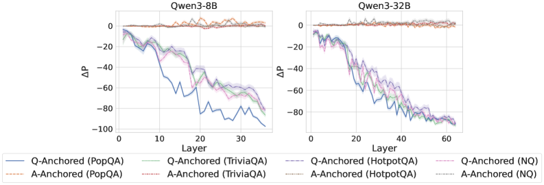
## Line Charts: Qwen3-8B and Qwen3-32B Layer-wise ΔP Analysis
### Overview
The image displays two side-by-side line charts comparing the performance change (ΔP) across model layers for two different model sizes: Qwen3-8B (left) and Qwen3-32B (right). Each chart plots multiple data series representing different question-answering (QA) datasets and two anchoring methods ("Q-Anchored" and "A-Anchored"). The overall trend shows a decline in ΔP as layer depth increases, with distinct patterns between the anchoring methods.
### Components/Axes
* **Chart Titles:**
* Left Chart: `Qwen3-8B`
* Right Chart: `Qwen3-32B`
* **Y-Axis (Both Charts):**
* Label: `ΔP`
* Scale: Linear, ranging from approximately -100 to 0. Major tick marks are at intervals of 20 (0, -20, -40, -60, -80, -100).
* **X-Axis (Both Charts):**
* Label: `Layer`
* Scale: Linear.
* Qwen3-8B: Ranges from 0 to approximately 35. Major tick marks at 0, 10, 20, 30.
* Qwen3-32B: Ranges from 0 to approximately 65. Major tick marks at 0, 20, 40, 60.
* **Legend (Bottom, spanning both charts):**
* Positioned below the x-axes of both charts.
* Contains 8 entries, each with a unique color and line style combination:
1. `Q-Anchored (PopQA)`: Solid blue line.
2. `A-Anchored (PopQA)`: Dashed orange line.
3. `Q-Anchored (TriviaQA)`: Solid green line.
4. `A-Anchored (TriviaQA)`: Dashed red line.
5. `Q-Anchored (HotpotQA)`: Solid purple line.
6. `A-Anchored (HotpotQA)`: Dashed brown line.
7. `Q-Anchored (NQ)`: Solid pink line.
8. `A-Anchored (NQ)`: Dashed gray line.
### Detailed Analysis
**Qwen3-8B Chart (Left):**
* **Trend Verification:** All eight data series begin near ΔP = 0 at Layer 0. The "A-Anchored" series (dashed lines) remain relatively flat, hovering near 0 with minor fluctuations across all layers. The "Q-Anchored" series (solid lines) show a pronounced downward trend, with ΔP decreasing (becoming more negative) as the layer number increases.
* **Data Points & Series Behavior:**
* **A-Anchored Series (All Datasets):** These lines (orange, red, brown, gray dashed) are tightly clustered near the top of the chart (ΔP ≈ 0 to -10) from Layer 0 to Layer ~35. They exhibit high-frequency, low-amplitude noise but no significant directional trend.
* **Q-Anchored Series (All Datasets):** These lines (blue, green, purple, pink solid) descend from near 0. They show a general, noisy decline.
* By Layer 10, they have dropped to a range of approximately -20 to -40.
* By Layer 20, they are in the range of approximately -40 to -70.
* By the final layer (~35), they converge in a range of approximately -70 to -95.
* **Relative Performance:** Among the Q-Anchored lines, the blue line (`PopQA`) often appears as the lowest (most negative) in the mid-to-late layers (e.g., near Layer 25-30), while the pink line (`NQ`) and green line (`TriviaQA`) are sometimes slightly higher. However, the lines are intertwined, and the differences are not consistently large.
**Qwen3-32B Chart (Right):**
* **Trend Verification:** The pattern is qualitatively similar to the 8B model but extended over more layers. "A-Anchored" series remain flat near zero. "Q-Anchored" series show a steady, noisy decline with increasing layer depth.
* **Data Points & Series Behavior:**
* **A-Anchored Series (All Datasets):** Again, the dashed lines cluster tightly near ΔP = 0 across the entire layer range (0 to ~65), showing only minor noise.
* **Q-Anchored Series (All Dataset):** The solid lines descend from 0.
* By Layer 20, they have dropped to a range of approximately -30 to -50.
* By Layer 40, they are in the range of approximately -60 to -85.
* By the final layer (~65), they converge very tightly in the range of approximately -85 to -95.
* **Convergence:** The Q-Anchored lines for the 32B model appear to converge more tightly at the final layers compared to the 8B model, forming a narrow band near -90.
### Key Observations
1. **Anchoring Method Dichotomy:** The most striking pattern is the fundamental difference between "Q-Anchored" and "A-Anchored" methods. A-Anchoring results in stable ΔP near zero across all layers, while Q-Anchoring leads to a strong, layer-dependent decrease in ΔP.
2. **Layer-Dependent Effect for Q-Anchoring:** For Q-Anchored methods, the measured effect (ΔP) is not uniform; it becomes progressively more negative in deeper layers of the network.
3. **Model Size Scaling:** The trend observed in the 8B model is replicated and extended in the larger 32B model. The rate of decline per layer appears somewhat similar, but the 32B model has more layers over which the effect accumulates.
4. **Dataset Similarity:** Within each anchoring method, the lines for different QA datasets (PopQA, TriviaQA, HotpotQA, NQ) follow very similar trajectories. While there is some separation and noise, no single dataset dramatically outperforms or underperforms the others in a consistent manner across all layers.
### Interpretation
This data suggests a fundamental difference in how "Q-Anchored" and "A-Anchored" methods interact with the internal representations of the Qwen3 language models. The stable, near-zero ΔP for A-Anchored methods implies that this anchoring technique does not induce a significant layer-wise shift in the measured property (likely related to probability or performance). In contrast, the Q-Anchored method causes a systematic change that compounds with network depth.
The layer-wise decline for Q-Anchoring could indicate that the method's effect is integrated progressively during the forward pass, or that deeper layers are more sensitive to this type of intervention. The consistency across four different QA datasets suggests this is a general phenomenon related to the model's architecture and the anchoring method, not an artifact of a specific data distribution.
The convergence of Q-Anchored lines in the final layers of the 32B model might imply a saturation point, where the maximum achievable effect of the anchoring is reached. From a technical perspective, this visualization is crucial for understanding where and how different prompting or intervention techniques (like anchoring) exert their influence within a transformer model's hierarchy. It provides empirical evidence that the impact is not uniform across layers.
DECODING INTELLIGENCE...