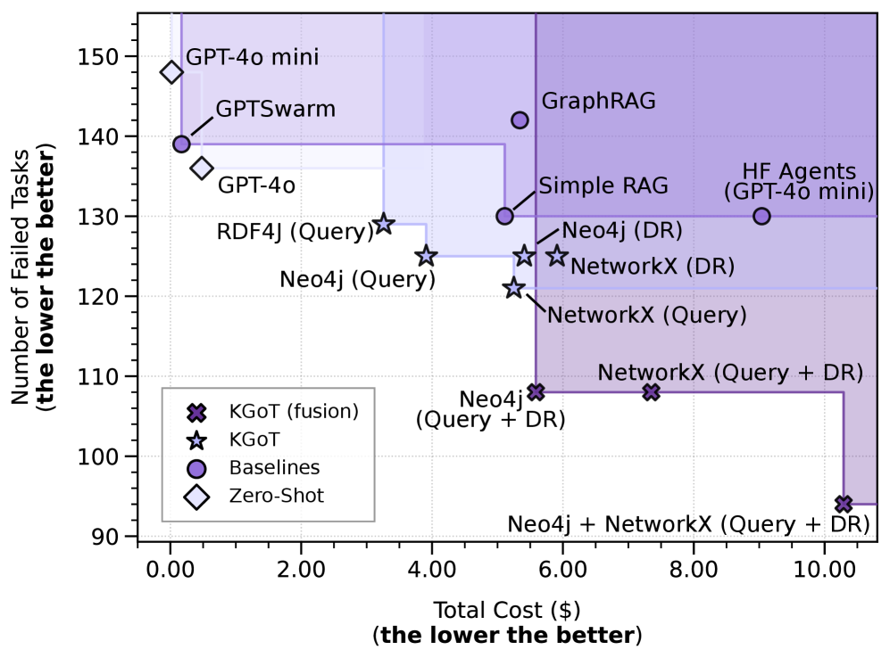
## Chart: Task Failure vs. Cost Comparison
### Overview
The image is a scatter plot comparing the number of failed tasks against the total cost for various systems. The goal is to have both values as low as possible, indicating better performance. The plot includes data points for KGOT (fusion), KGOT, Baselines, and Zero-Shot systems, with specific configurations like "Query" and "DR" (likely referring to different data retrieval methods). The plot also includes shaded regions.
### Components/Axes
* **X-axis:** Total Cost ($) (the lower the better). Scale ranges from 0.00 to 10.00, with tick marks at intervals of 2.00.
* **Y-axis:** Number of Failed Tasks (the lower the better). Scale ranges from 90 to 150, with tick marks at intervals of 10.
* **Legend (bottom-left):**
* KGOT (fusion): Represented by a dark gray "X" marker.
* KGOT: Represented by a gray star marker.
* Baselines: Represented by a purple circle marker.
* Zero-Shot: Represented by a white diamond marker.
### Detailed Analysis
* **KGOT (fusion):**
* Neo4j (Query + DR): Located at approximately (5.5, 103).
* Neo4j + NetworkX (Query + DR): Located at approximately (9.5, 93).
* **KGOT:**
* Neo4j (Query): Located at approximately (3.5, 125).
* RDF4J (Query): Located at approximately (3.5, 129).
* Neo4j (DR): Located at approximately (5.5, 125).
* NetworkX (Query): Located at approximately (5.5, 120).
* NetworkX (DR): Located at approximately (5.5, 123).
* NetworkX (Query + DR): Located at approximately (7.5, 112).
* **Baselines:**
* GPTSwarm: Located at approximately (0.5, 139).
* Simple RAG: Located at approximately (5.5, 130).
* GraphRAG: Located at approximately (5.5, 143).
* HF Agents (GPT-4o mini): Located at approximately (9.5, 130).
* **Zero-Shot:**
* GPT-4o: Located at approximately (0.5, 136).
* GPT-4o mini: Located at approximately (0.5, 148).
### Key Observations
* The KGOT (fusion) data points generally have lower failed tasks and higher costs compared to other KGOT configurations.
* The Zero-Shot data points have very low cost but high failed tasks.
* The Baseline data points are spread across the plot, with some having lower costs and others having lower failed tasks.
* There are two shaded regions, one in the top-left and one in the top-right.
### Interpretation
The plot visualizes the trade-off between the cost and the number of failed tasks for different systems. The ideal system would be located in the bottom-left corner of the plot, indicating low cost and low failed tasks.
* KGOT (fusion) appears to be more robust (fewer failed tasks) but at a higher cost.
* Zero-Shot methods are cheap but unreliable (high number of failed tasks).
* The Baseline methods show a range of performance, suggesting that their effectiveness depends on the specific configuration.
The shaded regions likely represent areas of unacceptable performance, either due to high cost or high failure rate. The systems that fall outside these regions are likely considered more viable options.