# Technical Data Extraction: Throughput Comparison Chart
## 1. Image Overview
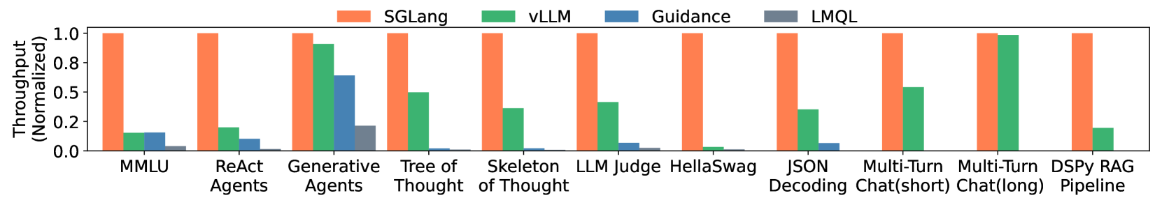
This image is a grouped bar chart comparing the normalized throughput of four different Large Language Model (LLM) inference/programming frameworks across eleven distinct benchmarks or tasks.
## 2. Component Isolation
### Header (Legend)
* **Location:** Top center of the image.
* **SGLang:** Orange bar (Reference baseline at 1.0).
* **vLLM:** Green bar.
* **Guidance:** Blue bar.
* **LMQL:** Grey bar.
### Main Chart Area
* **Y-Axis Label:** Throughput (Normalized)
* **Y-Axis Scale:** 0.0 to 1.0 (increments of 0.2 marked: 0.0, 0.2, 0.5, 0.8, 1.0). Note: The "0.5" marker is placed where 0.4 would typically be, and "0.8" where 0.6 would be, suggesting a non-linear or custom visual spacing, though the bars represent relative ratios.
* **X-Axis Categories (Benchmarks):**
1. MMLU
2. ReAct Agents
3. Generative Agents
4. Tree of Thought
5. Skeleton of Thought
6. LLM Judge
7. HellaSwag
8. JSON Decoding
9. Multi-Turn Chat (short)
10. Multi-Turn Chat (long)
11. DSPy RAG Pipeline
## 3. Data Extraction and Trend Analysis
**Trend Verification:** In every category, **SGLang (Orange)** maintains the maximum normalized value of 1.0. All other frameworks (**vLLM**, **Guidance**, **LMQL**) show significantly lower throughput relative to the SGLang baseline across all tested benchmarks.