## Line Chart: Model Performance Comparison
### Overview
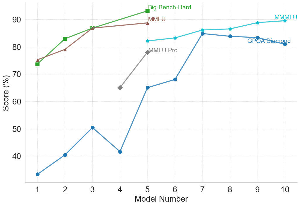
This line chart compares the performance of several models across a range of model numbers (1 to 10). The performance is measured as a score in percentage (%). The chart displays four distinct data series, each representing a different benchmark or model evaluation: Big-Bench-Hard, MMLU, MMLU Pro, and GPQA Diamond.
### Components/Axes
* **X-axis:** "Model Number" ranging from 1 to 10.
* **Y-axis:** "Score (%)" ranging from 30 to 90.
* **Data Series:**
* Big-Bench-Hard (Green)
* MMLU (Brown)
* MMLU Pro (Gray)
* GPQA Diamond (Teal)
* **Legend:** Located in the top-right corner of the chart, associating colors with each data series.
### Detailed Analysis
Let's analyze each data series individually:
* **Big-Bench-Hard (Green):** The line starts at approximately 73% at Model Number 1, increases to around 86% at Model Number 3, and then plateaus around 84-86% for the remaining model numbers.
* **MMLU (Brown):** The line begins at approximately 76% at Model Number 1, increases steadily to around 87% at Model Number 3, and then remains relatively stable between 85% and 88% for the rest of the model numbers.
* **MMLU Pro (Gray):** This line shows a significant increase from approximately 65% at Model Number 1 to around 79% at Model Number 5. It then rises sharply to approximately 87% at Model Number 7, and remains relatively constant around 86-88% for the remaining model numbers.
* **GPQA Diamond (Teal):** This line exhibits a more volatile pattern. It starts at approximately 33% at Model Number 1, increases to around 50% at Model Number 3, then drops to approximately 42% at Model Number 4. It then experiences a substantial increase to around 84% at Model Number 7, and fluctuates between 82% and 86% for the remaining model numbers.
Here's a more detailed breakdown of approximate values at each model number:
| Model Number | Big-Bench-Hard (%) | MMLU (%) | MMLU Pro (%) | GPQA Diamond (%) |
|--------------|--------------------|----------|--------------|------------------|
| 1 | 73 | 76 | 65 | 33 |
| 2 | 78 | 81 | 68 | 41 |
| 3 | 86 | 87 | 72 | 50 |
| 4 | 86 | 86 | 67 | 42 |
| 5 | 86 | 86 | 79 | 63 |
| 6 | 85 | 86 | 82 | 72 |
| 7 | 85 | 87 | 87 | 84 |
| 8 | 84 | 86 | 87 | 83 |
| 9 | 84 | 88 | 87 | 82 |
| 10 | 84 | 88 | 86 | 86 |
### Key Observations
* MMLU and Big-Bench-Hard consistently achieve the highest scores, generally above 80%, across all model numbers.
* GPQA Diamond starts with the lowest scores but shows the most significant improvement, reaching comparable levels to other benchmarks by Model Number 7.
* MMLU Pro demonstrates a delayed but substantial increase in performance, particularly between Model Numbers 5 and 7.
* The performance of all models appears to plateau after Model Number 7, indicating diminishing returns from further model development.
### Interpretation
The chart suggests that the models are improving in performance as the model number increases, likely representing iterative development or training. The different benchmarks (Big-Bench-Hard, MMLU, MMLU Pro, and GPQA Diamond) assess different aspects of model capabilities. The initial lower scores of GPQA Diamond, followed by a rapid increase, could indicate that this benchmark requires specific model characteristics that are developed later in the process. The plateauing of all curves after Model Number 7 suggests that the models are approaching a performance limit or that further improvements require fundamentally different approaches. The consistent high performance of MMLU and Big-Bench-Hard suggests these benchmarks are relatively easier to optimize for, or that the models are inherently strong in the areas they assess. The differences in the trajectories of the lines highlight the varying sensitivities of each benchmark to model improvements.