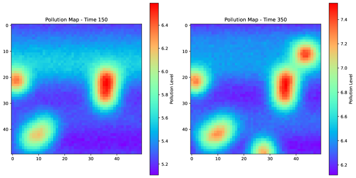
## Heatmap Comparison: Pollution Maps at Time 150 and Time 350
### Overview
The image displays two side-by-side heatmaps visualizing spatial pollution levels at two distinct time points. The left heatmap is titled "Pollution Map - Time 150" and the right is titled "Pollution Map - Time 350". Both maps use a color gradient to represent pollution intensity, with a dedicated color bar scale for each. The visualization suggests a comparison of pollution distribution and intensity over time.
### Components/Axes
* **Titles:**
* Left Map: "Pollution Map - Time 150"
* Right Map: "Pollution Map - Time 350"
* **Axes:** Both maps share identical unlabeled spatial axes. The horizontal (X) and vertical (Y) axes are marked with numerical ticks from 0 to 40, in increments of 10. These likely represent spatial coordinates (e.g., grid cells, distance in km).
* **Color Bars (Legends):**
* **Left Map (Time 150):** A vertical color bar is positioned to the right of the heatmap. It is labeled "Pollution level". The scale ranges from approximately **5.2** (dark blue/purple) at the bottom to **6.4** (dark red) at the top. Key intermediate markers are at 5.4, 5.6, 5.8, 6.0, and 6.2.
* **Right Map (Time 350):** A vertical color bar is positioned to the right of its heatmap. It is also labeled "Pollution level". The scale ranges from approximately **6.2** (dark blue/purple) at the bottom to **7.4** (dark red) at the top. Key intermediate markers are at 6.4, 6.6, 6.8, 7.0, and 7.2.
* **Spatial Layout:** The two heatmaps are placed horizontally adjacent. Each heatmap is a square grid. The color bars are placed immediately to the right of their respective maps.
### Detailed Analysis
**Pollution Map - Time 150 (Left):**
* **Trend:** Pollution is concentrated in three distinct, localized hotspots against a background of lower levels.
* **Data Points & Distribution:**
1. **Hotspot 1 (Center-Right):** The most intense area, centered approximately at coordinates (X=35, Y=25). The core color is dark red, indicating a pollution level of **~6.4**. This hotspot is vertically elongated.
2. **Hotspot 2 (Left Edge):** Located near (X=0, Y=20). The core color is orange-red, indicating a level of **~6.2**.
3. **Hotspot 3 (Bottom-Left):** Located near (X=10, Y=40). The core color is yellow-orange, indicating a level of **~6.0**.
* **Background:** The majority of the map area, especially the top half and the region between hotspots, is colored in shades of blue and cyan, indicating lower pollution levels between **~5.2 and 5.6**.
**Pollution Map - Time 350 (Right):**
* **Trend:** Pollution levels are significantly higher overall, hotspots have intensified, expanded, and new ones have appeared. The spatial distribution is more complex.
* **Data Points & Distribution:**
1. **Hotspot 1 (Center-Right):** The original hotspot at (X=35, Y=25) has intensified and expanded. Its core is now a deeper red, indicating a level of **~7.4**.
2. **Hotspot 2 (Left Edge):** The hotspot at (X=0, Y=20) remains, with a core level of **~7.0** (orange-red).
3. **Hotspot 3 (Bottom-Left):** The hotspot at (X=10, Y=40) has intensified, with a core level of **~7.0** (orange-red).
4. **New Hotspot 4 (Top-Right):** A new, intense hotspot has emerged near (X=40, Y=10). Its core is dark red, indicating a level of **~7.4**.
5. **New Hotspot 5 (Bottom-Center):** Another new, smaller hotspot is visible near (X=30, Y=45). Its core is orange, indicating a level of **~6.8**.
* **Background:** The background pollution level has risen. The lowest values (dark blue/purple) are now at **~6.2**, which was near the *maximum* of the previous map. Most of the background is in the cyan to green range (**~6.4 to 6.8**).
### Key Observations
1. **Systemic Increase:** The entire pollution baseline has risen dramatically. The minimum value at Time 350 (~6.2) is equivalent to the near-maximum value at Time 150.
2. **Hotspot Intensification & Proliferation:** Existing pollution sources have become more severe, and at least two new significant sources have appeared by Time 350.
3. **Spatial Spread:** The pollution is no longer confined to three isolated points; the areas of elevated pollution are larger and beginning to connect, especially on the right side of the map.
4. **Scale Change:** The color bar scales are different, which is critical for accurate comparison. Direct visual color comparison is misleading without referencing the numerical scales.
### Interpretation
This visualization demonstrates a significant degradation in environmental quality over the time interval from T=150 to T=350. The data suggests:
* **Worsening Conditions:** There is a clear and substantial increase in pollution concentration across the entire monitored area.
* **Source Activity:** The intensification of existing hotspots implies that primary pollution sources are emitting at a higher rate or that accumulation is occurring. The emergence of new hotspots suggests the activation of new pollution sources or the migration/formation of pollution plumes.
* **Potential for Coalescence:** The expansion of hotspots indicates a risk that separate pollution plumes may merge, leading to larger, contiguous zones of severe contamination.
* **Investigative Lead:** A technical investigator would use this map to prioritize field measurements at the new and intensified hotspot coordinates (e.g., (40,10), (35,25)) to identify the responsible sources or processes. The uniform rise in background levels might indicate a systemic issue like increased regional emissions or reduced atmospheric dispersion.