## Heatmap: Pollution Maps at Time 150 and Time 350
### Overview
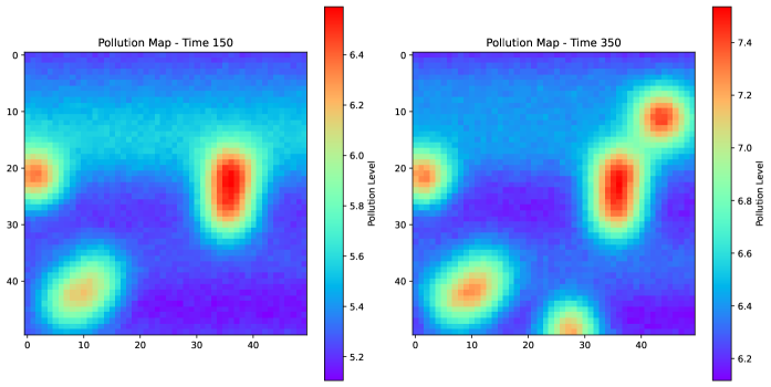
The image presents two heatmaps side-by-side, visualizing pollution levels at different time points (Time 150 and Time 350). The heatmaps use a color gradient to represent pollution levels, with cooler colors (purple/blue) indicating lower levels and warmer colors (yellow/red) indicating higher levels. The heatmaps show the spatial distribution of pollution, with distinct "hotspots" of higher pollution levels.
### Components/Axes
* **Titles:**
* Left Heatmap: "Pollution Map - Time 150"
* Right Heatmap: "Pollution Map - Time 350"
* **Axes:** Both heatmaps share the same axes.
* X-axis: Ranges from 0 to 40 in increments of 10.
* Y-axis: Ranges from 0 to 40 in increments of 10.
* **Colorbar/Legend:**
* Left Heatmap: "Pollution Level" ranges from 5.2 (purple) to 6.4 (red) in increments of 0.2.
* Right Heatmap: "Pollution Level" ranges from 6.2 (purple) to 7.4 (red) in increments of 0.2.
### Detailed Analysis
**Left Heatmap (Time 150):**
* **Background Pollution:** The general background pollution level is relatively low, indicated by the blue/purple color. The background pollution level is approximately 5.4.
* **Pollution Hotspots:** There are three distinct hotspots:
* Top-left: Located around coordinates (0, 20), with a pollution level of approximately 6.0.
* Center-right: Located around coordinates (40, 25), with a pollution level of approximately 6.4.
* Bottom-left: Located around coordinates (10, 45), with a pollution level of approximately 5.8.
* **Trend:** The pollution is concentrated in specific areas, with a gradual decrease in pollution levels away from the hotspots.
**Right Heatmap (Time 350):**
* **Background Pollution:** The general background pollution level is higher than in the left heatmap, indicated by the blue color. The background pollution level is approximately 6.4.
* **Pollution Hotspots:** There are three distinct hotspots:
* Top-left: Located around coordinates (0, 20), with a pollution level of approximately 6.8.
* Center-right: Located around coordinates (40, 25), with a pollution level of approximately 7.4.
* Bottom-left: Located around coordinates (10, 45), with a pollution level of approximately 7.0.
* **Trend:** The pollution is concentrated in specific areas, with a gradual decrease in pollution levels away from the hotspots. The hotspots appear to have intensified compared to Time 150.
### Key Observations
* The overall pollution level has increased from Time 150 to Time 350.
* The locations of the pollution hotspots remain relatively consistent between the two time points.
* The intensity of the pollution hotspots has increased from Time 150 to Time 350.
### Interpretation
The heatmaps suggest that pollution levels have increased over time, and the existing pollution sources have intensified. The consistent location of the hotspots indicates that the sources of pollution are likely stationary. The increase in background pollution suggests a general increase in pollution across the entire area. This data could be used to identify and address the sources of pollution, as well as to monitor the effectiveness of pollution control measures.