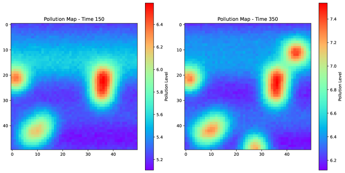
## Heatmaps: Pollution Maps at Time 150 and Time 350
### Overview
The image presents two heatmaps, side-by-side, visualizing pollution levels. The left heatmap represents pollution at Time 150, while the right heatmap shows pollution at Time 350. Both maps use a color gradient to represent pollution levels, with warmer colors (reds and oranges) indicating higher pollution and cooler colors (blues and purples) indicating lower pollution. The maps appear to represent a 2D space, likely a geographical area, discretized into a grid.
### Components/Axes
Both heatmaps share the following characteristics:
* **Title:** "Pollution Map - Time [Value]" (Time 150 for the left, Time 350 for the right). Positioned at the top-center of each map.
* **Axes:** Both axes range from 0 to 49. The x-axis is horizontal, and the y-axis is vertical. They are not explicitly labeled, but represent coordinates within the mapped area.
* **Colorbar:** A vertical colorbar is present on the right side of each heatmap.
* **Left Heatmap (Time 150):** Colorbar ranges from approximately 5.2 (purple) to 6.4 (red). Labeled "Pollution Level".
* **Right Heatmap (Time 350):** Colorbar ranges from approximately 6.2 (purple) to 7.4 (red). Labeled "Pollution Level".
### Detailed Analysis or Content Details
**Left Heatmap (Time 150):**
* **Dominant Feature:** A significant concentration of high pollution (red/orange) is located around coordinates (25, 15).
* **Secondary Feature:** A smaller area of moderate pollution (yellow/orange) is present near coordinates (5, 40).
* **Low Pollution Areas:** The bottom-left corner (around 0,0) and the top-right corner (around 45, 45) exhibit lower pollution levels (blue/purple).
* **Approximate Pollution Levels (based on colorbar):**
* (25, 15): ~6.2 - 6.4
* (5, 40): ~5.8 - 6.0
* (0, 0): ~5.2 - 5.4
* (45, 45): ~5.4 - 5.6
**Right Heatmap (Time 350):**
* **Dominant Features:** Two major concentrations of high pollution (red/orange) are visible. One is around (25, 15), similar to the left heatmap, but slightly more dispersed. The other is around (40, 5).
* **Secondary Feature:** A moderate pollution area (yellow/orange) is present near coordinates (5, 40).
* **Low Pollution Areas:** The bottom-right corner (around 45, 40) exhibits lower pollution levels (blue/purple).
* **Approximate Pollution Levels (based on colorbar):**
* (25, 15): ~6.8 - 7.0
* (40, 5): ~7.0 - 7.2
* (5, 40): ~6.4 - 6.6
* (45, 40): ~6.2 - 6.4
### Key Observations
* **Pollution Increase:** Overall pollution levels appear to have increased from Time 150 to Time 350. The colorbar range shifted upwards (5.2-6.4 to 6.2-7.4).
* **Persistent Hotspot:** The area around (25, 15) remains a hotspot for pollution in both timeframes, although the intensity has increased.
* **New Hotspot:** A new significant pollution concentration emerged around (40, 5) between Time 150 and Time 350.
* **Spatial Distribution:** The pollution distribution is not uniform; it's clustered in specific areas.
### Interpretation
The data suggests a dynamic pollution pattern. The increase in overall pollution levels between Time 150 and Time 350 indicates a worsening environmental situation. The persistence of the hotspot at (25, 15) suggests a consistent pollution source in that area. The emergence of a new hotspot at (40, 5) implies a new pollution source or a shift in pollution patterns.
The heatmaps likely represent a simplified model of pollution distribution. The grid-like structure suggests that the area is being monitored at discrete points. The lack of axis labels makes it difficult to determine the geographical context, but the data provides valuable insights into the spatial and temporal dynamics of pollution. Further investigation would be needed to identify the sources of pollution and understand the factors driving the observed changes. The difference in colorbar ranges between the two maps is significant, indicating a substantial increase in pollution levels over the 200-unit time difference.