## Heatmap: Pollution Maps at Time 150 and Time 350
### Overview
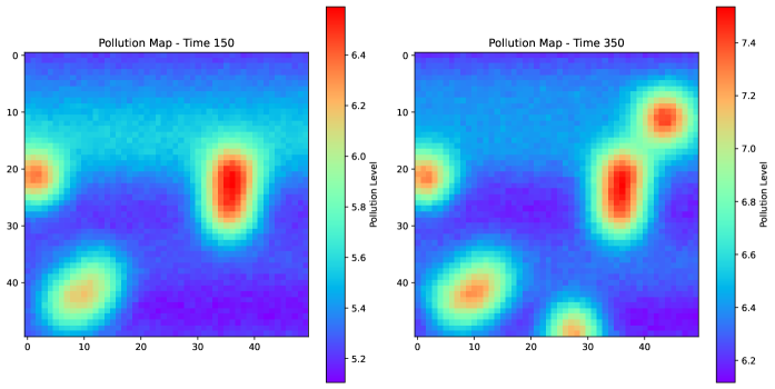
Two side-by-side heatmaps depict pollution levels across a 2D spatial grid at two distinct time points (150 and 350). Pollution intensity is represented by color gradients, with red indicating higher levels and blue/purple lower levels. The maps show spatial distribution patterns and temporal evolution of pollution.
### Components/Axes
- **X-axis**: Labeled 0 to 40 (spatial coordinate, no units specified).
- **Y-axis**: Labeled 0 to 40 (spatial coordinate, no units specified).
- **Color Legend**:
- **Time 150**: Ranges from 5.2 (purple) to 6.4 (red).
- **Time 350**: Ranges from 6.2 (purple) to 7.4 (red).
- **Legend Position**: Right-aligned for both heatmaps.
### Detailed Analysis
#### Time 150 Heatmap
- **Pollution Levels**:
- Central region (X=25, Y=20): Peak pollution at ~6.4 (red).
- Lower-left quadrant (X=10, Y=30): Moderate pollution (~5.8–6.0).
- Upper-right quadrant (X=35, Y=40): Moderate pollution (~5.8–6.0).
- **Distribution**: Three distinct hotspots with gradual decay toward cooler colors.
#### Time 350 Heatmap
- **Pollution Levels**:
- Central region (X=25, Y=20): Peak pollution at ~7.4 (dark red).
- Lower-left quadrant (X=10, Y=10): New hotspot (~6.8–7.0).
- Upper-right quadrant (X=35, Y=15): Moderate pollution (~6.6–6.8).
- Lower-center (X=15, Y=35): Moderate pollution (~6.6–6.8).
- **Distribution**: Four hotspots, with increased intensity and spread compared to Time 150.
### Key Observations
1. **Temporal Increase**: Pollution levels rise by ~1.0–1.2 units across all regions between Time 150 and 350.
2. **Hotspot Evolution**:
- The central hotspot (X=25, Y=20) intensifies significantly.
- A new hotspot emerges at (X=10, Y=10) in Time 350.
3. **Spatial Spread**: Pollution spreads to adjacent regions (e.g., X=15, Y=35 in Time 350).
### Interpretation
- **Pollution Dynamics**: The data suggests a growing pollution source at the central location (X=25, Y=20), possibly due to industrial activity or environmental factors. The emergence of a new hotspot at (X=10, Y=10) in Time 350 indicates either a new pollution source or diffusion from existing sources.
- **Temporal Correlation**: The uniform increase in pollution levels across the grid implies a systemic driver (e.g., policy changes, weather patterns, or industrial expansion).
- **Anomalies**: The rapid intensification of the central hotspot warrants further investigation into localized factors (e.g., waste disposal, emissions).
### Spatial Grounding
- **Legend Alignment**: Colors in the heatmaps match the legend gradients exactly (e.g., red at X=25, Y=20 in Time 350 corresponds to 7.4).
- **Axis Consistency**: Both heatmaps use identical spatial axes (0–40), enabling direct comparison.
### Content Details
- **Time 150**:
- Pollution levels: 5.2–6.4.
- Hotspots: (10,30), (25,20), (35,40).
- **Time 350**:
- Pollution levels: 6.2–7.4.
- Hotspots: (10,10), (15,35), (25,20), (35,15).
### Key Trends
- **Increasing Intensity**: All regions show higher pollution in Time 350.
- **Hotspot Migration**: The lower-left hotspot shifts from (10,30) to (10,10), suggesting downward movement.
- **New Source**: The (10,10) hotspot in Time 350 may indicate a new pollution origin.
### Final Notes
The heatmaps provide a clear visualization of pollution evolution over time, highlighting both quantitative increases and spatial redistribution. Further analysis could correlate these patterns with environmental or socioeconomic data to identify root causes.