## Diagram: Directed Graph and 3D Surface Plot
### Overview
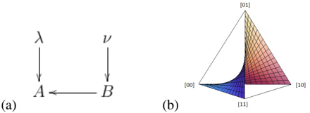
The image contains two distinct technical diagrams labeled (a) and (b). Diagram (a) is a simple directed graph showing relationships between four elements using Greek letters and Latin characters. Diagram (b) is a three-dimensional surface plot on a triangular domain, with vertices labeled with binary pairs and a colored surface indicating a continuous function or distribution.
### Components/Axes
**Diagram (a):**
- **Elements:** Four nodes labeled with the Greek letters λ (lambda) and ν (nu), and the Latin letters A and B.
- **Connections:** Three directed arrows:
1. A vertical arrow from λ down to A.
2. A vertical arrow from ν down to B.
3. A horizontal arrow from B to A.
- **Label:** The subfigure is labeled "(a)" at the bottom left.
**Diagram (b):**
- **Plot Type:** A 3D surface plot projected onto a 2D plane, forming a triangular (tetrahedral) shape.
- **Vertices/Labels:** The four corners of the triangular domain are labeled with binary pairs:
- Bottom-left vertex: `[00]`
- Bottom-right vertex: `[10]`
- Top vertex: `[01]`
- Bottom-center vertex: `[11]`
- **Surface:** A continuous, curved surface is plotted within this domain. It is overlaid with a grid mesh.
- **Color Gradient:** The surface uses a color map that transitions from blue (near the `[00]` vertex) through purple and magenta to red (near the `[10]` vertex). The area near `[01]` appears lighter, possibly white or light gray.
- **Label:** The subfigure is labeled "(b)" at the bottom left.
### Detailed Analysis
**Diagram (a) - Component Isolation:**
This is a pure structural diagram with no numerical data. It defines a set of directed relationships:
- **Region 1 (Top):** Contains the source nodes λ and ν.
- **Region 2 (Bottom):** Contains the target nodes A and B.
- **Flow:** The flow is strictly top-to-bottom (λ→A, ν→B) and right-to-left (B→A). This creates a dependency where A is influenced by both λ (directly) and B (indirectly, via ν).
**Diagram (b) - Spatial Grounding & Trend Verification:**
- **Spatial Layout:** The legend (vertex labels) is placed at the four extreme points of the plot area. The colored surface is contained entirely within the bounds defined by these labels.
- **Visual Trend:** The surface shows a clear gradient trend. Starting from the `[00]` vertex (blue), the surface value (represented by color and height) increases as one moves towards the `[10]` vertex (red). The path towards `[01]` shows a different, possibly lower or distinct, profile. The surface appears to dip or form a valley near the `[11]` vertex.
- **Data Points:** No discrete data points are plotted; the information is conveyed entirely through the continuous surface and its color mapping. The grid lines help visualize the curvature and slope of the surface across the domain.
### Key Observations
1. **Complementary Diagrams:** Diagram (a) is abstract and symbolic, defining a logical structure. Diagram (b) is concrete and visual, representing a mathematical or statistical function over a defined space.
2. **Binary State Space:** The labels in diagram (b) (`[00]`, `[01]`, `[10]`, `[11]`) strongly suggest the plot represents a function over the four possible states of a two-bit system or a two-category variable.
3. **Color as Data:** In diagram (b), color is not merely decorative but is a primary channel for conveying the magnitude or value of the plotted function, with blue representing low values and red representing high values along the `[00]` to `[10]` axis.
4. **No Overlapping Text:** All text labels are clearly positioned at the vertices or as subfigure captions, with no overlap or ambiguity.
### Interpretation
This composite image likely illustrates a concept from fields like information theory, quantum computing, or statistical modeling.
* **Diagram (a)** represents a **causal or dependency model**. It suggests that outcome `A` is determined by a direct factor `λ` and an indirect factor mediated through `B` (which is itself determined by `ν`). This is a common structure in path analysis or structural equation modeling.
* **Diagram (b)** visualizes a **function or probability distribution over a joint binary state space**. The four vertices represent the four possible combined states of two binary variables (e.g., two qubits, two binary features). The colored surface likely represents a key metric such as:
* **Probability Density:** The likelihood of the system being in a state near a given point.
* **Energy Landscape:** In optimization or physics, showing minima and maxima.
* **Correlation or Mutual Information:** Showing the strength of relationship between the two variables across their state space.
* **A Payoff or Utility Function:** In game theory or decision science.
**Connection:** The most plausible link is that diagram (a) defines the **underlying model** (e.g., `A` and `B` are random variables influenced by parameters `λ` and `ν`), and diagram (b) shows the **resulting joint distribution or property** of `A` and `B` (where `[00]` might represent `A=0, B=0`, etc.). The gradient from blue (`[00]`) to red (`[10]`) indicates that the plotted quantity is highest when the first variable is 1 and the second is 0, suggesting an asymmetric relationship or a specific correlation pattern defined by the model in (a).