## Line Chart: Mean Pass Rate vs. Mean Number of Tokens Generated
### Overview
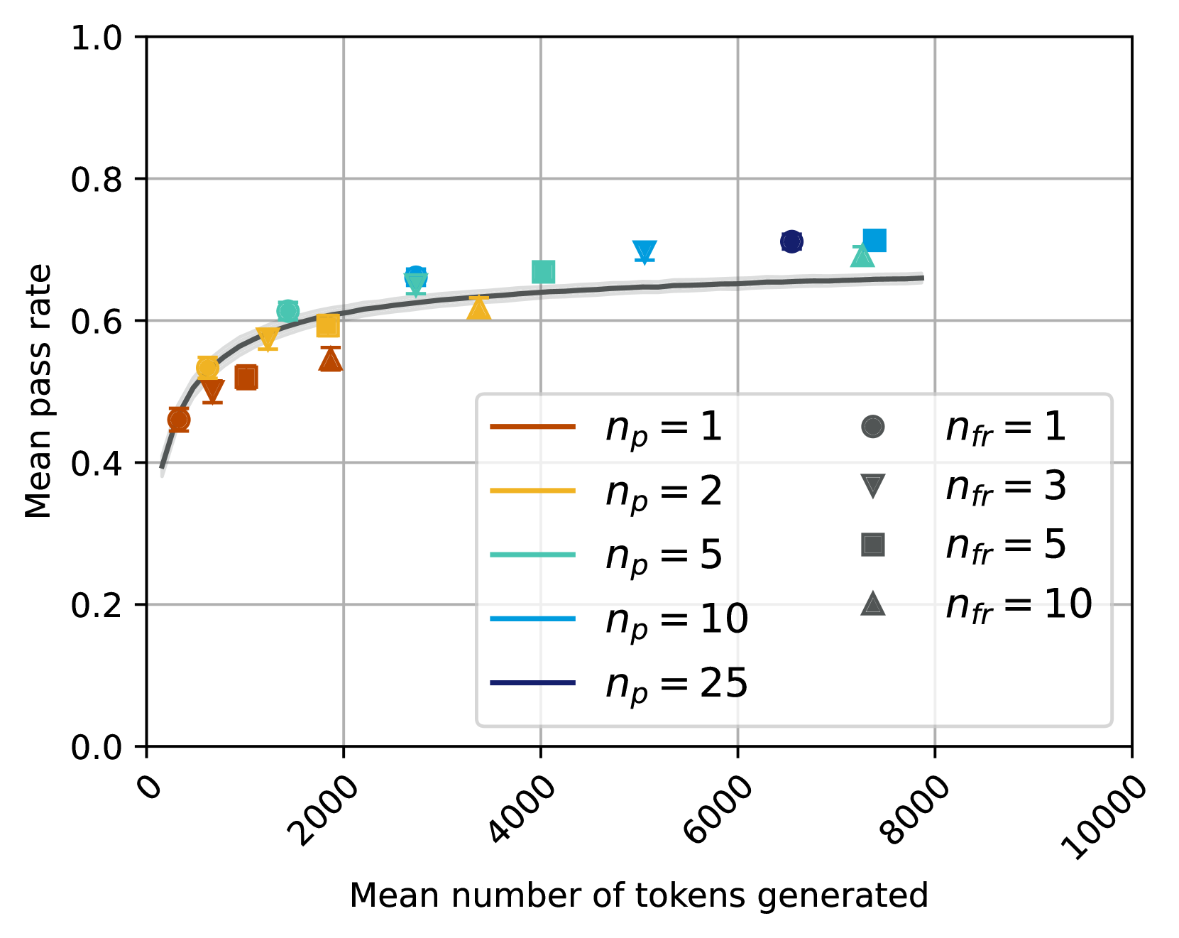
The image is a line chart displaying the relationship between the mean pass rate and the mean number of tokens generated. The chart includes multiple data series, each representing a different configuration of parameters denoted as 'np' and 'nfr'. The x-axis represents the mean number of tokens generated, ranging from 0 to 10000. The y-axis represents the mean pass rate, ranging from 0.0 to 1.0. The chart includes a legend to distinguish between the different data series.
### Components/Axes
* **X-axis:** Mean number of tokens generated, ranging from 0 to 10000 in increments of 2000.
* **Y-axis:** Mean pass rate, ranging from 0.0 to 1.0 in increments of 0.2.
* **Title (Y-axis):** Mean pass rate
* **Title (X-axis):** Mean number of tokens generated
* **Legend:** Located on the right side of the chart.
* `np = 1` (Brown line)
* `np = 2` (Yellow line)
* `np = 5` (Light Blue line)
* `np = 10` (Blue line)
* `np = 25` (Dark Blue line)
* `nfr = 1` (Dark Gray circle markers)
* `nfr = 3` (Dark Gray downward triangle markers)
* `nfr = 5` (Dark Gray square markers)
* `nfr = 10` (Dark Gray upward triangle markers)
### Detailed Analysis
* **np = 1 (Brown line):** The line starts at approximately (0, 0.45) and increases rapidly to approximately (2000, 0.58), then plateaus around 0.65.
* **np = 2 (Yellow line):** The line starts at approximately (0, 0.4) and increases rapidly to approximately (2000, 0.60), then plateaus around 0.65.
* **np = 5 (Light Blue line):** The line starts at approximately (0, 0.4) and increases rapidly to approximately (2000, 0.62), then plateaus around 0.65.
* **np = 10 (Blue line):** The line starts at approximately (0, 0.4) and increases rapidly to approximately (2000, 0.62), then plateaus around 0.65.
* **np = 25 (Dark Blue line):** The line starts at approximately (0, 0.4) and increases rapidly to approximately (2000, 0.62), then plateaus around 0.65.
* **nfr = 1 (Dark Gray circle markers):** Data points are scattered. Approximate values: (200, 0.46), (6500, 0.72).
* **nfr = 3 (Dark Gray downward triangle markers):** Data points are scattered. Approximate values: (1500, 0.55), (5000, 0.70).
* **nfr = 5 (Dark Gray square markers):** Data points are scattered. Approximate values: (1500, 0.58), (7500, 0.71).
* **nfr = 10 (Dark Gray upward triangle markers):** Data points are scattered. Approximate values: (1500, 0.54), (8000, 0.69).
### Key Observations
* The mean pass rate generally increases with the mean number of tokens generated, but the rate of increase diminishes as the number of tokens increases.
* The lines for different 'np' values (1, 2, 5, 10, 25) converge to a similar plateau level of mean pass rate.
* The scattered data points for 'nfr' values (1, 3, 5, 10) appear to be distributed around the plateau level of the 'np' lines.
### Interpretation
The data suggests that increasing the mean number of tokens generated initially leads to a significant improvement in the mean pass rate. However, after a certain point (around 2000 tokens), the improvement becomes marginal, and the pass rate plateaus. The different 'np' configurations seem to have a similar effect on the pass rate, as their lines converge. The 'nfr' values, represented by scattered data points, indicate the variability or distribution of the pass rate around the plateau level achieved by the 'np' configurations. The chart demonstrates that there is a diminishing return in increasing the number of tokens generated beyond a certain threshold, and the 'np' parameter has a limited impact on the final pass rate.