## Heatmap: Mean Passage Rate
### Overview
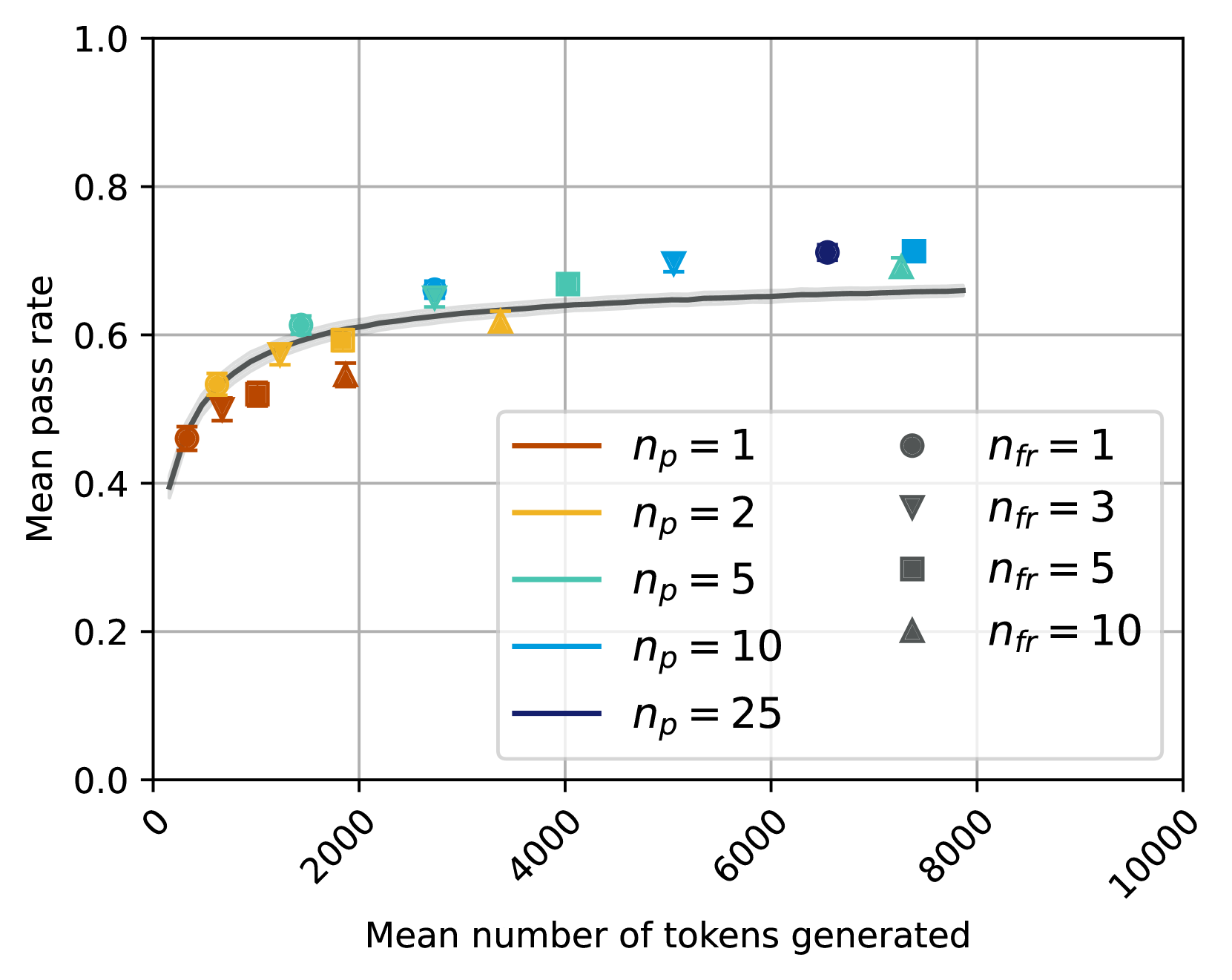
The heatmap illustrates the mean passage rate of different models as the mean number of tokens generated increases. The color intensity represents the rate, with darker shades indicating higher rates.
### Components/Axes
- **X-axis**: Mean number of tokens generated
- **Y-axis**: Mean passage rate
- **Legend**: Different models with corresponding colors and symbols
### Detailed Analysis or ### Content Details
The heatmap shows a general trend where the mean passage rate increases with the mean number of tokens generated. Each model has a distinct color and symbol, indicating different parameters (n_p and n_fr). The models are as follows:
- **n_p = 1**: Dark red, filled circle
- **n_p = 2**: Dark orange, filled triangle
- **n_p = 5**: Dark green, filled square
- **n_p = 10**: Dark blue, filled diamond
- **n_p = 25**: Dark purple, filled pentagon
### Key Observations
- **n_p = 1**: The model with the highest mean passage rate, especially noticeable at higher token counts.
- **n_p = 2**: Shows a moderate increase in passage rate.
- **n_p = 5**: Exhibits a steady increase in passage rate.
- **n_p = 10**: Shows a slight increase in passage rate.
- **n_p = 25**: The model with the lowest mean passage rate, especially noticeable at lower token counts.
### Interpretation
The data suggests that as the mean number of tokens generated increases, the mean passage rate also increases for all models. The model with n_p = 1 consistently shows the highest passage rate, indicating it might be more efficient or better at handling larger token counts. The model with n_p = 2 shows a moderate improvement, while n_p = 5 and n_p = 10 show steady increases. The model with n_p = 25 shows the lowest passage rate, which might indicate it is less efficient or better at handling smaller token counts. This information is crucial for selecting the most appropriate model for a given task based on the expected token count.