## Line Charts: Normalized Citation Metrics for Four Researchers
### Overview
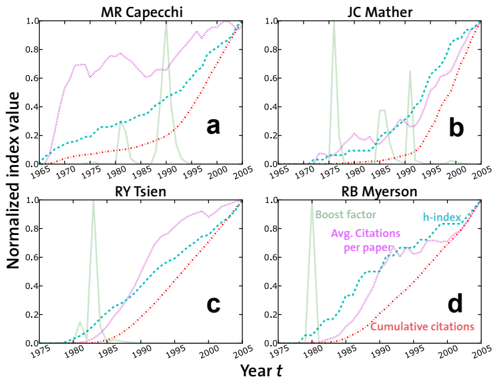
The image displays four line charts arranged in a 2x2 grid, each tracking the normalized citation metrics of a different Nobel laureate in Physiology or Medicine over time (1965-2005). The charts compare four distinct bibliometric indices for each researcher.
### Components/Axes
* **Overall Structure:** Four subplots labeled **a**, **b**, **c**, and **d** in the bottom-right corner of each chart.
* **Common Y-Axis (Left):** Label: `Normalized index value`. Scale: Linear, from `0.0` to `1.0` in increments of `0.2`.
* **Common X-Axis (Bottom):** Label: `Year t`. Scale: Linear, from `1965` to `2005` in increments of 5 years.
* **Subplot Titles (Top Center):**
* a: `MR Capecchi`
* b: `JC Mather`
* c: `RY Tsien`
* d: `RB Myerson`
* **Legend (Located in subplot d, top-left quadrant):**
* `Boost factor` (Solid green line)
* `Avg. Citations per paper` (Pink dotted line)
* `h-index` (Blue dashed line)
* `Cumulative citations` (Red dotted line)
### Detailed Analysis
**Chart a: MR Capecchi**
* **Boost factor (Green):** Shows two major, sharp peaks. The first peak reaches ~0.95 around 1978. The second, broader peak reaches ~1.0 around 1990. It drops to near zero between peaks and after 1995.
* **Avg. Citations per paper (Pink):** Rises rapidly from 1965, reaching ~0.7 by 1975. It fluctuates between 0.6 and 0.8 until the mid-1990s, then climbs steadily to 1.0 by 2005.
* **h-index (Blue):** Shows a steady, near-linear increase from 1965, reaching ~0.5 by 1990 and 1.0 by 2005.
* **Cumulative citations (Red):** Begins rising later than the others, around 1975. It follows a smooth, accelerating curve, reaching 1.0 by 2005.
**Chart b: JC Mather**
* **Boost factor (Green):** Exhibits one extremely sharp, narrow peak reaching 1.0 around 1974. It remains near zero for the rest of the timeline.
* **Avg. Citations per paper (Pink):** Shows a low, fluctuating baseline until the mid-1980s, then begins a steady climb, reaching 1.0 by 2005.
* **h-index (Blue):** Follows a smooth, accelerating upward curve, starting its rise around 1975 and reaching 1.0 by 2005.
* **Cumulative citations (Red):** Begins its ascent around 1980, following a smooth curve similar to the h-index but slightly lagging, reaching 1.0 by 2005.
**Chart c: RY Tsien**
* **Boost factor (Green):** Has one major, sharp peak reaching 1.0 around 1982. It shows smaller fluctuations before and after this peak.
* **Avg. Citations per paper (Pink):** Rises sharply in the late 1970s, reaching a plateau of ~0.8 by 1985. It stays near this level until the late 1990s, then rises to 1.0.
* **h-index (Blue):** Shows a steady, linear increase from the mid-1970s, reaching 1.0 by 2005.
* **Cumulative citations (Red):** Begins rising around 1980, following a smooth, accelerating curve to 1.0 by 2005.
**Chart d: RB Myerson (Contains Legend)**
* **Boost factor (Green):** Shows one major, sharp peak reaching 1.0 around 1982. It has a smaller secondary peak around 1994.
* **Avg. Citations per paper (Pink):** Remains very low until the early 1980s, then begins a steady, linear climb to 1.0 by 2005.
* **h-index (Blue):** Follows a smooth, accelerating upward curve, starting its rise around 1980 and reaching 1.0 by 2005.
* **Cumulative citations (Red):** Begins its ascent around 1982, following a smooth curve that closely tracks the h-index, reaching 1.0 by 2005.
### Key Observations
1. **Boost Factor Anomaly:** The "Boost factor" metric behaves fundamentally differently from the others. It is characterized by one or two sharp, transient peaks (likely corresponding to a single highly influential paper or discovery) and is near zero at all other times.
2. **Convergence by 2005:** All four metrics for all four researchers are normalized to reach a value of 1.0 by the final year, 2005. This is a normalization artifact, not a natural convergence.
3. **Metric Trajectories:** The "h-index" and "Cumulative citations" show smooth, monotonically increasing curves for all researchers, reflecting their cumulative nature. "Avg. Citations per paper" can show more volatility and plateaus.
4. **Temporal Shifts:** The onset of significant growth for the cumulative metrics (h-index, Cumulative citations) varies by researcher, occurring roughly between 1975 and 1982, which may correlate with the timing of their major contributions.
### Interpretation
This visualization compares the *shape* of impact over a career for four distinguished scientists, using normalized indices. The data suggests:
* **Different Impact Profiles:** The charts reveal distinct "impact signatures." JC Mather's profile (b) is dominated by a single, early blockbuster paper (massive Boost factor spike), after which his average citations and h-index grow steadily. In contrast, MR Capecchi (a) shows evidence of two major impactful periods.
* **Nature of the Metrics:** The stark contrast between the volatile "Boost factor" and the smooth cumulative curves illustrates the difference between measuring a singular "hit" versus sustained, accumulating influence. The h-index and cumulative citations are shown to be robust, steadily growing measures of long-term scholarly impact.
* **Career Arcs:** The delayed start of the cumulative curves for some researchers (e.g., RB Myerson) compared to others may indicate a longer period of foundational work before their research achieved high visibility and citation impact.
* **Normalization Purpose:** By normalizing each metric to a 0-1 scale over the 40-year period, the chart emphasizes comparative *trends and timing* over absolute values. It allows us to see, for example, that RY Tsien's average citations per paper reached a high plateau earlier in his career than JC Mather's.
**Language Declaration:** All text in the image is in English.