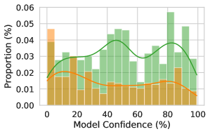
## Histogram with Overlaid Density Curves: Model Confidence Distribution
### Overview
The image displays a statistical chart combining a histogram and two overlaid kernel density estimate (KDE) curves. It visualizes the distribution of a model's confidence scores, comparing two distinct groups or datasets. The chart is presented on a white background with a light gray grid.
### Components/Axes
* **Chart Type:** Histogram with overlaid density curves.
* **X-Axis:**
* **Label:** "Model Confidence (%)"
* **Scale:** Linear, ranging from 0 to 100.
* **Major Ticks:** 0, 20, 40, 60, 80, 100.
* **Y-Axis:**
* **Label:** "Proportion (%)"
* **Scale:** Linear, ranging from 0.00 to 0.06.
* **Major Ticks:** 0.00, 0.01, 0.02, 0.03, 0.04, 0.05, 0.06.
* **Data Series (Visual Elements):**
1. **Orange Histogram Bars:** Represent the proportion of predictions for one group (likely "incorrect" or "low-confidence" predictions) across confidence bins.
2. **Green Histogram Bars:** Represent the proportion of predictions for a second group (likely "correct" or "high-confidence" predictions) across confidence bins.
3. **Orange Line:** A smoothed KDE curve for the orange histogram data.
4. **Green Line:** A smoothed KDE curve for the green histogram data.
* **Legend:** No explicit legend is present within the chart area. The color coding (orange vs. green) is the primary means of distinguishing the two data series.
### Detailed Analysis
**Histogram Bars (Approximate Proportions per Bin):**
* **Orange Bars (Left-skewed distribution):**
* Highest peak at the 0-5% confidence bin: ~0.048 proportion.
* Significant presence in the 5-10% bin: ~0.038.
* Proportion generally decreases as confidence increases, with minor local peaks around 15-20% (~0.03) and 30-35% (~0.025).
* Very low proportions above 60% confidence, tapering to near zero by 100%.
* **Green Bars (Right-skewed distribution):**
* Very low proportions below 20% confidence.
* Begins to rise significantly around 30-35% confidence.
* Major cluster of high bars between 40% and 95% confidence.
* Highest peak appears in the 80-85% confidence bin: ~0.058 proportion.
* Other notable peaks at ~50% (~0.048), ~65% (~0.045), and ~90% (~0.045).
**Density Curves (Trend Verification):**
* **Orange Line Trend:** Starts high on the left (low confidence), slopes downward with a slight hump around 15-20%, and continues a steady decline towards the right (high confidence). This confirms the left-skewed nature of the orange data.
* **Green Line Trend:** Starts near zero on the left, rises to form a broad, multi-modal distribution across the middle-to-high confidence range. It shows a primary peak around 50% and a secondary, slightly higher peak around 80%, before declining. This confirms the right-skewed, high-confidence nature of the green data.
**Spatial Grounding:**
* The orange data (bars and line) is concentrated on the **left side** of the chart (0-50% confidence).
* The green data (bars and line) is concentrated on the **right side** of the chart (40-100% confidence).
* There is a clear zone of overlap between approximately 30% and 60% confidence where both orange and green bars are present.
### Key Observations
1. **Bimodal Separation:** The chart reveals two distinct, largely non-overlapping populations of model predictions. One group (orange) is characterized by low confidence scores, while the other (green) is characterized by moderate-to-high confidence scores.
2. **Peak Confidence Disparity:** The mode (most common value) for the orange distribution is extremely low (~2.5% confidence), while the mode for the green distribution is high (~82.5% confidence).
3. **Overlap Region:** The area between 30-60% confidence represents a "zone of uncertainty" where predictions from both groups coexist, though the green group begins to dominate as confidence increases.
4. **Absence of Extreme High Confidence for Orange:** The orange series has virtually no representation above 70% confidence, suggesting the model is rarely highly confident about this class of predictions.
### Interpretation
This chart is a classic visualization of **model calibration and discriminative performance**, likely for a binary classification task.
* **What the data suggests:** The two distributions almost certainly represent the model's confidence scores for **incorrect predictions** (orange) versus **correct predictions** (green). A well-calibrated, high-performing model should exhibit this pattern: low confidence when it's wrong and high confidence when it's right.
* **How elements relate:** The separation between the orange and green peaks indicates the model has good **discriminative ability**—it can distinguish between cases it will get right and cases it will get wrong based on its confidence score. The overlap region highlights where the model is less certain and errors are more likely.
* **Notable implications:**
* **Calibration:** The model appears reasonably well-calibrated. Its high-confidence predictions (green peak near 80%) are likely to be correct, and its low-confidence predictions (orange peak near 0%) are likely to be incorrect.
* **Performance:** The clear separation suggests high overall accuracy, as most predictions fall into the distinct high-confidence/correct or low-confidence/incorrect clusters.
* **Actionable Insight:** Predictions falling in the 30-60% confidence overlap zone could be flagged for human review, as the model is less decisive there. The near-zero orange proportion above 70% confidence is a positive sign, indicating the model rarely makes confident mistakes.