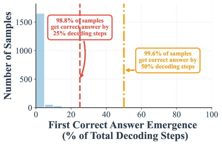
## Bar Chart: First Correct Answer Emergence vs. Number of Samples
### Overview
The chart visualizes the relationship between the percentage of decoding steps required to achieve the first correct answer and the number of samples processed. Two data series are presented: one for 25% decoding steps (blue) and one for 50% decoding steps (orange). Key annotations highlight accuracy thresholds at specific decoding steps.
### Components/Axes
- **X-axis**: "First Correct Answer Emergence (% of Total Decoding Steps)"
- Scale: 0% to 100% in 20% increments.
- Key markers:
- Red dashed line at 25% (labeled "25% decoding steps").
- Yellow dashed line at 50% (labeled "50% decoding steps").
- **Y-axis**: "Number of Samples"
- Scale: 0 to 1500 in 500 increments.
- **Legend**: Located in the top-right corner.
- Blue: Represents 25% decoding steps.
- Orange: Represents 50% decoding steps.
### Detailed Analysis
1. **Blue Bar (25% decoding steps)**:
- Positioned at 25% on the x-axis.
- Height: ~1500 samples (exact value annotated as "1500").
- Annotation: "98.8% of samples get correct answer by 25% decoding steps."
2. **Orange Bar (50% decoding steps)**:
- Positioned at 50% on the x-axis.
- Height: ~1000 samples (exact value annotated as "1000").
- Annotation: "99.6% of samples get correct answer by 50% decoding steps."
### Key Observations
- **Inverse relationship**: As decoding steps increase (25% → 50%), the number of samples processed decreases (1500 → 1000).
- **Accuracy improvement**: Higher decoding steps correlate with marginally higher accuracy (98.8% → 99.6%).
- **Thresholds**:
- At 25% decoding steps, nearly all samples (98.8%) achieve correctness.
- At 50% decoding steps, accuracy increases slightly but sample throughput drops by ~33%.
### Interpretation
The data suggests a trade-off between computational efficiency and accuracy. While increasing decoding steps from 25% to 50% improves correctness by 0.8%, it reduces the number of samples that can be processed by a third. This implies that optimizing decoding steps for real-time applications may require balancing speed and precision. The red and yellow dashed lines emphasize critical thresholds where accuracy plateaus or sample throughput becomes limiting.