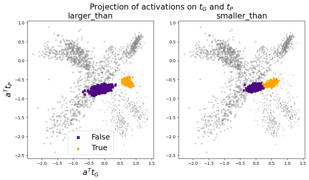
## Scatter Plot: Projection of Activations on t_G and t_P
### Overview
The image displays two side-by-side scatter plots under the main title "Projection of activations on t_G and t_P". Each subplot visualizes the distribution of data points in a 2D space defined by the dot products `a^T t_G` (x-axis) and `a^T t_P` (y-axis). The plots compare two conditions labeled "larger_than" (left subplot) and "smaller_than" (right subplot). Each plot contains a dense cloud of gray background points and two distinct, colored clusters of points labeled "False" and "True".
### Components/Axes
* **Main Title:** "Projection of activations on t_G and t_P"
* **Subplot Titles:**
* Left: "larger_than"
* Right: "smaller_than"
* **X-Axis Label (Both subplots):** `a^T t_G` (representing the dot product between activation vector `a` and vector `t_G`).
* **Y-Axis Label (Both subplots):** `a^T t_P` (representing the dot product between activation vector `a` and vector `t_P`).
* **Axis Scales (Both subplots):**
* X-axis: Ranges from approximately -2.0 to 1.5, with major ticks at -2.0, -1.5, -1.0, -0.5, 0.0, 0.5, 1.0, 1.5.
* Y-axis: Ranges from approximately -2.5 to 1.0, with major ticks at -2.5, -2.0, -1.5, -1.0, -0.5, 0.0, 0.5, 1.0.
* **Legend (Located in the bottom-left corner of the "larger_than" subplot):**
* **False:** Represented by purple squares (■).
* **True:** Represented by orange triangles (▲).
* **Data Series:**
1. **Gray Points:** A widespread, diffuse cloud of small gray squares forming the background distribution in both subplots.
2. **Purple Cluster ("False"):** A dense cluster of purple square markers.
3. **Orange Cluster ("True"):** A dense cluster of orange triangle markers.
### Detailed Analysis
**1. "larger_than" Subplot (Left):**
* **Gray Background:** Forms a broad, roughly diagonal cloud stretching from the bottom-left quadrant (negative `a^T t_G`, negative `a^T t_P`) to the top-right quadrant (positive `a^T t_G`, positive `a^T t_P`). The density is highest along this diagonal.
* **Purple "False" Cluster:** Positioned in the center-left region. Its center is approximately at (`a^T t_G` ≈ -0.2, `a^T t_P` ≈ -0.7). The cluster is elongated horizontally, spanning roughly from `a^T t_G` = -0.5 to 0.2, and vertically from `a^T t_P` = -0.9 to -0.5.
* **Orange "True" Cluster:** Positioned to the right of the purple cluster. Its center is approximately at (`a^T t_G` ≈ 0.7, `a^T t_P` ≈ -0.5). The cluster is more compact and circular, spanning roughly from `a^T t_G` = 0.5 to 1.0, and `a^T t_P` = -0.7 to -0.3.
* **Spatial Relationship:** The two colored clusters are clearly separated along the x-axis (`a^T t_G`). The "True" cluster has a significantly higher mean `a^T t_G` value than the "False" cluster. Their y-axis (`a^T t_P`) ranges overlap considerably.
**2. "smaller_than" Subplot (Right):**
* **Gray Background:** The distribution is visually similar to the left subplot, maintaining the same diagonal spread.
* **Purple "False" Cluster:** Positioned similarly to the left plot, centered near (`a^T t_G` ≈ -0.1, `a^T t_P` ≈ -0.7). Its shape and spread appear consistent.
* **Orange "True" Cluster:** Positioned to the right of the purple cluster but closer to it than in the left subplot. Its center is approximately at (`a^T t_G` ≈ 0.4, `a^T t_P` ≈ -0.6). The cluster spans roughly from `a^T t_G` = 0.2 to 0.7.
* **Spatial Relationship:** The separation between the "False" and "True" clusters along the x-axis (`a^T t_G`) is less pronounced compared to the "larger_than" plot. The clusters are closer together, with a smaller gap between their rightmost "False" points and leftmost "True" points. Their y-axis ranges still overlap.
### Key Observations
1. **Conditional Separation:** The primary difference between the two subplots is the degree of separation between the "False" and "True" clusters along the `a^T t_G` axis. Separation is greater in the "larger_than" condition.
2. **Consistent Y-Axis Positioning:** In both conditions, the "True" cluster is positioned slightly higher (less negative `a^T t_P`) than the "False" cluster, but the difference is small compared to the x-axis separation.
3. **Background Context:** The colored clusters occupy a specific, dense region within the much broader distribution of the gray background points. They are not at the extremes of the overall data cloud.
4. **Cluster Shape:** The "False" cluster appears more horizontally elongated, while the "True" cluster is more compact and rounded.
### Interpretation
This visualization likely analyzes the internal activations (`a`) of a neural network model performing a comparison task (e.g., "is X larger/smaller than Y?"). The vectors `t_G` and `t_P` are probably learned task-specific vectors (e.g., "grounding" and "prediction" vectors).
* **What the Data Suggests:** The model's activations for inputs where the comparison is **True** (orange) are projected to have a higher dot product with `t_G` (`a^T t_G`) than activations for **False** inputs (purple). This separation is more distinct when the model is processing the "larger_than" relation. The `t_P` vector seems less discriminative for this true/false distinction, as both clusters have similar `a^T t_P` values.
* **Relationship Between Elements:** The `a^T t_G` dimension appears to be a key feature the model uses to distinguish between true and false statements for these comparison relations. The "larger_than" task may create a clearer internal representation along this dimension than the "smaller_than" task.
* **Notable Patterns/Anomalies:** The clear clustering suggests the model has learned a structured internal representation for this logical task. The difference in separation between the two relations ("larger_than" vs. "smaller_than") could indicate an asymmetry in how the model processes these concepts, potentially reflecting biases in the training data or the inherent difficulty of the tasks. The fact that the clusters are embedded within a larger gray cloud indicates these are specific, task-relevant activations drawn from a wider population of model states.