## Scatter Plot: Projection of activations on tG and tP
### Overview
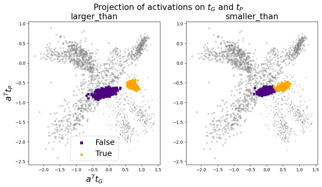
The image contains two scatter plots, each displaying the projection of activations onto tG (x-axis) and tP (y-axis). The left plot is labeled "larger_than" and the right plot is labeled "smaller_than". Data points are colored to indicate a "True" or "False" condition, with gray points representing background data. The plots show the distribution of these activations, revealing how the "True" and "False" conditions cluster in relation to tG and tP.
### Components/Axes
* **Title:** Projection of activations on tG and tP
* **X-axis (both plots):** a^T tG (a transpose tG)
* Scale: -2.0 to 1.5, with tick marks at -2.0, -1.5, -1.0, -0.5, 0.0, 0.5, 1.0, 1.5
* **Y-axis (both plots):** a^T tP (a transpose tP)
* Scale: -2.5 to 1.0, with tick marks at -2.5, -2.0, -1.5, -1.0, -0.5, 0.0, 0.5, 1.0
* **Plot Titles:**
* Left Plot: larger\_than
* Right Plot: smaller\_than
* **Legend (bottom-left of both plots):**
* Purple Square: False
* Orange Triangle: True
* **Data Points:**
* Gray squares and triangles: Background data
* Purple squares: "False" condition
* Orange triangles: "True" condition
### Detailed Analysis
**Left Plot (larger\_than):**
* **Gray Data:** The gray data points (squares and triangles) are scattered across the plot, with higher concentrations in the top-left and bottom-right quadrants.
* **False (Purple Squares):** The purple squares, representing the "False" condition, are clustered in a relatively dense region centered around x = -0.5 and y = -0.8. The x values range from approximately -1.0 to 0.0, and the y values range from approximately -1.0 to -0.6.
* **True (Orange Triangles):** The orange triangles, representing the "True" condition, are clustered in a region centered around x = 0.8 and y = -0.4. The x values range from approximately 0.5 to 1.2, and the y values range from approximately -0.6 to -0.2.
**Right Plot (smaller\_than):**
* **Gray Data:** Similar to the left plot, the gray data points are scattered, with concentrations in the top-left and bottom-right quadrants.
* **False (Purple Squares):** The purple squares are clustered in a region centered around x = -0.2 and y = -0.7. The x values range from approximately -0.5 to 0.2, and the y values range from approximately -0.9 to -0.5.
* **True (Orange Triangles):** The orange triangles are clustered in a region centered around x = 0.6 and y = -0.6. The x values range from approximately 0.3 to 1.0, and the y values range from approximately -0.8 to -0.4.
### Key Observations
* In both plots, the "True" and "False" conditions form distinct clusters, suggesting that the tG and tP projections can effectively differentiate between these conditions.
* The "larger\_than" plot shows a more pronounced separation between the "True" and "False" clusters compared to the "smaller\_than" plot.
* The gray background data is distributed more widely, indicating a broader range of activation projections.
### Interpretation
The scatter plots visualize how activations are projected onto two bases, tG and tP, under different conditions ("larger\_than" and "smaller\_than"). The clustering of "True" and "False" data points suggests that these projections can be used to discriminate between these conditions. The "larger\_than" condition appears to be more easily separable based on these projections than the "smaller\_than" condition, as evidenced by the greater distance between the "True" and "False" clusters in the left plot. The scattered gray data represents background activations, which are less indicative of either "True" or "False" conditions. The plots provide insight into the feature space learned by the model and how different conditions are represented within that space.